---
title: Tile
description: >-
The tile component displays interactive buttons for the POS smart grid. Use
tiles as customizable shortcuts that allow merchants to quickly access
workflows, actions, and information from the smart grid.
api_version: 2026-04
source_url:
html: >-
https://shopify.dev/docs/api/pos-ui-extensions/latest/web-components/actions/tile
md: >-
https://shopify.dev/docs/api/pos-ui-extensions/latest/web-components/actions/tile.md
---
# Tile
The tile component displays interactive buttons for the POS smart grid. Use tiles as customizable shortcuts that allow merchants to quickly access workflows, actions, and information from the smart grid.
Tiles can change their appearance, content, and enabled state based on surrounding context such as cart contents, device conditions, or runtime state. They can display contextual information through headings, subheadings, and badge values.
Each POS UI extension can only render one tile component for each [home screen tile target](https://shopify.dev/docs/api/pos-ui-extensions/latest/targets/home-screen#home-screen-tile-).
### Support Targets (1)
### Supported targets
* [pos.home.tile.render](https://shopify.dev/docs/api/pos-ui-extensions/2026-04/targets/home-screen#home-screen-targets)
#### Use cases
* **Quick actions:** Create action shortcuts like "Apply 10% discount" or "Add popular item."
* **Contextual info:** Display dynamic subheadings showing cart totals or item counts.
* **Notifications:** Show badges for pending items, alerts, or status indicators.
* **Workflow entry:** Provide entry points to launch detailed modal workflows.
***
## Properties
Displays tappable content in a compact tile layout.
* **disabled**
**boolean**
**Default: false**
Disables the tile meaning it cannot be clicked or receive focus.
* **heading**
**string**
**Default: ''**
A title that describes the content of the tile.
* **id**
**string**
A unique identifier for the element.
* **itemCount**
**number**
A numeric indicator rendered within the tile (for example, a count or a step number).
* When provided, the indicator is displayed inside the tile.
* Intended for small integers. It may clamp, truncate, or abbreviate larger values.
* **subheading**
**string**
**Default: ''**
Supporting text displayed below the heading.
* **tone**
**'auto' | 'neutral' | 'accent'**
**Default: 'auto'**
Sets the tone of the tile, based on the intention of the information being conveyed.
### Events
The tile component provides event callbacks for handling user interactions. Learn more about [handling events](https://shopify.dev/docs/api/polaris/using-polaris-web-components#handling-events).
* **click**
**(event: CallbackEvent<"s-tile">) => void**
Callback when the tile is activated.
### CallbackEvent
* bubbles
```ts
boolean
```
* cancelable
```ts
boolean
```
* composed
```ts
boolean
```
* currentTarget
```ts
HTMLElementTagNameMap[T]
```
* detail
```ts
any
```
* eventPhase
```ts
number
```
* target
```ts
HTMLElementTagNameMap[T] | null
```
***
## Examples
### Create a smart grid tile
Create interactive smart grid shortcuts using a tile component with customizable heading, subheading, and badge. This example shows a basic tile for the POS smart grid.
## Create a smart grid tile
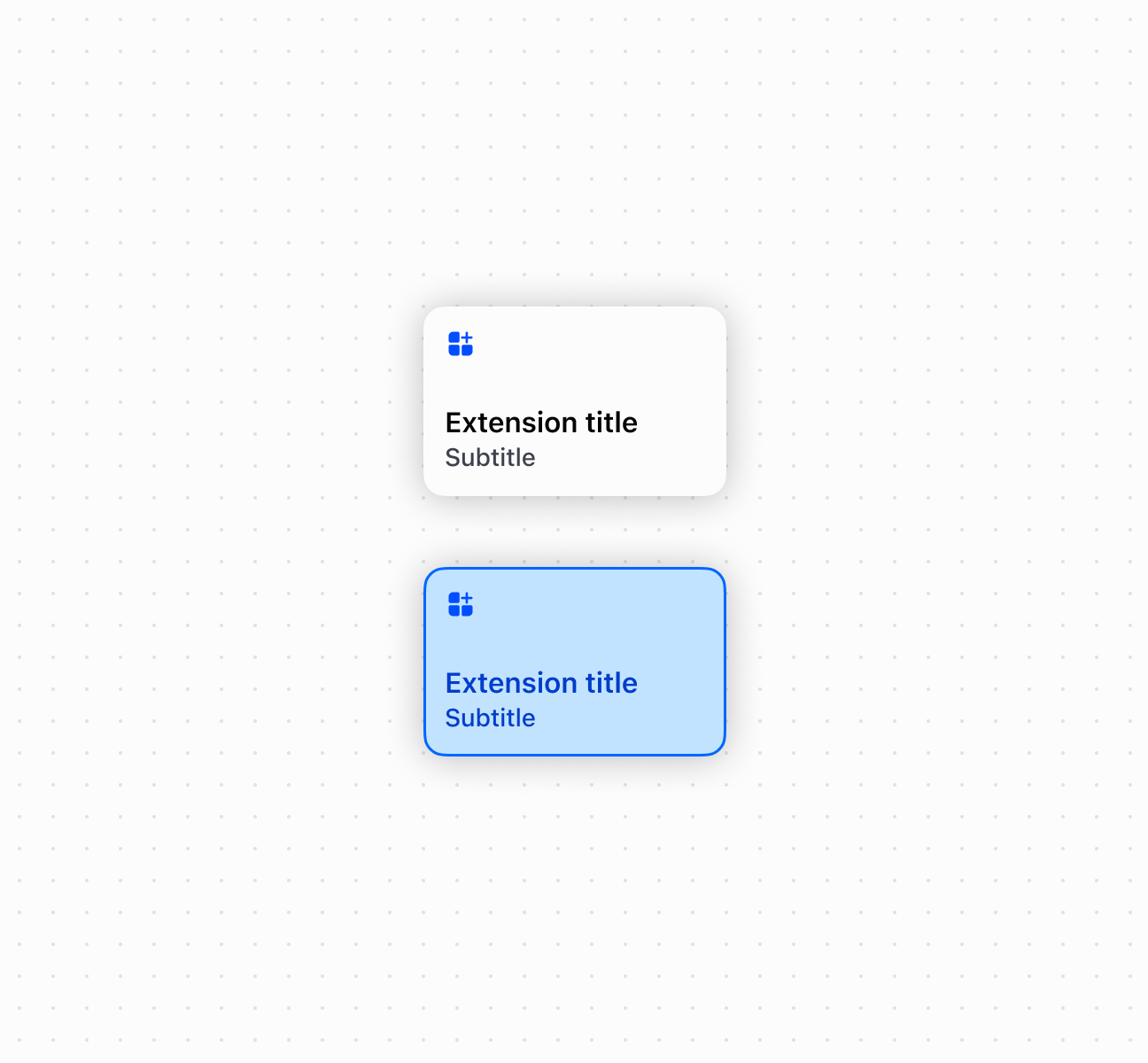
## Create a smart grid tile
```html
```
***
## Best practices
* **Write action-oriented headings:** Use specific language like "Apply loyalty discount" rather than generic terms like "Loyalty app."
* **Provide contextual subheadings:** Show dynamic information like cart totals, eligibility requirements, or current status.
* **Use meaningful item counts:** Display counts for actionable items like pending notifications or items requiring action, not just informational counts.
* **Launch modals for workflows:** Use `onClick` with `shopify.action.presentModal()` rather than performing complex operations directly.
***
## Limitations
The tile component supports click and long press interactions only. Swipe, drag, and other gestures aren't supported.
***