Version 2025-07 is the last API version to support React-based UI components. Later versions use web components, native UI elements with built-in accessibility, better performance, and consistent styling with Shopify's design system. Check out the upgrade guide to upgrade your extension.
Tile
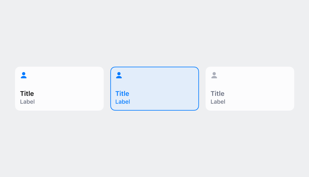
The Tile component displays interactive buttons for the POS smart grid that allow merchants to complete actions quickly. Tiles serve as customizable shortcuts that provide contextual information and enable merchants to quickly access workflows, actions, and information from the smart grid.
Tiles are dynamic components that can change their appearance, content, and enabled state based on surrounding context such as cart contents, device conditions, or runtime state. They support tap interactions, visual feedback, and can display contextual information through titles, subtitles, and badge values.
Supported targets
Supported targets
Anchor to PropertiesProperties
Configure the following properties on the Tile component.
- Anchor to titletitletitlestringstringrequiredrequired
The text displayed as the main label of the tile.
- Anchor to badgeValuebadge
Valuebadge Value numbernumber A numeric value displayed as a small badge in the top right corner of the tile.
- Anchor to destructivedestructivedestructivebooleanboolean
Sets whether the tile appears in a destructive/warning state. As of POS 10.0.0, this property creates an "active state" appearance rather than just red coloring.
- Anchor to enabledenabledenabledbooleanboolean
Whether the tile can be tapped and responds to user interaction. When disabled, the tile appears dimmed and doesn't respond to tap events.
- Anchor to onPresson
Presson Press () => void() => void The callback function that's executed when users tap the tile.
- Anchor to subtitlesubtitlesubtitlestringstring
The text displayed as the secondary label below the title.
Anchor to ExamplesExamples
Anchor to Create a smart grid tileCreate a smart grid tile
Display an interactive button on the POS smart grid for quick actions. This example shows a Tile that provides customizable shortcuts with contextual information, titles, subtitles, and badge values, enabling merchants to quickly access workflows and complete actions from the smart grid.Create a smart grid tile
Create a smart grid tile
React
import React from 'react'
import { Tile, reactExtension, useApi } from '@shopify/ui-extensions-react/point-of-sale'

const TileComponent = () => {
  const api = useApi()
  return (
    <Tile
      title="My app"
      subtitle="Hello world!"
      onPress={() => {
        api.action.presentModal()
      }}
      enabled
    />
  )
}

export default reactExtension('pos.home.tile.render', () => {
  return <TileComponent />
})
TS
import {
  Tile,
  extension,
} from '@shopify/ui-extensions/point-of-sale';

export default extension(
  'pos.home.tile.render',
  (root, api) => {
    const tile = root.createComponent(Tile, {
      title: 'My app',
      subtitle: 'Hello world!',
      enabled: true,
      onPress: () => {
        api.action.presentModal();
      },
    });

    root.append(tile);
  },
);
Anchor to Best practicesBest practices
- Provide contextual subtitles: Show dynamic information like cart totals, eligibility requirements, current status, or helpful context. Subtitles should complement the title by providing additional details staff need before taking action.
- Use meaningful badge values: Display counts that represent actionable items or important status information like pending notifications, items requiring action, or error counts. Badge values work best when they represent actionable information rather than purely informational counts.
- Design tiles as workflow entry points: Use tiles primarily to launch modal experiences using
api.action.presentModal()rather than performing complex operations directly. Store contextual data before presenting modals. - Update properties efficiently: Dynamically enable or disable tiles based on cart state, user permissions, or business rules. Only call
updateProps()when displayed values actually change, and batch multiple property updates into single calls.
Anchor to LimitationsLimitations
- Each POS UI extension can only render one Tile component.
- Badge values must be numeric-string or text badges aren't supported.
- Custom icons, images, or visual styling beyond built-in properties aren't supported.
- Tile size and layout is determined by the smart grid and can't be customized.
- The Tile component is limited to tap interactions only. There's no support for long press, swipe, or other gestures.
- Title and subtitle text must be plain strings-no HTML, markdown, or rich text formatting.