UX for customer accounts
Customer accounts are getting layout and design updates. Enable the Customer account improvements feature preview to get early access. Review the feature preview overview and where extension targets will render in the new layout.
Customer accounts are getting layout and design updates. Enable the Customer account improvements feature preview to get early access. Review the feature preview overview and where extension targets will render in the new layout.
Customer accounts offer a secure and flexible way for customers to manage their information and orders. Accounts empower customers with greater control over post-purchase surfaces and create opportunities for merchants to drive more sales with features like offers, wishlists, product offers, and loyalty programs.
All apps should follow the general guidance provided by the App Design Guidelines. This guide provides additional guidance for designing customer account UI extensions.
Anchor to Merchant-to-customer contentMerchant-to-customer content
When you write UI content for your customer account app, you’re writing directly to a merchant’s customers. The content that you write should represent the merchant, not your app, and should optimize the customer’s online experience.
Consult Polaris for more guidelines on voice, tone, and vocabulary to consider for merchant-to-customer content.
Anchor to PrinciplesPrinciples
Enable self-service: Self-service options help customers resolve issues faster and reduce merchant support interactions.
Design for consistency: Merchants can use different apps to enhance their customer account interface. Because your app operates alongside other apps, it's important to ensure a familiar user experience. Avoid introducing unfamiliar UX patterns, terms, or navigation paradigms that deviate from our guidelines. Aim to integrate your app seamlessly into the existing customer account experience.
Personalize when possible: Customer account extensions benefit from authenticated access to customer data. Use this data to personalize the customer experience and create delightful moments. For example, offer complementary products, birthday discounts, or personalize content with the customer's name. Be creative, but respect privacy.
Don't expose your brand to the customer: Enhance the merchant's brand subtly and effectively. At all times, aim to create a seamless and consistent experience that makes customers feel like they're interacting directly with the merchant.
Build for scale: Design your app to support merchants of all sizes, from small startups to large enterprises. Ensure that your app effectively handles both low and high order volumes.
Anchor to Responsive designResponsive design
Design interfaces that adapt to different screen sizes. Your app should offer a good UX across mobile, tablet, and desktop devices. Test the extension on various screen sizes to ensure content adjusts appropriately for each device.
Anchor to Grid layoutsGrid layouts
Grid layouts enable responsive design for different screen sizes, and streamline development while enhancing the overall aesthetics of the customer experience. Grid layouts also ensure that elements are spaced, aligned, and positioned consistently.
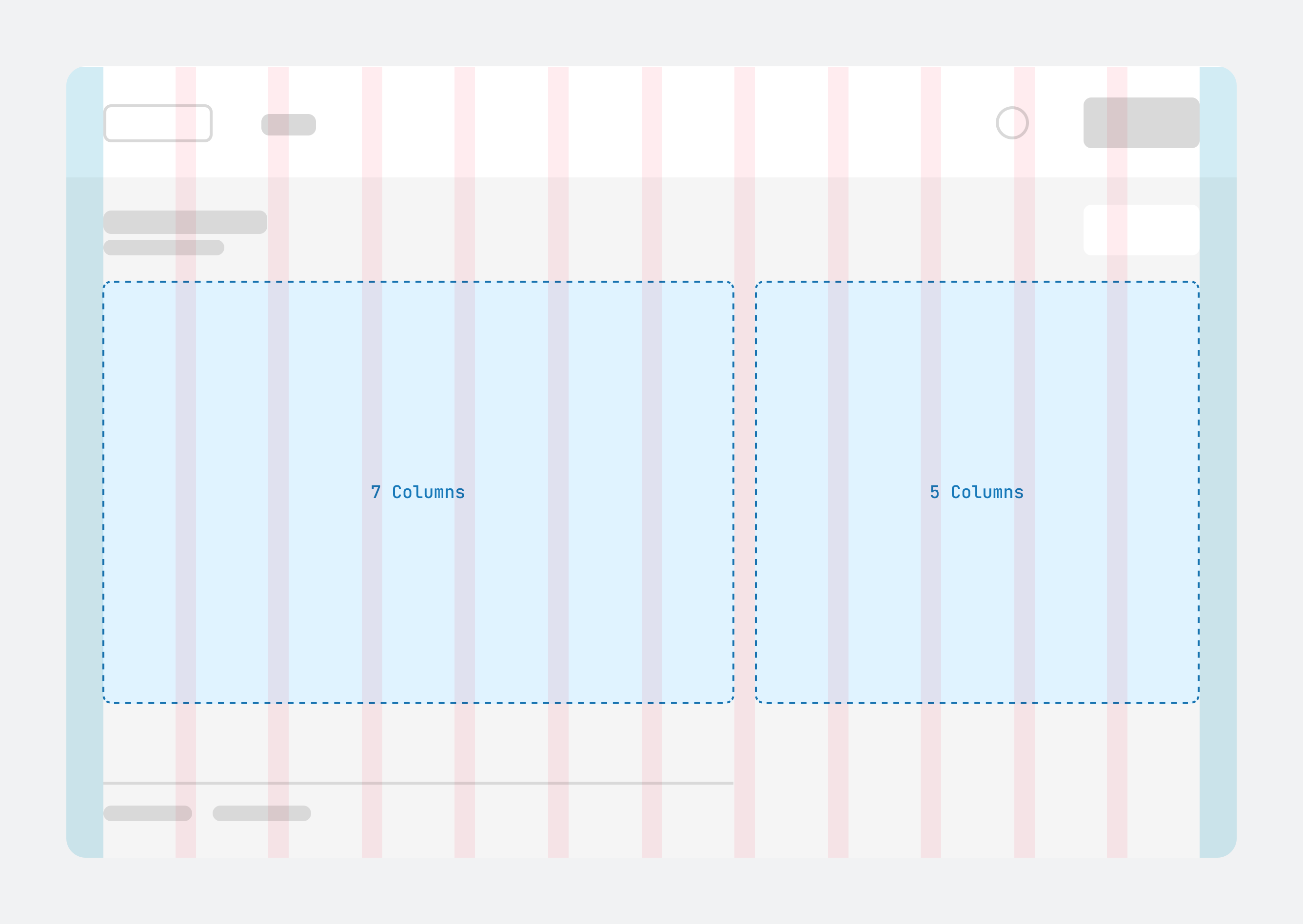
Customer account pages are made up of columns, gutters, and margins. The design is based on a 12-column grid.
The following are the grid breakpoints per device type:
-
Mobile:
375 dpbreakpoint, six column grid, one column content -
Tablet:
750 dpbreakpoint, six column grid, one column content -
Small laptop:
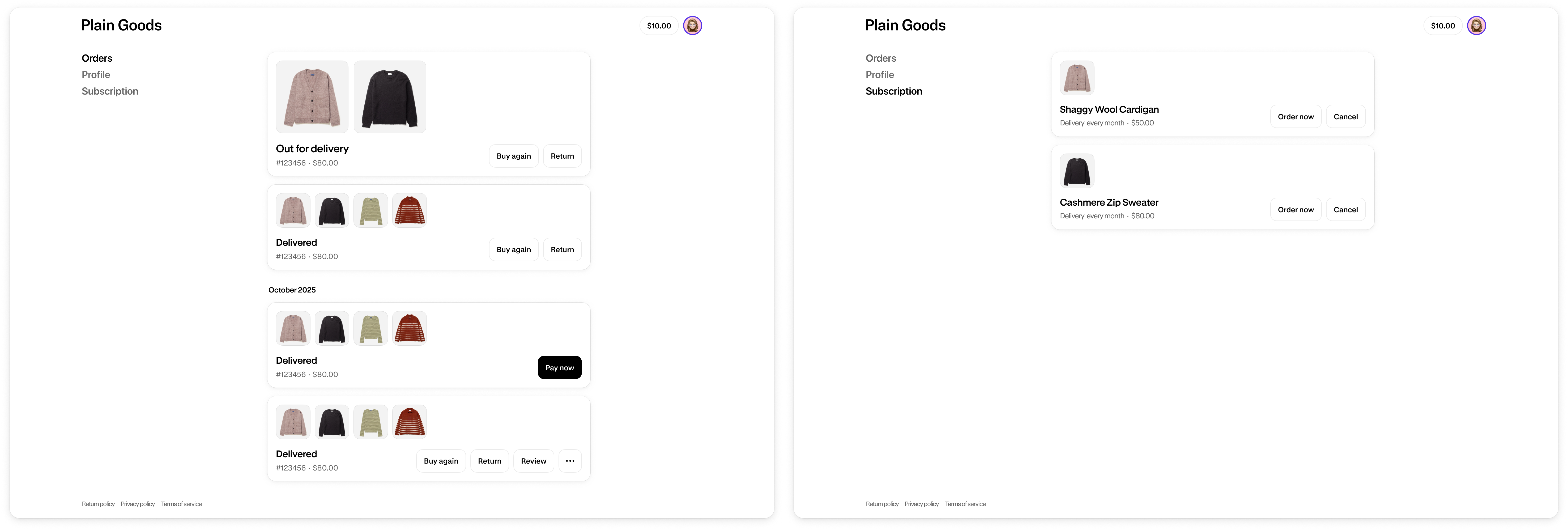
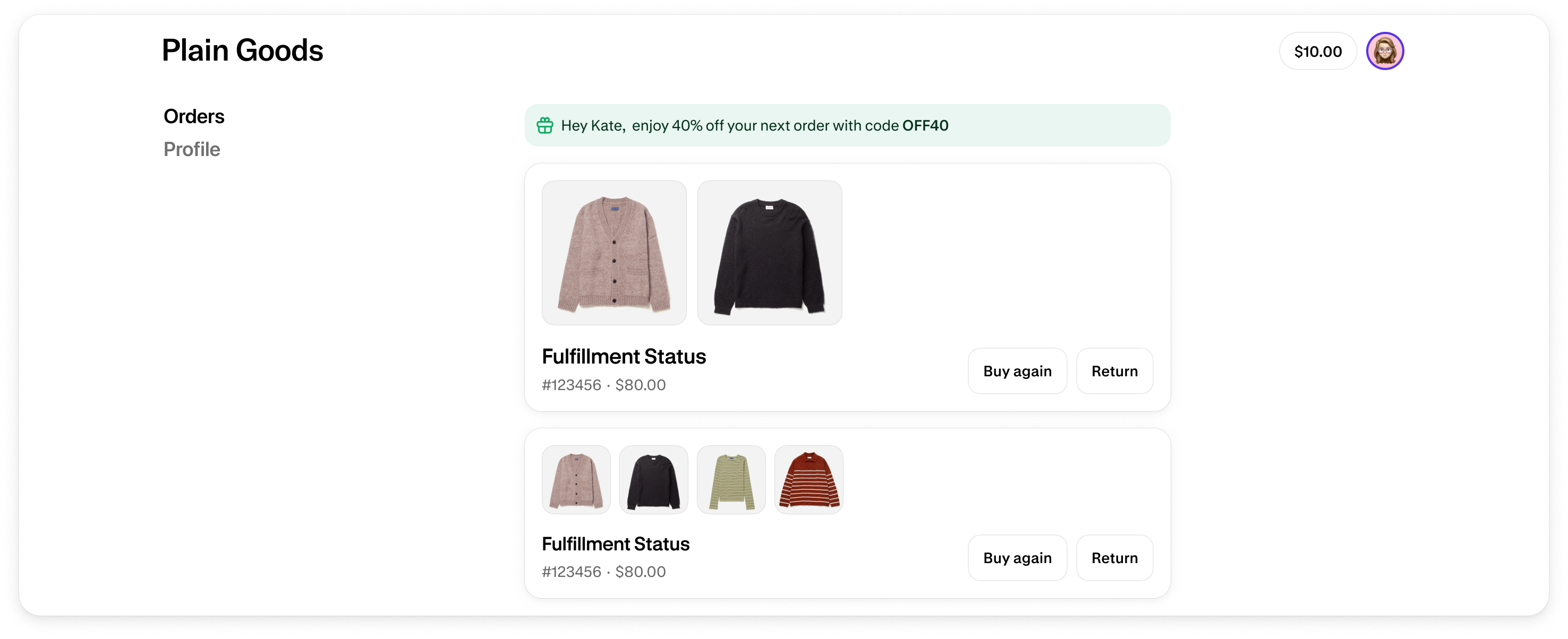
1000 dpbreakpoint, six column grid, two column contentWhen you design your page layout, you should generally space the content evenly across the grid columns. For example, in a three-column layout, each column of content would span four columns of the grid. However, to create a layout similar to the Order status page, the first column of content should span seven columns and the second should span five columns.
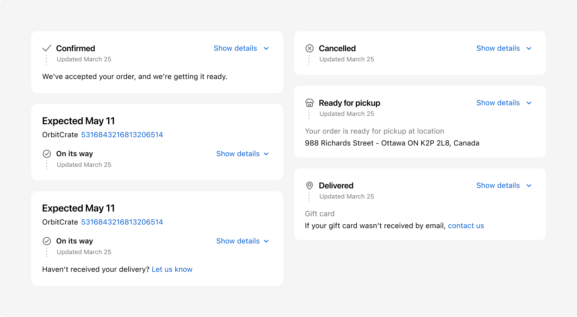
Anchor to Fulfillment statusesFulfillment statuses
Anchor to Conditional logic based on statusConditional logic based on status
Design your apps so that merchants have the flexibility to determine where an action displays.
For example, for order actions that only become relevant once the customer has received the order, like requesting a return or writing a review, ideally customer's can’t take action until the order is marked as delivered. However, when merchants don't provide a tracking number for a fulfilled order, it can be difficult for Shopify to know when the order has been delivered. In these instances, customer wouldn't have access to actions that depend on an order's delivered status. Be mindful of situations like this, and enable merchants to configure your app to suit their fulfillment processes.
Anchor to Content guidelinesContent guidelines
Anchor to Status namesStatus names
- Aim for one to three words.
- Use sentence case.
Anchor to Test different fulfillment scenariosTest different fulfillment scenarios
We recommend testing your Order status page extensions across different fulfillment states. The following are some examples:
- Different delivery statuses, such as confirmed, on its way, and delivered.
- Partial fulfillments
- Multiple fulfillments
- Local pickup
- Gift cards
- Digital products
- Returns
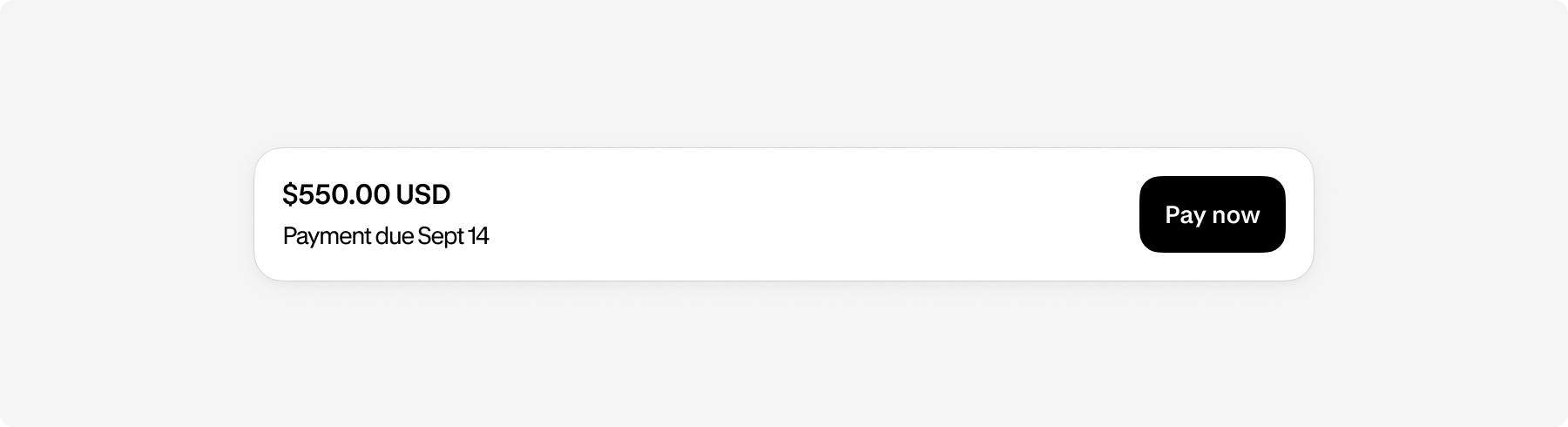
Anchor to Payment statusesPayment statuses
Depending on the payment status of an order, a payment card will display above the order summary. For example, when a customer has made a purchase with Net 90 payment terms, they have 90 days to submit payment. In this scenario, the payment card displays the amount due, the due date, and a Pay now button.
Anchor to Test different payment scenariosTest different payment scenarios
We recommend testing your Order status page extensions across different payment statuses. The following are some example statuses:
- Payment terms
- Partial payment
- Refund
- Paid
Anchor to Error messagesError messages
Error messages should help the customer understand what went wrong and how they can resolve the error.
Create error messages using a banner component with the alert or critical status prop.
Don't use toasts for error messages. Since toasts disappear, customers lose access to the information that they need to move forward.
Learn more about error handling.
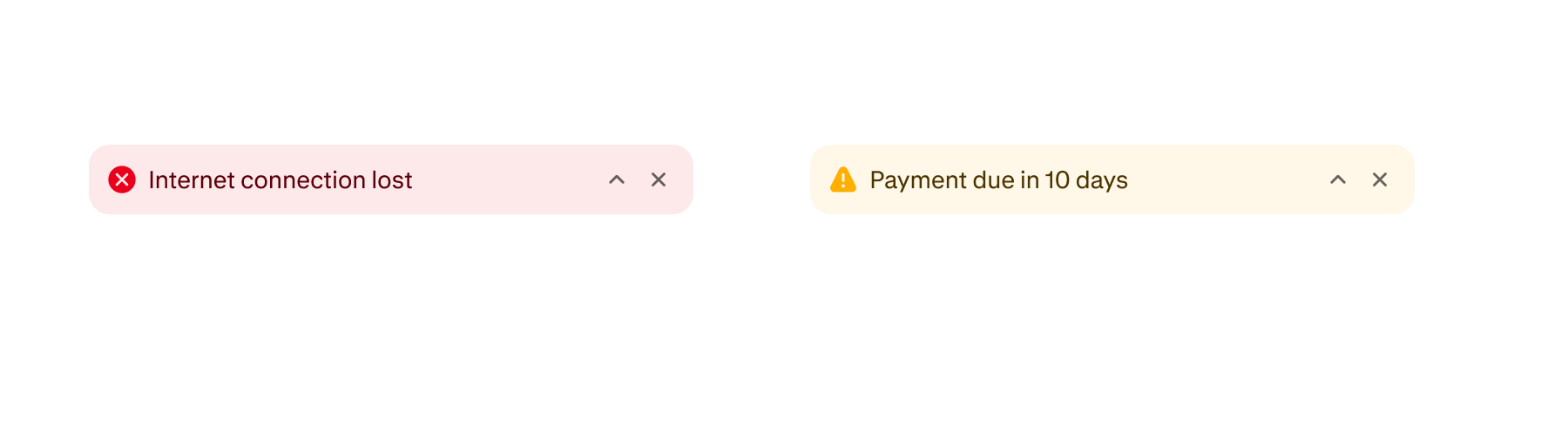
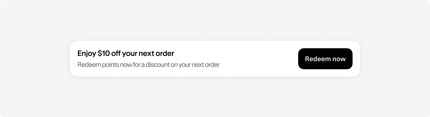
Create informational banners using a banner component with the info status prop.

To build a more neutral banner, without the icons and colors that are associated with the different props, the following are some examples of components that you can use:
-
Section: Customer account
-
Heading: Heading 2
-
Text: Default
-
Button: Secondary
These components adopt the merchant's branding by default, which helps your banner align with the overall look and feel of the merchant's shop.