Building with sections and blocks
When you're designing a theme, you should consider when to provide functionality in a section or a block. Sections and blocks are modular components that give merchants the opportunity to customize and extend their theme. Merchants can add and remove sections and theme blocks, adjust section and block settings, and introduce app blocks and metafields.
These guidelines apply to Online Store 2.0 themes, which use JSON templates and section groups. You can't add or remove static sections from Liquid templates or layouts.
Anchor to SectionsSections
Sections are available on all pages.
When building theme templates, you should ensure that your template's default content is available in a main template section, and that sections can be added, removed, and reordered. You can use sections to do the following:
- To add, remove, or reorder content at the template or section group level
- To control theme settings that are scoped to the entire section's layout and content
Anchor to BlocksBlocks
You should provide blocks to add, remove, or reorder content at the section level, or when it enhances the usability of a section.
Keep the following principles in mind when developing blocks:
- Ensure that the theme settings are scoped to the block.
- Choose a block layout that is appropriate for the content, and ensure that your blocks flow logically regardless of block type or sequence.
- Select an appropriate flexibility level to introduce using blocks.
Anchor to Block layoutsBlock layouts
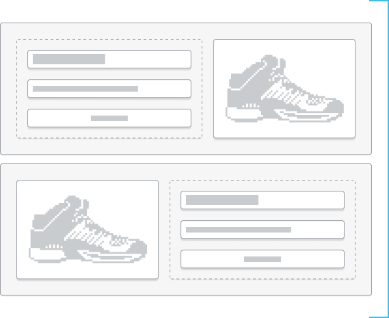
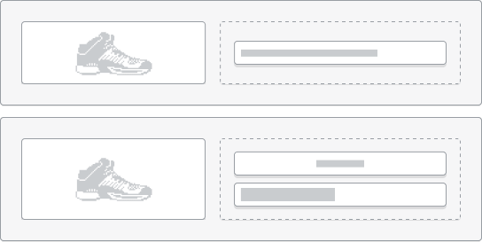
When designing the grid layout for your section, ensure that your blocks follow a logical and intuitive reading flow regardless of the block types and block sequence.
Consider the following when determining how blocks should flow in a section:
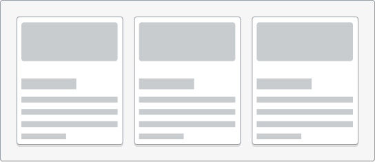
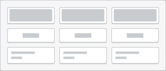
- Stack blocks vertically for text-based content that requires hierarchy.
- If you don't need to show hierarchy, then either stack blocks horizontally or create a grid that adapts to the block types that are available in the section.
- When stacking blocks horizontally, either ensure that the section grid can wrap on several lines or offer horizontal sliding controls to maintain a comfortable block width. Ensure your section grid is responsive and that blocks can reflow depending on screen size.
 |  |
|  |
 |  |
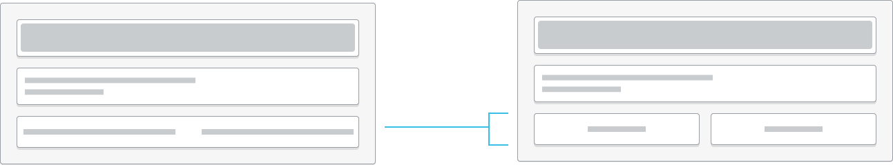
- Don't rely on a specific block type or sequence to design a layout, and don't use a specific block order to change the grid layout.
|  |
|  |
| | |
 | ||
Anchor to Blocks and flexibilityBlocks and flexibility
To balance simplicity and flexibility, you should carefully consider when to add blocks and what each block should contain. Too many blocks creates clutter and complexity. You can use the following principles to understand how to define your blocks.
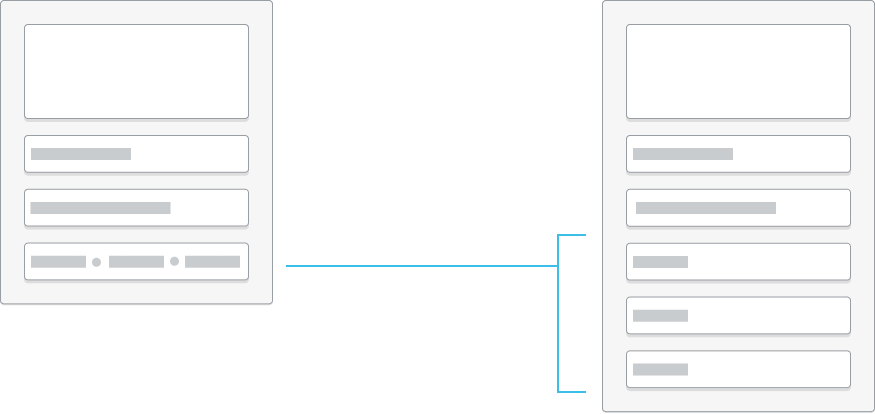
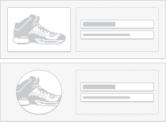
- Group settings into blocks to simplify the editing experience and declutter the editor sidebar. For example, you can nest theme settings to customize an image block inside of the block.
- When elements follow a specific hierarchy, group elements together and optionally allow block insertion points before and after. For example, you might create a single block that controls cart page line items.
- Avoid providing blocks that are too granular. Granularity adds complexity to the theme code and to the merchant editing experience. For example, you should group the author, date, and comments into a single block or into settings, rather than introducing these attributes as three separate blocks.
| | |
 | ||
Anchor to Considerations for app blocksConsiderations for app blocks
Merchants can add app-provided blocks to their themes. As a theme developer, you need to add support for these types of blocks to your sections. Consider the following when deciding whether to support app blocks in a section:
- Provide app blocks in sections that have clear use cases for layering additional conversion tools, or purchase decision factors. For example, you might want to include an app block with the product information on the product page, or in the cart template.
- Always consider antifragility and the section's purpose when considering extending a theme using app blocks. Would the layout break easily when inserting unexpected block types? Would it require adding edge-case CSS styles to handle those blocks? Would it make the section's purpose vague, or inconsistent? If the answer is yes to these questions, then avoid app blocks.
Anchor to Theme settingsTheme settings
Use theme settings to provide different look and feel options. Theme settings can be applied at the section, block, and theme levels.
Anchor to MetafieldsMetafields
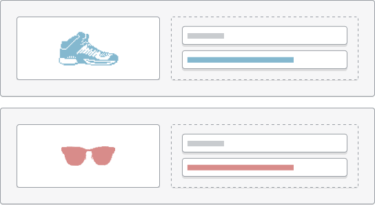
Shopify provides various standard metafields that can fit your target segment. Review what's available and consider which use cases make sense for the theme. For example, you might include either sections or blocks for a care guide or size chart metafield. These metafields, when referenced as dynamic sources, update to reflect their context, such as the product that is being rendered.
When building metafields into your theme, consider building specific blocks for metafields. You can also audit ecommerce websites for your target segment, and analyze how content is presented to identify opportunities to design specific components. For example, you might want to use metafields to create a well-formatted information list for electronic products, or to add information about a coffee blend and origin.