Forms
Most Create and Edit actions require the use of forms for data input. Good form design is important because these are likely the most frequent touchpoints that merchants have with your app.
Many apps have complex forms, with many input fields. This can be overwhelming for merchants.
Ensure that your forms use proper spacing by using the Polaris Form layout component.
Follow this guidance to create organized forms that will be easy for merchants to understand.
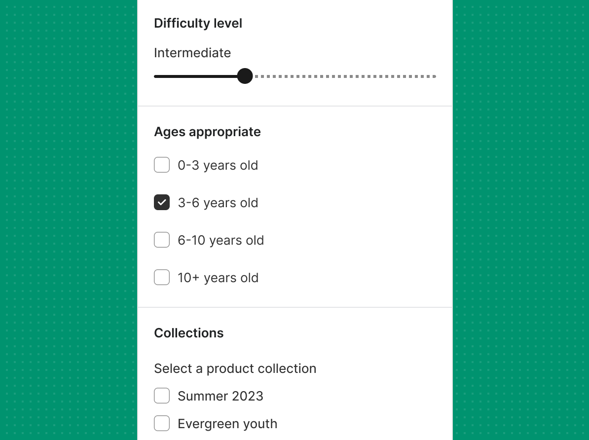
Use progressive disclosure when form inputs or information changes depending on input values. This prevents merchants from becoming overwhelmed by very long forms.
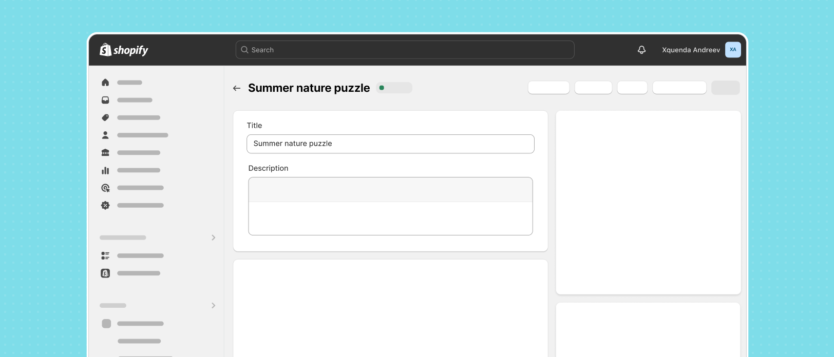
The Shopify admin uses individual pages for object definitions. For example, a single page is used for a single product definition, or a single page is used for a variant definition. Following this pattern can help focus merchant workflows and make your app look more like the Shopify admin.
Must Do
For more than five inputs, use sections with titles in one card or use multiple cards with headers.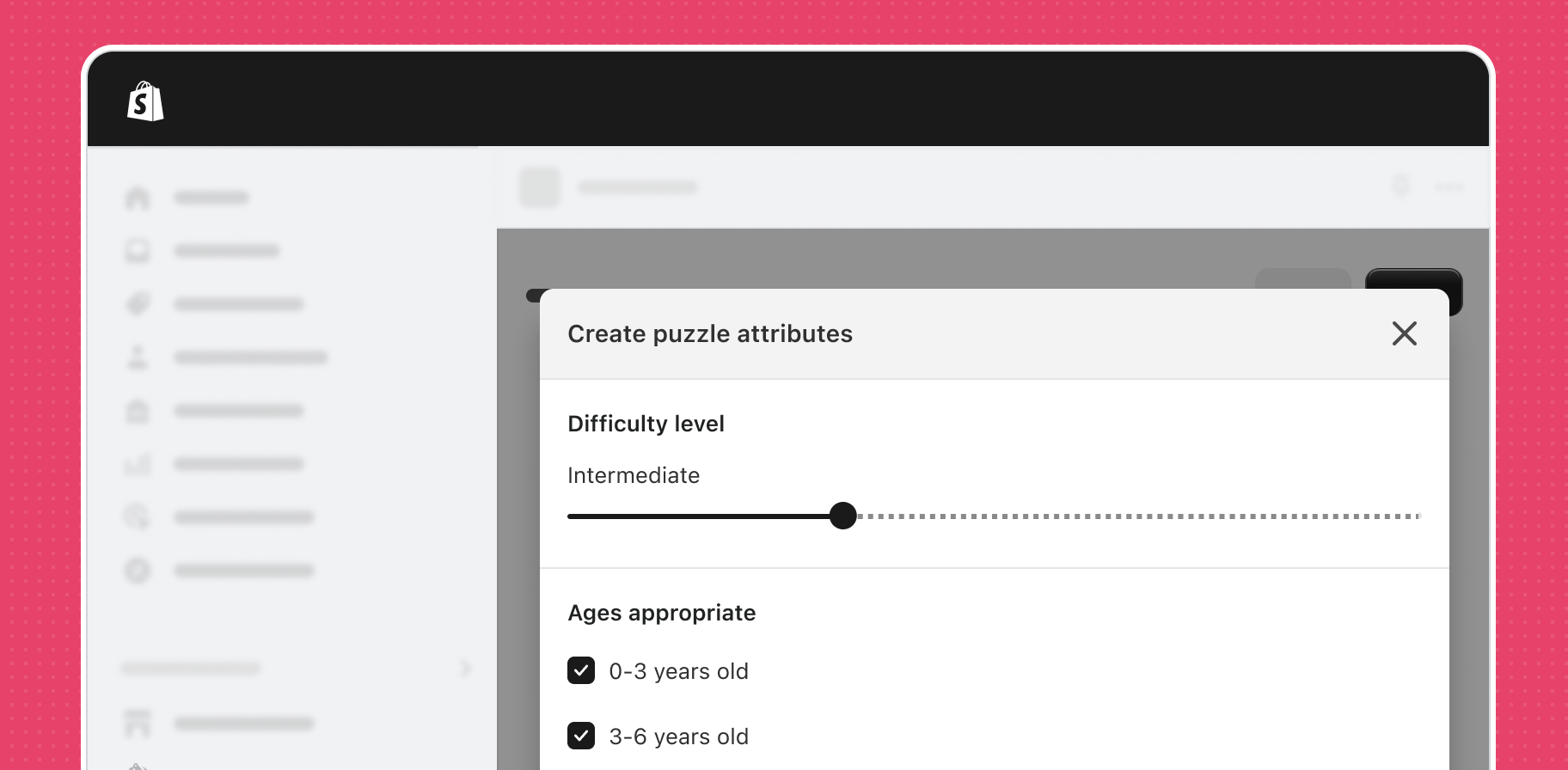
Do Not
Don’t place large forms inside max height, max width modals. Instead, create a new page in your embedded app to give merchants room to work with the form inputs.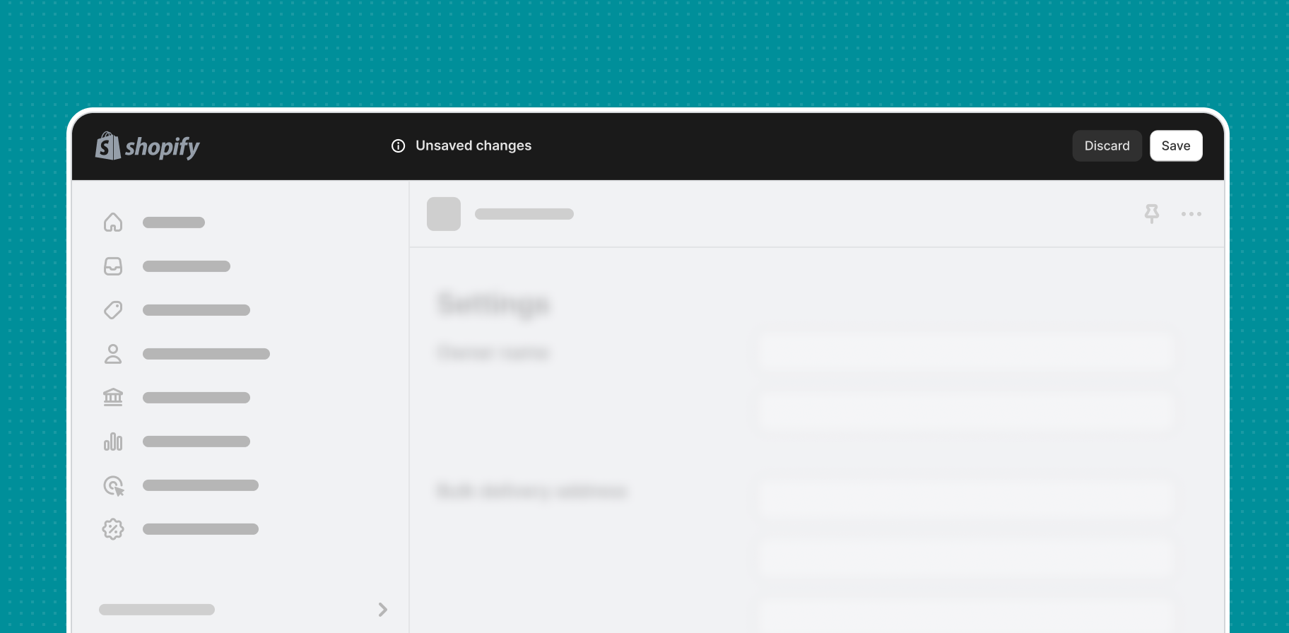
Tip
Form inputs can be saved using the App Bridge Contextual Save Bar API. Continuous data validation or auto-save for forms is incongruous with the standard Shopify admin save UX.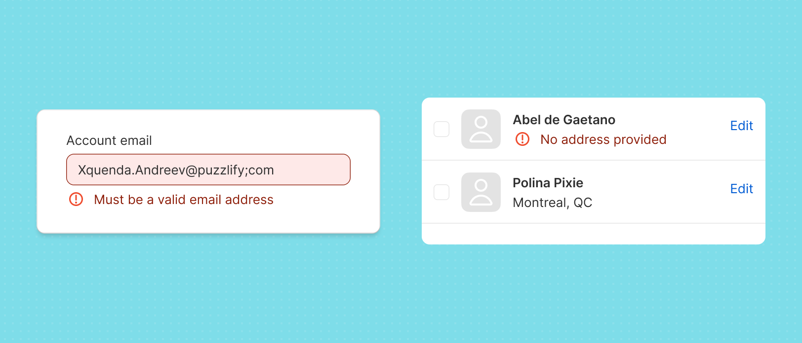
Refer to the Alerts page for guidance on how to show form errors to merchants.