Visual design
Visual design focuses on app aesthetics through the strategic use of images, colors, fonts, and other elements.
Colors, fonts, icons, illustrations, and many other visual elements have a big influence on your app's usability. Great apps use strong visual design to heighten the merchant experience.
Fitting into the admin
Because merchant workflows cross between apps and the Shopify admin, merchants can have an easier time accomplishing their tasks when apps use the same visual design cues as the admin. The easiest way to create a harmonious experience with the Shopify admin is by using Polaris, Shopify's unified system for building app interfaces.Admin UI extensions blend in seamlessly with the Shopify admin UI. For optimal integration, we recommend that App Home workflows follow Polaris. Otherwise, the merchant experience across your app and admin UI extensions might break or feel jarring.
Admin UI extensions blend in seamlessly with the Shopify admin UI. For optimal integration, we recommend that App Home workflows follow Polaris. Otherwise, the merchant experience across your app and admin UI extensions might break or feel jarring.
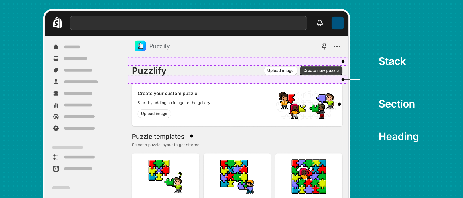
Refer to the web components for styles that we use across the Shopify admin, such as colors, typography, spacing, shadows, borders, and more.
Color
Your app exists within the Shopify admin, so you should consider colors that adhere to the Admin. Your colors should also respect minimum contrast ratios when used with text or interactive elements.
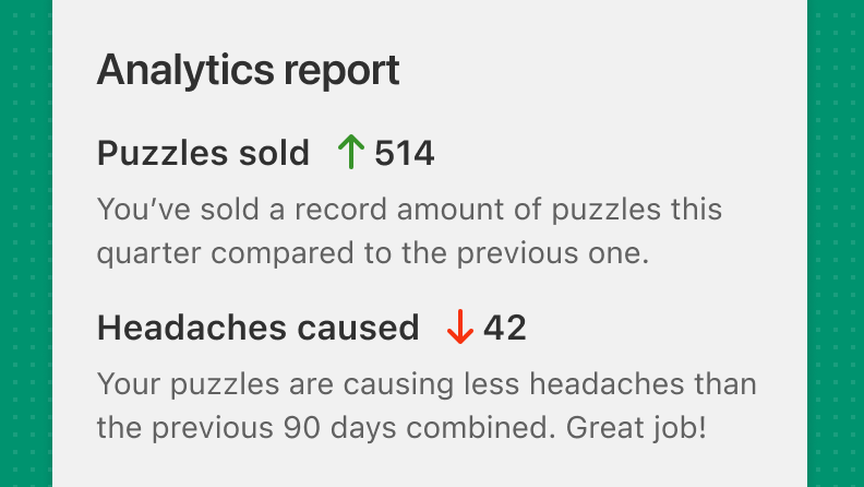
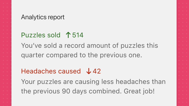
While colors are useful in design, avoid relying on color only to provide context. For alerts like error states, success states, or system warnings, include messaging or iconography that explains what's happening.
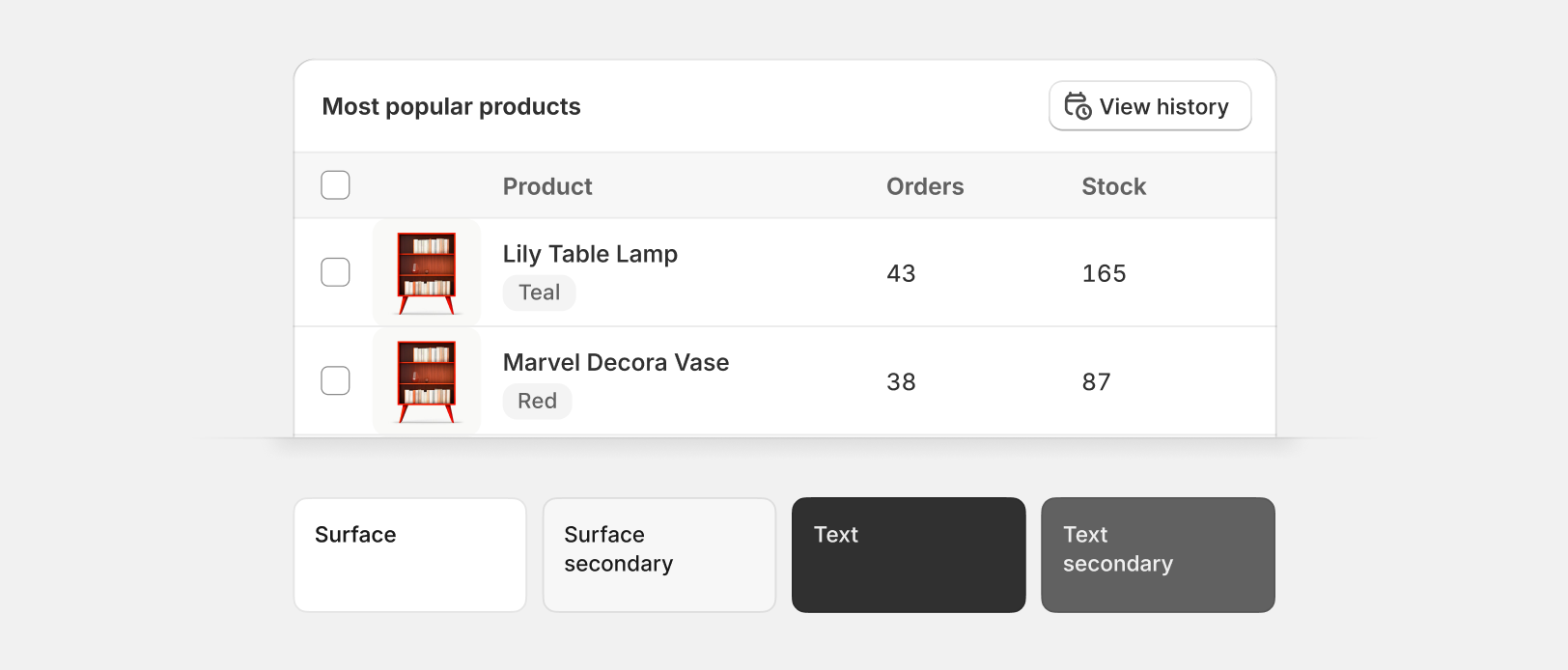
Present the majority of app text in a legible and neutral color, such as black or dark gray.
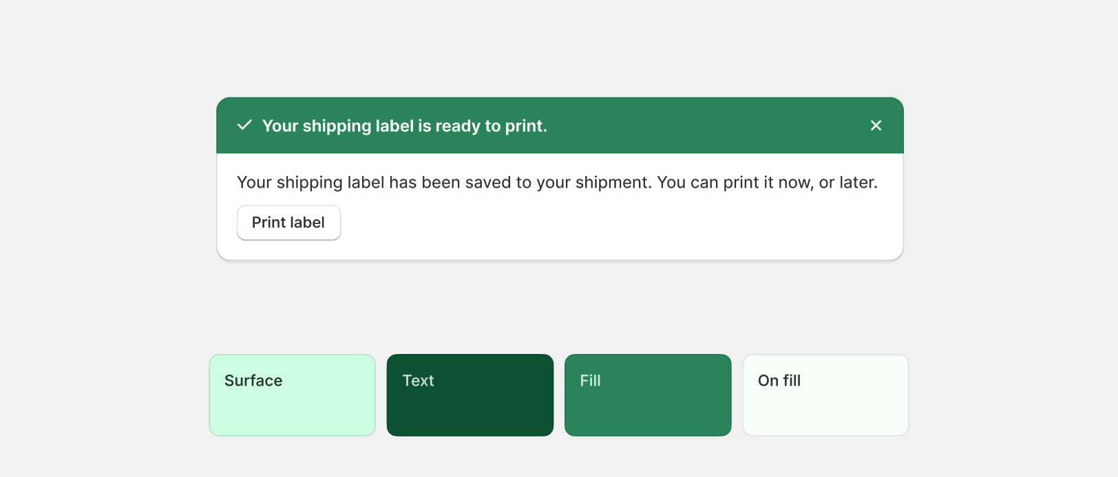
Green should be used to indicate that a status is positive or that an action has been completed successfully. Avoid using green to entice merchants or to draw unnecessary attention.
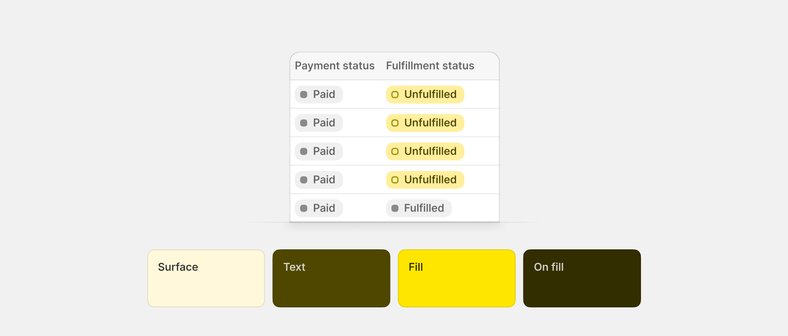
Yellow should be used to indicate that a status is on pause or incomplete, or to highlight information that requires merchant attention but isn't urgent. Avoid using yellow for announcements.
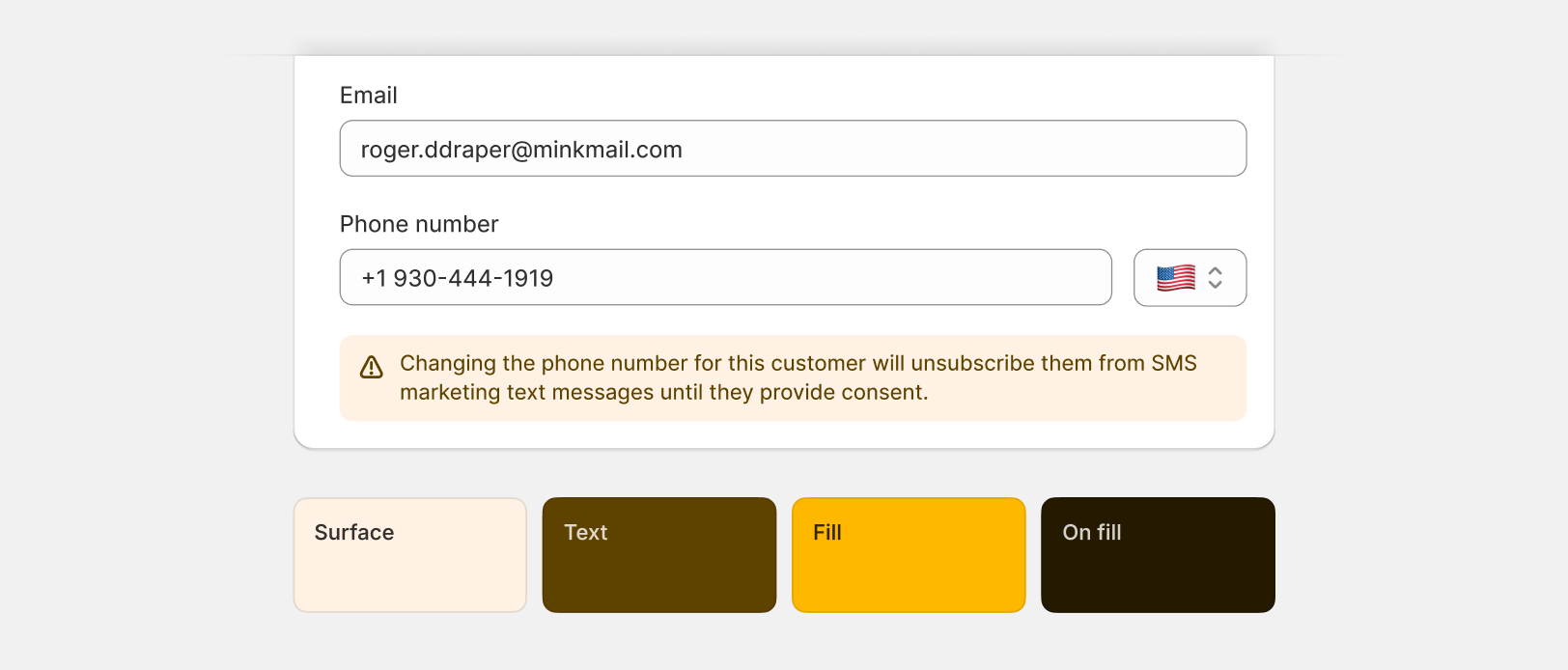
Orange should be used to indicate that a status is in-progress, pending, or to tell merchants that something needs their attention. Orange is the strongest, non-blocking color role in the Shopify admin. Avoid using orange for "under construction" or "coming soon" messaging.
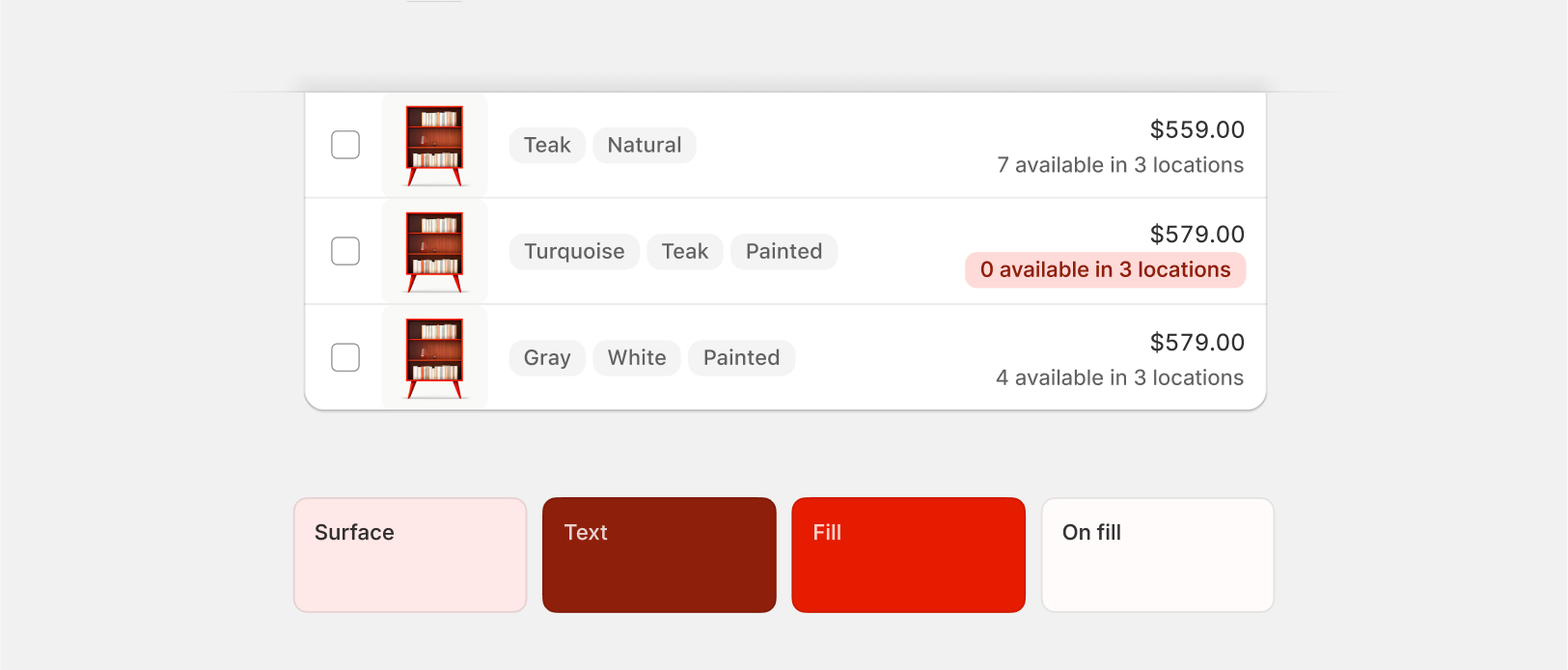
Red should only be used to convey messaging that implies an action is impossible, blocked, or has resulted in an error. Avoid using red to entice merchants or to draw unnecessary attention.
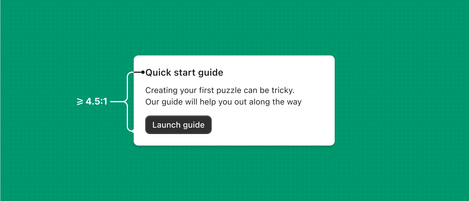
Background-to-text contrast ratio should be at least 4.5:1 to be WCAG AA compliant. Test your ratios using a tool such as WebAIM Contrast Checker.
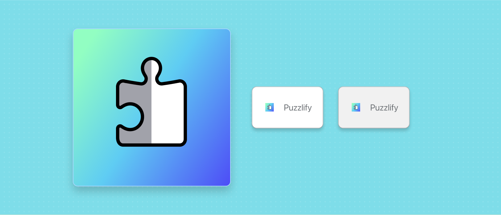
App icon
Your app icon acts as the main visual identifier for merchants.
The app icon displays in many touch points, like in the Shopify App Store, on the Apps page in the Shopify admin. Shopify renders your app icon as an SVG into the admin left hand navigation.
To change your app icon, go to the app's Settings page in the Dev Dashboard.
To change your app icon, go to the app's Settings page in the Dev Dashboard.
App icons will be used on white and light gray backgrounds, so avoid using similar colors that might make your icon illegible.
Specifications
Adhere to the following app icon specifications:
- PNG or JPG
- Square
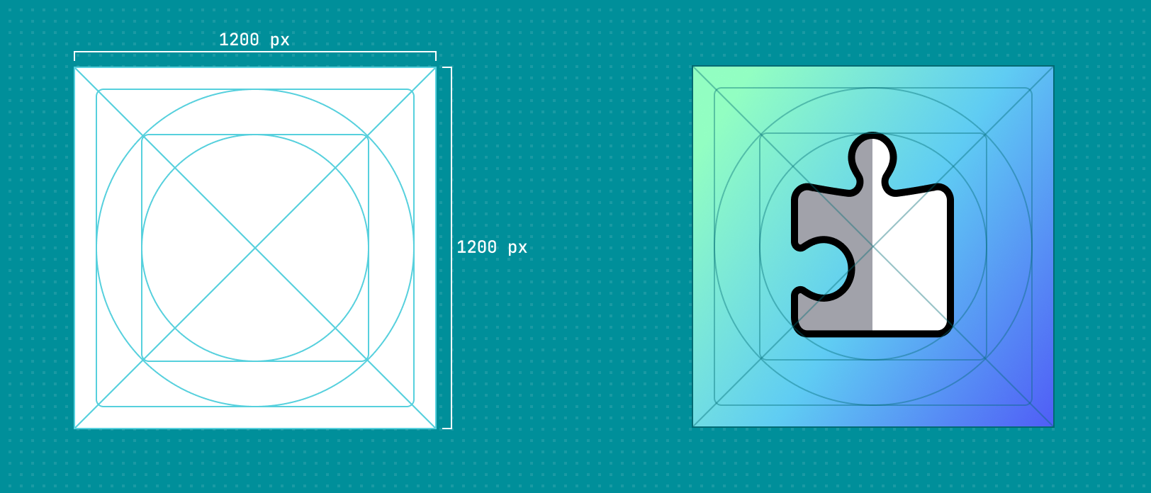
1200px x 1200px - No rounded corners
- Additional Shopify App Store icon guidelines
Preparing your app icon
Design your app icon at 1200px x 1200px. This ensures that your icon meets the size requirements.
We recommend using the app icon templates to easily adhere to app icon guidelines.
We recommend using the app icon templates to easily adhere to app icon guidelines.
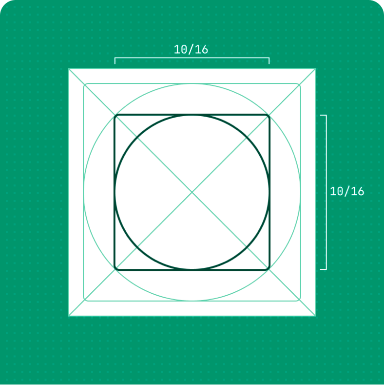
Design your icon to fill 10/16ths (750px for a 1200px icon) of a vertical or horizontal space.
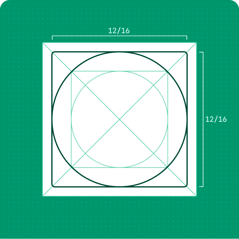
Design your icon to at most fill 12/16ths (900px for a 1200px icon) of a vertical or horizontal space.
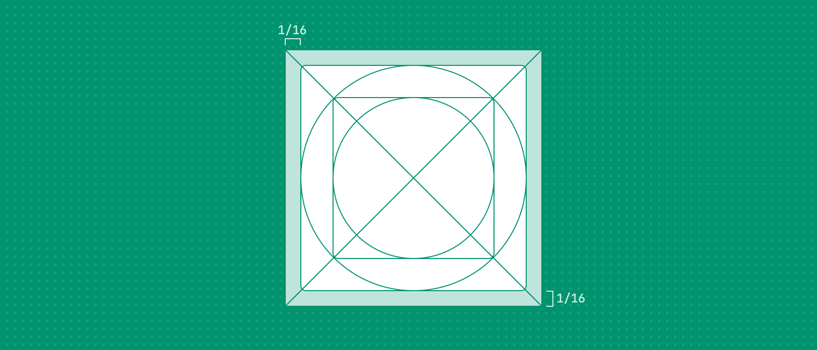
Leave a 1/16th (75px for a 1200px icon) margin around your icon that's free of any visual elements.
Avoid using excessive amounts of text in your icon. This makes it hard to identify and read at smaller sizes.
Don't mislead merchants by using an app icon that you don't own. This includes any part of the Shopify logo.
Typography
Typography is the arrangement of letters in a way that makes reading text easy and comfortable for merchants.
The Polaris Text component provides a great way to streamline typography.
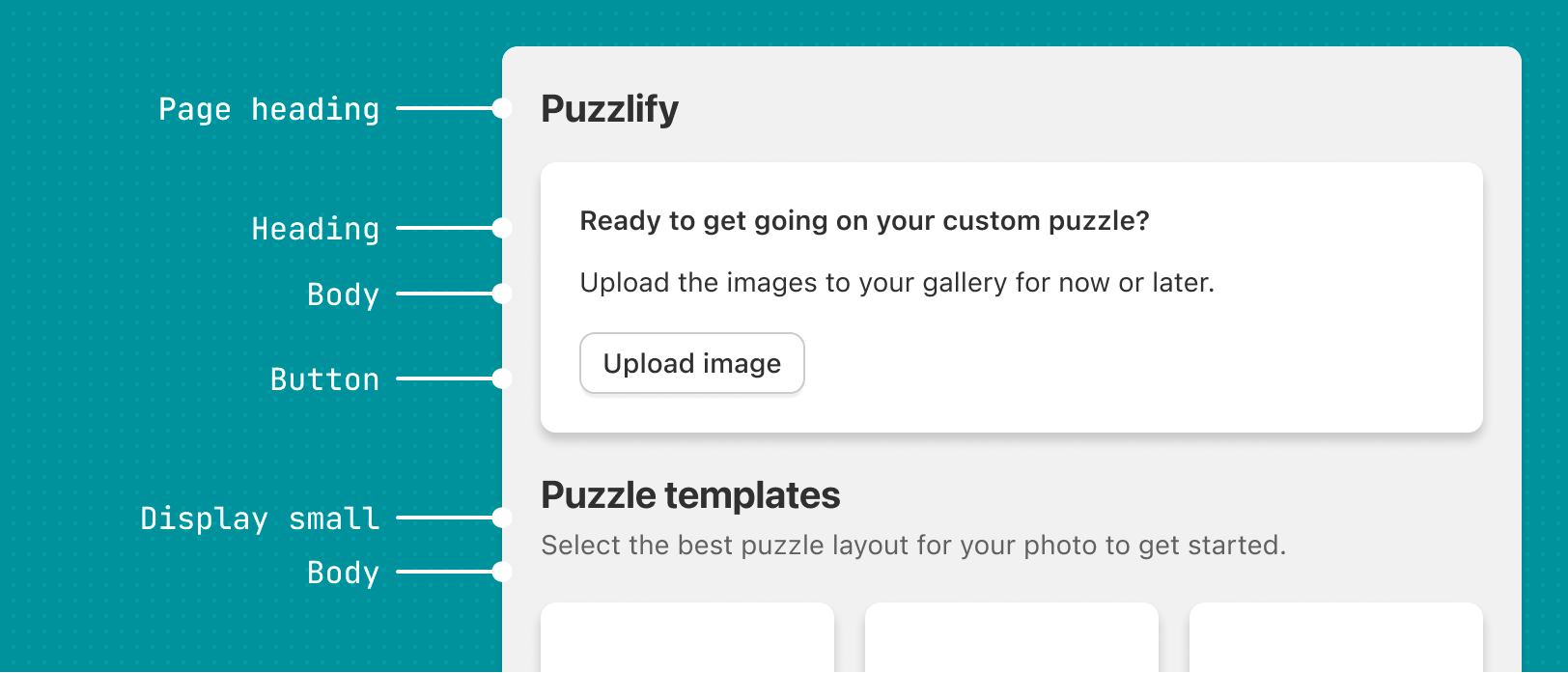
Type hierarchy
Proper use of typography can improve the app experience. By creating a healthy visual hierarchy between headlines and copy, you'll improve legibility and consistency with the Shopify admin.
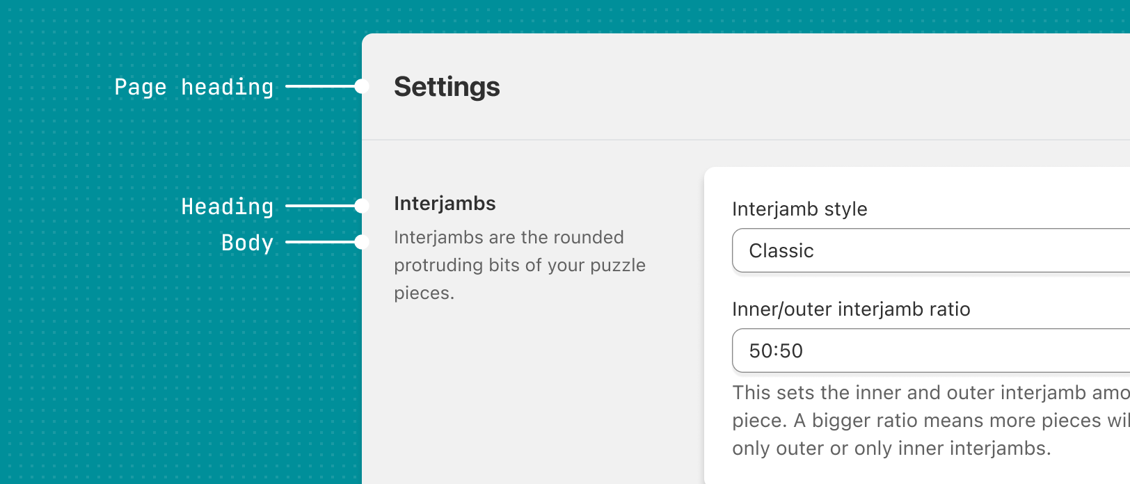
Typography should create a clear hierarchy between headings and text that's easily legible by merchants. Whenever possible, the title of the current page should be the largest heading size.
Make headings visually distinct from the rest of the text, by being bolder, larger in size, or both. Avoid using underlines that might be mistaken for links.
Avoid using only color to distinguish a heading to convey hierarchy, as some merchants may not be able to perceive color.
Font sizes
Our font size specifications apply to the minimum sizes required for legibility in the Shopify admin.
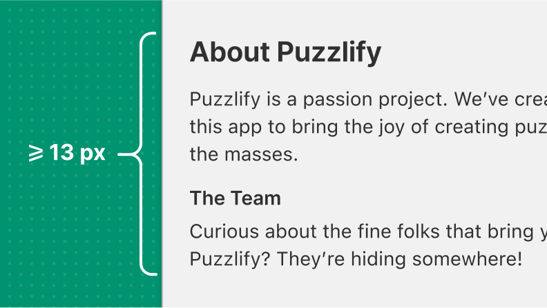
Use 13px as the minimum size for headings, body text, and text in interactive elements.
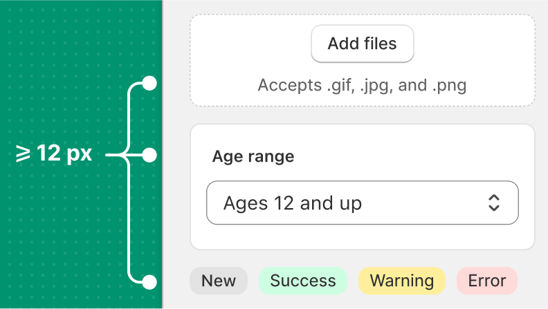
12px is the minimum size for smaller copy, like captions and subheadings.
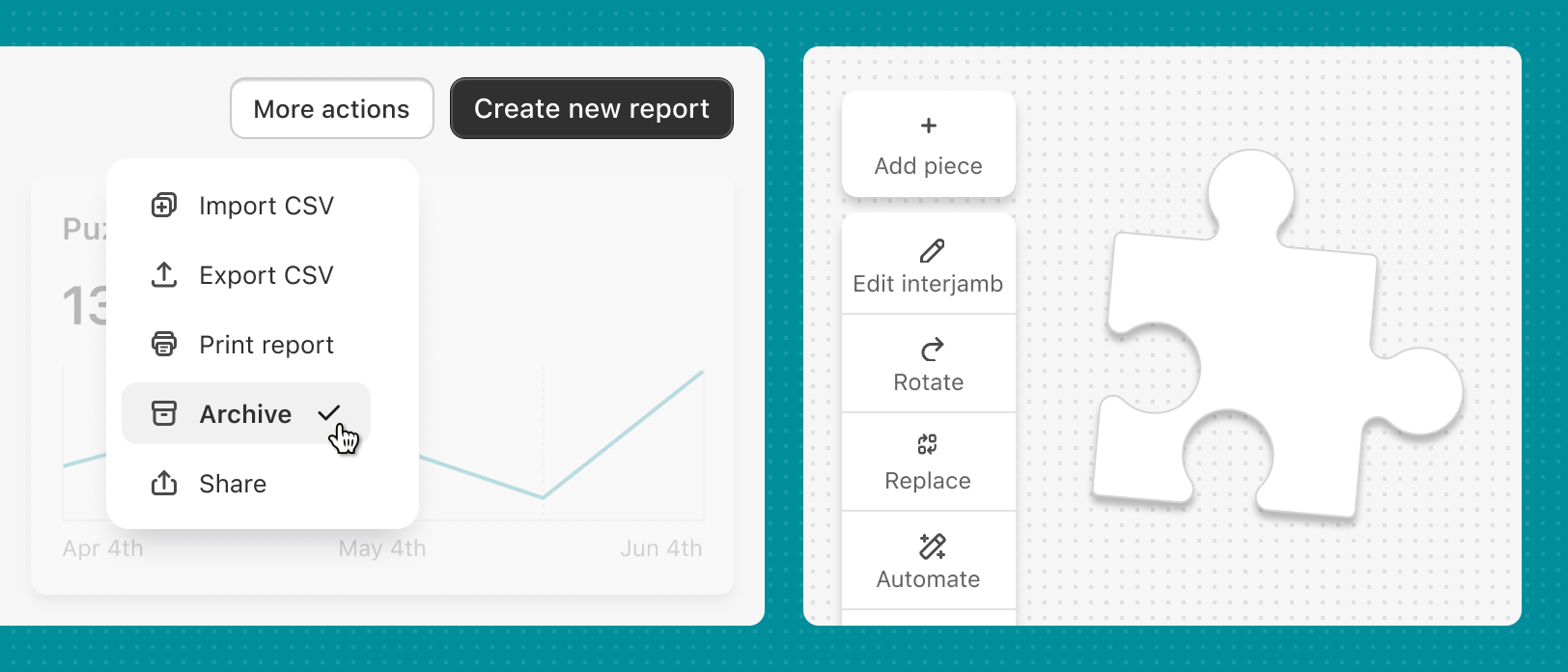
Icons
Icons act as visual aids to help merchants complete tasks. They're often paired with text to make your app easier to use and to disambiguate certain interactions. You can save time by using the Polaris Icon component, or create your own by following the Polaris icon guidelines.
Icons can help merchants better understand the outcome of an action, or help them understand more technical terms that they might not be familiar with.
Avoid using icons inconsistently in lists and other repeating elements. This makes your app look broken.
Illustrations
Illustrations give your app personality and help merchants understand complex concepts through meaningful visual metaphors.
Following the Polaris illustrations guidelines is a great way to make your app's illustrations fit nicely with the Shopify admin.
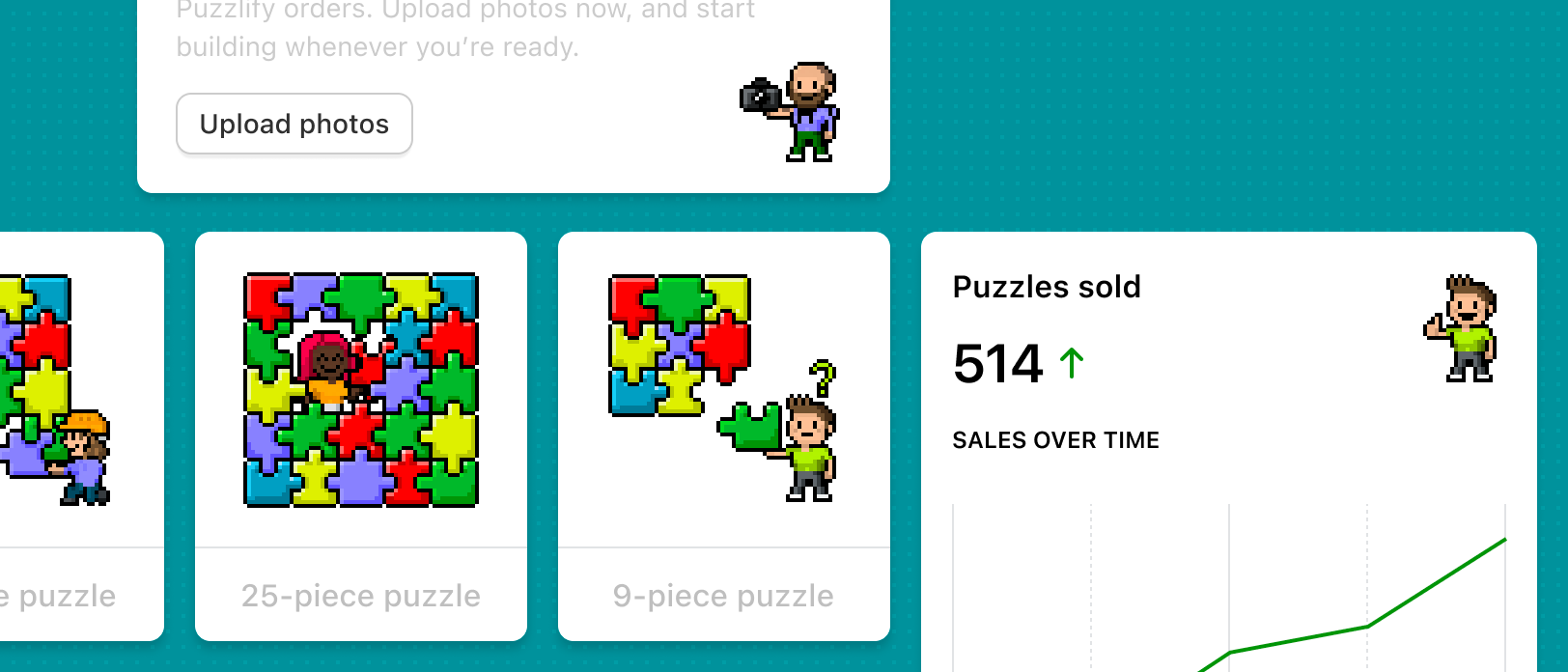
Keeping a consistent illustration style in your app can strengthen your brand presence and make your app easily recognizable.
Avoid using low resolution photos or images, as they can convey a lack of care and poor quality experience.