Section
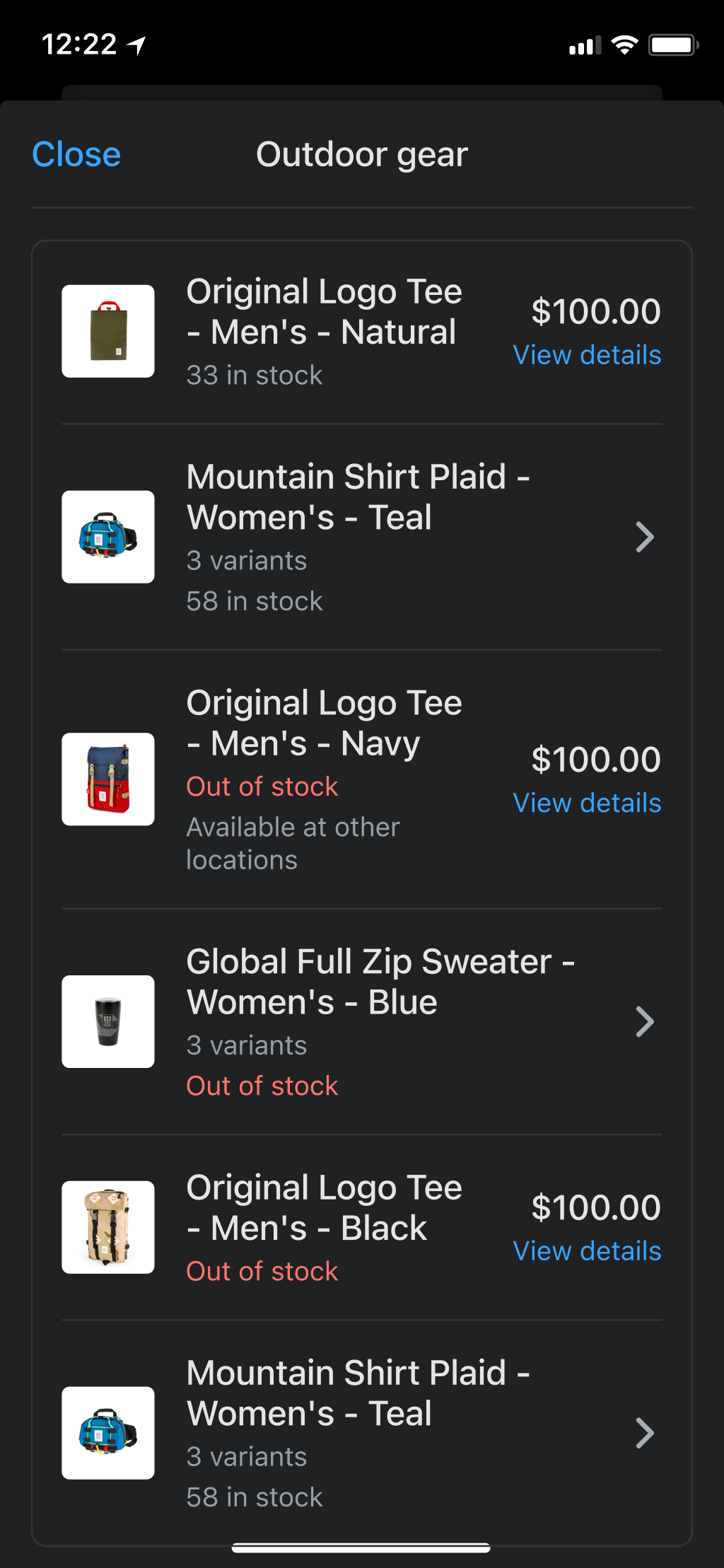
A component used to group other components together in a card-like UI. Usually, sections will be used inside a ScrollView.
| Name | Type | Description |
|---|---|---|
| title | string? |
The name of the section that will be displayed on top of the card. |
| action | SectionHeaderAction? |
An action that will be displayed on top of the card. |
SectionHeaderAction
Anchor link to section titled "SectionHeaderAction"| Name | Type | Description |
|---|---|---|
| title | string |
The name of the action that will be displayed on top of the card. |
| onPress | () => void |
An action that will be triggered when the header action is pressed. |
Sections will frequently feature a header to describe what is in the list below, especially if there is more than one section in a ScrollView.
In cases where there is only one section in a ScrollView, the section header is redundant with the page header and not recommended.
Sections may also feature an SectionHeaderAction which is displayed in the top right of the card. This action should be used for actions that affect the whole section such as ‘edit’ or ‘manage.’ Tapping the action opens a modal view.
Content guidelines
Anchor link to section titled "Content guidelines"- Keep section headers concise. Ideally, they should be 1-2 words.
- Section headers should describe what’s in the list, not provide instructions.
- ✅ Receipt options
- ❌ Provide receipt
- ❌ Select receipt option
- Content shouldn’t change dynamically (for example, section headers shouldn’t show count). This is to keep content scannable and create reliable expectations throughout the app.
- ✅ Addresses
- ❌ 3 addresses