---
title: List
description: The list is a scrollable component in which the list rows are rendered.
api_version: 2024-04
api_name: pos-ui-extensions
source_url:
html: 'https://shopify.dev/docs/api/pos-ui-extensions/2024-04/components/list'
md: 'https://shopify.dev/docs/api/pos-ui-extensions/2024-04/components/list.md'
---
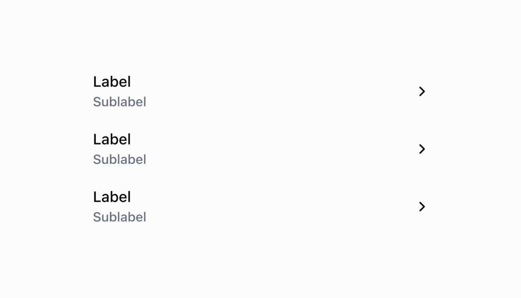
# Listcomponent
The list is a scrollable component in which the list rows are rendered.
## List
* data
ListRow\[]
required
The array of `ListRow` which will be converted into rows for this list.
* title
string
A large display title at the top of the `List`.
* listHeaderComponent
RemoteFragment
A header component for the list.
* isLoadingMore
boolean
Whether or not more data is being loaded. Set this to `true` when paginating and fetching more data for the list.
* imageDisplayStrategy
"automatic" | "always" | "never"
Default: \`automatic\`
The logic behind displaying an image or placeholder. `automatic` will display an image or placeholder if it detects that a `ListItem` in `data` has an `imageUri` value. `never` will never display images or placeholders. `always` will always display images or placeholders if `imageUri` is undefined or empty.
* onEndReached
() => void
Callback for when the user reaches the end of the `List`. This can be used to fire a request to load more data.
### ListRow
* id
The unique identifier for this list item.
```ts
string
```
* leftSide
The user interface of the left side of the row.
```ts
ListRowLeftSide
```
* rightSide
The user interface of the right side of the row.
```ts
ListRowRightSide
```
* onPress
Callback for when the user taps the row.
```ts
() => void
```
```ts
export interface ListRow {
/**
* The unique identifier for this list item.
*/
id: string;
/**
* The user interface of the left side of the row.
*/
leftSide: ListRowLeftSide;
/**
* The user interface of the right side of the row.
*/
rightSide?: ListRowRightSide;
/**
* Callback for when the user taps the row.
*/
onPress?: () => void;
}
```
### ListRowLeftSide
* label
The main label that will be displayed on the left side of the row.
```ts
string
```
* subtitle
The subtitles to display beneath the main label. Up to 3 subtitles can be displayed. Subtitles can optionally be configured with colors by passing an object with a \`content\` and \`color\` properties.
```ts
[ListRowSubtitle, ListRowSubtitle?, ListRowSubtitle?]
```
* badge
```ts
BadgeProps
```
* badges
Colored badges that are displayed underneath the \`title\` and \`subtitles\`.
```ts
BadgeProps[]
```
* image
```ts
{ source?: string; badge?: number; }
```
```ts
export interface ListRowLeftSide {
/**
* The main label that will be displayed on the left side of the row.
*/
label: string;
/**
* The subtitles to display beneath the main label. Up to 3 subtitles can be displayed.
* Subtitles can optionally be configured with colors by passing an object with a `content` and `color` properties.
*/
subtitle?: [ListRowSubtitle, ListRowSubtitle?, ListRowSubtitle?];
/**
* @deprecated
* badge will be removed in version 2.0.0 in favor of badges.
* Please migrate to using badges as soon as possible.
*/
badge?: BadgeProps;
/**
* Colored badges that are displayed underneath the `title` and `subtitles`.
*/
badges?: BadgeProps[];
image?: {
/**
* A link to an image to be displayed on the far left side of the row.
*/
source?: string;
/**
* A number that is displayed on the top right of the image.
*/
badge?: number;
};
}
```
### ListRowSubtitle
```ts
string | SubtitleType
```
### SubtitleType
* content
The subtitles to display beneath the main label.
```ts
string
```
* color
Property used to modify the subtitle appearance.
```ts
ColorType
```
```ts
export interface SubtitleType {
/**
* The subtitles to display beneath the main label.
*/
content: string;
/**
* Property used to modify the subtitle appearance.
*/
color?: ColorType;
}
```
### ColorType
```ts
'TextNeutral' | 'TextSubdued' | 'TextDisabled' | 'TextWarning' | 'TextCritical' | 'TextSuccess' | 'TextInteractive' | 'TextHighlight'
```
### BadgeProps
* text
The text displayed inside the badge.
```ts
string
```
* variant
The appearance and function of the badge.
```ts
BadgeVariant
```
* status
A circle icon displaying the status of the badge.
```ts
BadgeStatus
```
```ts
export interface BadgeProps {
/**
* The text displayed inside the badge.
*/
text: string;
/**
* The appearance and function of the badge.
*/
variant: BadgeVariant;
/**
* A circle icon displaying the status of the badge.
*/
status?: BadgeStatus;
}
```
### BadgeVariant
```ts
'neutral' | 'critical' | 'warning' | 'success' | 'highlight'
```
### BadgeStatus
```ts
'empty' | 'partial' | 'complete'
```
### ListRowRightSide
* label
The main label that will be displayed on the right side of the row.
```ts
string
```
* showChevron
Show a chevron. Set this to true if pressing on the row navigates to another screen.
```ts
boolean
```
* toggleSwitch
A toggle switch that is be displayed on the right side of the row.
```ts
ToggleSwitch
```
```ts
export interface ListRowRightSide {
/**
* The main label that will be displayed on the right side of the row.
*/
label?: string;
/**
* Show a chevron. Set this to true if pressing on the row navigates to another screen.
* @defaultValue `false`
*/
showChevron?: boolean;
/**
* A toggle switch that is be displayed on the right side of the row.
*/
toggleSwitch?: ToggleSwitch;
}
```
### ToggleSwitch
* value
Whether or not the toggle switch is on or off.
```ts
boolean
```
* disabled
Whether or not the toggle switch is disabled.
```ts
boolean
```
```ts
export interface ToggleSwitch {
/**
* Whether or not the toggle switch is on or off.
*/
value?: boolean;
/**
* Whether or not the toggle switch is disabled.
*/
disabled?: boolean;
}
```
### Examples
* #### Product List
##### React
```tsx
import React, {useState} from 'react';
import {
Navigator,
Screen,
ScrollView,
List,
Text,
Section,
ListRowSubtitle,
reactExtension,
} from '@shopify/ui-extensions-react/point-of-sale';
const SmartGridModal = () => {
const [seeDetails, setSeeDetails] = useState(false);
const listData = [
{
id: 'graphicTees',
leftSide: {
label: 'Graphic Tees',
subtitle: [{content: 'Summer Collection'}, {content: 'Unisex'}] as [
ListRowSubtitle,
ListRowSubtitle?,
],
},
rightSide: {
label: 'Product details',
showChevron: true,
},
onPress: () => setSeeDetails(!seeDetails),
},
{
id: 'denimShorts',
leftSide: {
label: 'Denim Shorts',
subtitle: [{content: 'Summer Collection'}, {content: 'Denim'}] as [
ListRowSubtitle,
ListRowSubtitle?,
],
},
},
];
return (
{seeDetails && (
Our shirts are made with 100% organic cotton!
)}
);
};
export default reactExtension('pos.home.modal.render', () => (
));
```
##### TS
```ts
import {
Navigator,
Screen,
ScrollView,
List,
Text,
Section,
ListRowSubtitle,
extension,
} from '@shopify/ui-extensions/point-of-sale';
export default extension('pos.home.modal.render', (root, api) => {
let showDetails = false;
const scrollView = root.createComponent(ScrollView);
const section = root.createComponent(Section, {
title: 'Our T-shirts',
});
const triggerShowDetails = () => {
showDetails = !showDetails;
if (showDetails) {
scrollView.append(section);
} else {
scrollView.removeChild(section);
}
};
const listData = [
{
id: 'graphicTees',
leftSide: {
label: 'Graphic Tees',
subtitle: [{content: 'Summer Collection'}, {content: 'Unisex'}] as [
ListRowSubtitle,
ListRowSubtitle?,
],
},
rightSide: {
label: 'Product details',
showChevron: true,
},
onPress: () => triggerShowDetails(),
},
{
id: 'denimShorts',
leftSide: {
label: 'Denim Shorts',
subtitle: [{content: 'Summer Collection'}, {content: 'Denim'}] as [
ListRowSubtitle,
ListRowSubtitle?,
],
},
},
];
const list = root.createComponent(List, {
title: 'Products',
data: listData,
});
const textBlock = root.createComponent(
Text,
null,
'Our shirts are made with 100% organic cotton!',
);
section.append(textBlock);
scrollView.append(list);
if (showDetails) {
scrollView.append(section);
}
const screen = root.createComponent(Screen, {
name: 'TextArea',
title: 'Text Area Example',
});
screen.append(scrollView);
const navigator = root.createComponent(Navigator);
navigator.append(screen);
root.append(navigator);
});
```
## Preview
## Guidelines
List items have a wide variety of use cases:
* To display and link to an object | Examples: an item in the cart, a customer in the customer list
* To display information | Examples: the payment breakdown in an order, staff contact information
* To display a menu item | Examples: an item on the first page of settings, an item in “More actions”
* To display a setting
* To display an action related to other items in the section
* To show a selectable option | Example: one filter option
* To display an external link
## Content Guidelines
Subtitles:
* Each subtitle should have a different piece of information. Don't use dashes to display more than one type of information on the same line.
* Subtitles should be shown in order of relevance.
* If you're showing the results of the form, the label should be the form field title and the subtitle should be the information the merchant entered.
## Related
[See how to use the ProductSearch API with a SearchBar to search for products. - ProductSearch API](https://shopify.dev/api/pos-ui-extensions/apis/productsearch-api#example-search-for-products-with-a-search-bar)