---
title: TextField
description: >-
Use a text field to allow merchants to enter or edit text. If you want to
specify the kind of input, then use a formatted text field.
api_version: 2024-04
api_name: pos-ui-extensions
source_url:
html: 'https://shopify.dev/docs/api/pos-ui-extensions/2024-04/components/textfield'
md: >-
https://shopify.dev/docs/api/pos-ui-extensions/2024-04/components/textfield.md
---
# TextFieldcomponent
Use a text field to allow merchants to enter or edit text. If you want to specify the kind of input, then use a formatted text field.
## TextField
Use a text field to allow merchants to input or modify multiline text.
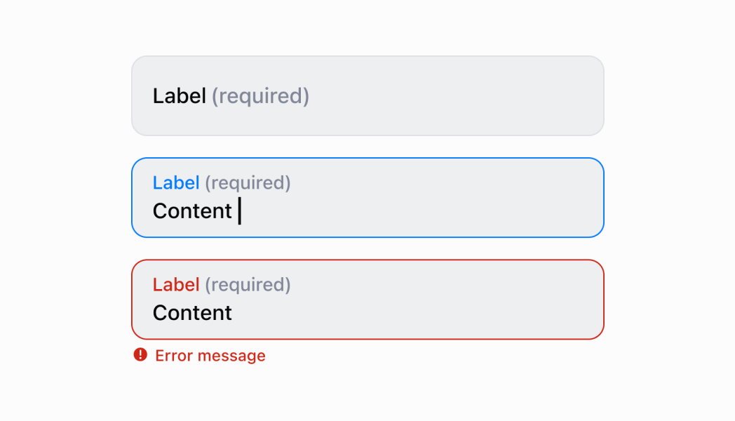
* label
string
required
The content to use as the field label.
* disabled
boolean
Whether the field can be modified.
* error
string
Indicates an error to the user. The field is given specific stylistic treatment to communicate problems that have to be resolved immediately.
* onBlur
() => void
The callback when focus is removed.
* onChange
(value: string) => void
The callback when the user has finished editing a field.
* onFocus
() => void
The callback when input is focused.
* onInput
(value: string) => void
Callback when the user makes any changes in the field. As noted in the documentation for `onChange`, you **must not** use this to update `value` — use the `onChange` callback for that purpose. Use the `onInput` prop when you need to do something as soon as the user makes a change, like clearing validation errors that apply to the field as soon as the user begins making the necessary adjustments.
* placeholder
string
A short hint that describes the expected value of the field.
* required
boolean
Whether the field needs a value.
* value
string
The current value for the field. Defaults to now. You should update this value in response to the `onChange` callback.
* helpText
string
The label under the text field which provides guidance or instructions that assist users.
* action
InputAction
A button under the text field to provide extra functionality.
* maxLength
number
The maximum number of characters allowed in the input field.
### InputAction
* label
The text displayed in the button.
```ts
string
```
* onPress
A callback to be performed.
```ts
() => void
```
* disabled
Whether the button can be pressed.
```ts
boolean
```
```ts
export interface InputAction {
/**
* The text displayed in the button.
*/
label: string;
/**
* A callback to be performed.
*/
onPress: () => void;
/**
* Whether the button can be pressed.
*/
disabled?: boolean;
}
```
### Examples
* #### Name Input
##### React
```tsx
import React, {useState} from 'react';
import {
TextField,
Screen,
ScrollView,
Navigator,
reactExtension,
Text,
} from '@shopify/ui-extensions-react/point-of-sale';
const SmartGridModal = () => {
const [name, setName] = useState('');
return (
{name ? `Hello ${name}!` : ''}
);
};
export default reactExtension('pos.home.modal.render', () => (
));
```
##### TS
```ts
import {
Navigator,
Screen,
ScrollView,
Text,
TextField,
extension,
} from '@shopify/ui-extensions/point-of-sale';
export default extension('pos.home.modal.render', (root, api) => {
const textField = root.createComponent(TextField, {
label: 'Name',
placeholder: 'Input your name here',
required: true,
value: '',
});
const textBox = root.createComponent(Text);
const onChangeHandler = (newValue: string) => {
textField.updateProps({value: newValue});
const greeting = newValue ? `Hello ${newValue}!` : '';
textBox.replaceChildren(greeting);
};
textField.updateProps({onChange: onChangeHandler});
const scrollView = root.createComponent(ScrollView);
scrollView.append(textField);
scrollView.append(textBox);
const screen = root.createComponent(Screen, {
name: 'TextField',
title: 'Text Field Example',
});
screen.append(scrollView);
const navigator = root.createComponent(Navigator);
navigator.append(screen);
root.append(navigator);
});
```
## Preview
## Guidelines
* When a merchant opens a new form, the first text field should be in a focused state.
* If the merchant is actively focused in a text field, then the keyboard should come up and the label should move to the top of the field.
* If focus goes away from the text field, then the keyboard should hide.
* Text fields always take up the full screen width.
* Text fields don’t change height. If text entered is longer than the width of the text field, then the oldest text on the left should be hidden to make room.
* When it makes sense, provide autocomplete options (for example, entering an address).
## Content Guidelines
* If a text field is required, then it should indicate `Required`.
* Label titles should be brief and written in sentence case.
* Use the same terms for similar label titles throughout the app.