---
title: Switch
description: >-
Use a switch to represent an on or off state that takes effect immediately
when tapped.
api_version: 2025-07
api_name: checkout-ui-extensions
source_url:
html: >-
https://shopify.dev/docs/api/checkout-ui-extensions/2025-07/components/forms/switch
md: >-
https://shopify.dev/docs/api/checkout-ui-extensions/2025-07/components/forms/switch.md
---
# Switch
Use a switch to represent an on or off state that takes effect immediately when tapped.
## SwitchProps
* accessibilityLabel
string
A label used for buyers using assistive technologies.
* checked
boolean
Whether the switch is active.
* disabled
boolean
Whether the switch can be changed.
* id
string
A unique identifier for the component.
* label
string
Visual content to use as the switch label.
* name
string
An identifier for the field that is unique within the nearest containing `Form` component.
* onChange
(value: boolean) => void
A callback that is run whenever the switch is changed. This callback is called with a boolean indicating whether the switch should now be active or inactive. This component is [controlled](https://reactjs.org/docs/forms.html#controlled-components), so you must store this value in state and reflect it back in the `checked` or `value` props.
* toggles
string
The component's identifier whose visibility will be toggled when this component is actioned.
* value
boolean
Whether the switch is selected. This prop is an alias for `checked`, and can be useful in form libraries that provide a normalized API for dealing with both `boolean` and `string` values. If both `value` and `checked` are set, `checked` takes precedence.
### Examples
* #### Basic Switch
##### React
```tsx
import {
reactExtension,
Switch,
} from '@shopify/ui-extensions-react/checkout';
export default reactExtension(
'purchase.checkout.block.render',
() => ,
);
function Extension() {
return (
);
}
```
##### JS
```js
import {extension, Switch} from '@shopify/ui-extensions/checkout';
export default extension('purchase.checkout.block.render', (root) => {
const baseSwitch = root.createComponent(Switch, {
accessibilityLabel: 'my-switch',
});
root.appendChild(baseSwitch);
});
```
## Preview

## Best Practices
* The outcome of a switch should take effect immediately when tapped.
* Use for independent settings, like turning on a stand-alone feature.
* Most of the time no call-to-action should be needed as the switch should take effect immediately, but if the experience needs one, use “done” instead of “submit” or “apply”.
### Content
The label should be a noun. Try explaining the setting out loud to test the name. The name should make sense when you insert it into these statements:
* You can turn \[setting\_label] on or off in settings.
* \[setting\_label] is on.
* \[setting\_label] is off.
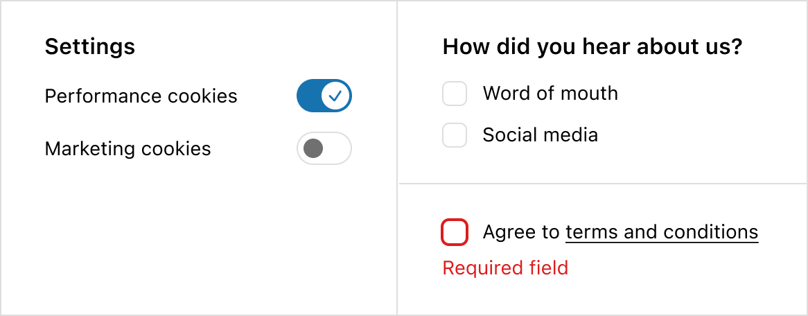
### Switch vs checkbox
* If the experience requires multiple connected inputs, like a survey, use a checkbox instead of a switch.
* If the experience requires an error state, like agreeing to terms and conditions, use a checkbox instead of a switch. Both on and off options for a switch should always be valid.
* If you’re unsure, default to a checkbox as it’s the more familiar web pattern.
## Examples
### Examples
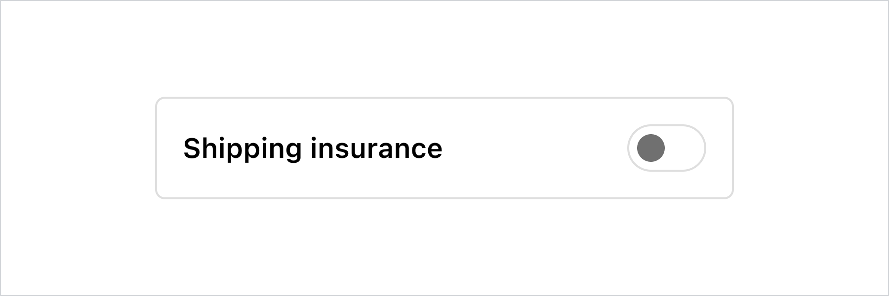
* #### Custom label
##### Description
This example demonstrates pairing the switch with a custom label and layout while keeping it accessible to screen readers.
##### React
```jsx
import {
reactExtension,
InlineLayout,
Switch,
Text,
} from '@shopify/ui-extensions-react/checkout';
export default reactExtension(
'purchase.checkout.footer.render-after',
() => ,
);
function Extension() {
const switchLabel = 'Shipping insurance';
return (
{switchLabel}
);
}
```
##### JavaScript
```js
import {
extension,
InlineLayout,
Switch,
Text,
} from '@shopify/ui-extensions/checkout';
export default extension(
'purchase.checkout.block.render',
(root) => {
const switchLabel = 'Shipping insurance';
const inlineLayout = root.createComponent(
InlineLayout,
{
padding: 'base',
borderRadius: 'base',
border: 'base',
columns: ['fill', 'auto'],
},
[
root.createComponent(
Text,
null,
switchLabel,
),
root.createComponent(Switch, {
accessibilityLabel: switchLabel,
}),
],
);
root.appendChild(inlineLayout);
},
);
```
## Preview
## Related
[Component - Checkbox](checkbox)