Customer
A modal to complete an order action flow. This component can only be used to populate the customer-account.order.action.render extension target, which renders as a result of the customer clicking the order action button rendered via the customer-account.order.action.menu-item.render extension target.
Anchor to customeraccountactionpropsCustomerAccountActionProps
- Anchor to titletitlestringrequired
Sets the title of the Action container.
- Anchor to primaryActionprimaryActionRemoteFragment
Sets the Primary action button of the container. This component must be a button component.
- Anchor to secondaryActionsecondaryActionRemoteFragment
Sets the Secondary action button of the container. This component must be a button component.
CustomerAccountActionProps
- primaryAction
Sets the Primary action button of the container. This component must be a button component.
RemoteFragment - secondaryAction
Sets the Secondary action button of the container. This component must be a button component.
RemoteFragment - title
Sets the title of the Action container.
string
export interface CustomerAccountActionProps {
  /**
   * Sets the title of the Action container.
   */
  title: string;
  /**
   * Sets the Primary action button of the container. This component must be a button component.
   */
  primaryAction?: RemoteFragment;
  /**
   * Sets the Secondary action button of the container. This component must be a button component.
   */
  secondaryAction?: RemoteFragment;
}Supported props for Buttons used inside CustomerAccountAction prop.children only support text.
- string
A label used for buyers using assistive technologies. When set, any
childrensupplied to this component will not be announced to screen reader users.- ButtonAccessibilityRoleDefault: 'button'
The role of the button that will be rendered.
button: renders a regular button.submit: renders a button that submits a form.- booleanDefault: false
Disables the button, disallowing any interaction.
- booleanDefault: false
Replaces content with a loading indicator.
- string
Accessible label for the loading indicator when user prefers reduced motion. This value is only used if
loadingis true.- () => void
Callback that is run when the button is pressed.
Docs_CustomerAccountAction_Button_PrimaryAction
- accessibilityLabel
A label used for buyers using assistive technologies. When set, any `children` supplied to this component will not be announced to screen reader users.
string - accessibilityRole
The role of the button that will be rendered. `button`: renders a regular button. `submit`: renders a button that submits a form.
ButtonAccessibilityRole - disabled
Disables the button, disallowing any interaction.
boolean - loading
Replaces content with a loading indicator.
boolean - loadingLabel
Accessible label for the loading indicator when user prefers reduced motion. This value is only used if `loading` is true.
string - onPress
Callback that is run when the button is pressed.
() => void
export interface Docs_CustomerAccountAction_Button_PrimaryAction
  extends Pick<
    ButtonProps,
    | 'onPress'
    | 'loading'
    | 'loadingLabel'
    | 'disabled'
    | 'accessibilityLabel'
    | 'accessibilityRole'
  > {}
ButtonAccessibilityRole
'button' | 'submit'Supported props for Button used inside CustomerAccountAction prop.children only support text.
- string
A label used for buyers using assistive technologies. When set, any
childrensupplied to this component will not be announced to screen reader users.- booleanDefault: false
Disables the button, disallowing any interaction.
- booleanDefault: false
Replaces content with a loading indicator.
- string
Accessible label for the loading indicator when user prefers reduced motion. This value is only used if
loadingis true.- () => void
Callback that is run when the button is pressed.
Docs_CustomerAccountAction_Button_SecondaryAction
- accessibilityLabel
A label used for buyers using assistive technologies. When set, any `children` supplied to this component will not be announced to screen reader users.
string - disabled
Disables the button, disallowing any interaction.
boolean - loading
Replaces content with a loading indicator.
boolean - loadingLabel
Accessible label for the loading indicator when user prefers reduced motion. This value is only used if `loading` is true.
string - onPress
Callback that is run when the button is pressed.
() => void
export interface Docs_CustomerAccountAction_Button_SecondaryAction
  extends Pick<
    ButtonProps,
    'onPress' | 'loading' | 'loadingLabel' | 'disabled' | 'accessibilityLabel'
> {}Basic CustomerAccountAction
examples
Basic CustomerAccountAction
React
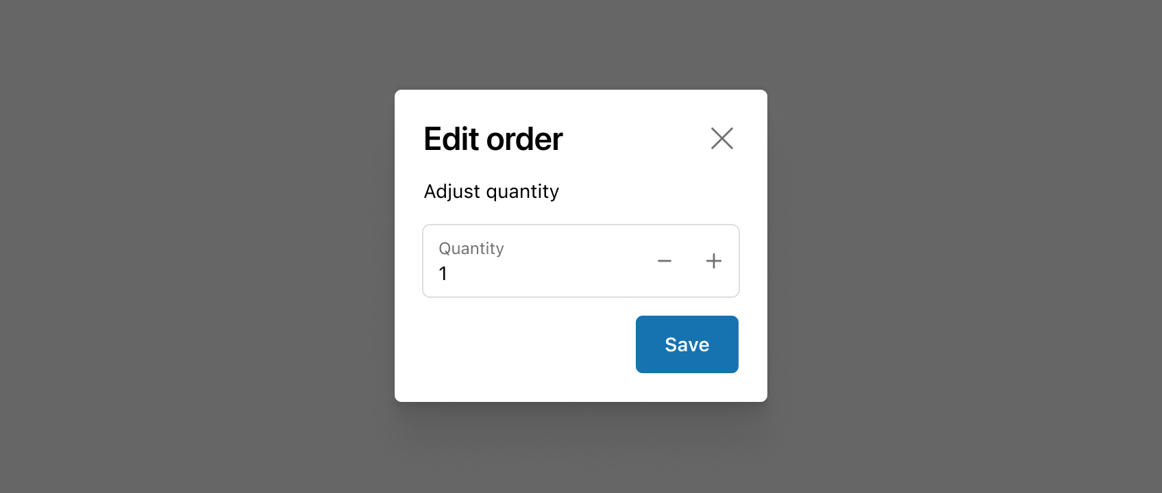
import {
  Button,
  CustomerAccountAction,
  TextBlock,
  reactExtension,
  useApi,
} from '@shopify/ui-extensions-react/customer-account';
import React from 'react';

export default reactExtension('customer-account.order.action.render', () => (
  <App />
));

function App() {
  const api = useApi<'customer-account.order.action.render'>();

  return (
    <CustomerAccountAction
      title="Extension title"
      primaryAction={
        <Button
          onPress={() => {
            api.close();
          }}
        >
          Click to close
        </Button>
      }
    >
      <TextBlock>Extension content</TextBlock>
    </CustomerAccountAction>
  );
}
JS
import {
  Button,
  CustomerAccountAction,
  extension
} from '@shopify/ui-extensions/customer-account';

export default extension(
  'customer-account.order.action.render',
  (root, api) => {
    renderApp(root, api);
  },
)

async function renderApp(root, api) {
  const primaryAction = root.createFragment();
  await primaryAction.append(root.createComponent(Button, {onPress: () => {api.close()}}, 'Click to close'));

  const customerAccountAction = root.createComponent(
    CustomerAccountAction,
    {
      title: 'Extension title',
      primaryAction,
    },
    root.createComponent('TextBlock', {}, 'Extension content')
  );
  root.append(customerAccountAction);
}
Preview
Anchor to best-practicesBest Practices
- Use CustomerAccountAction to shift focus toward information and functionality needed to confirm or complete an order action.
- If the order action experience you’re building requires complex forms or large amounts of information, consider building a full-page extension instead.
- See Polaris for more best practices and content guidelines for designing Modals.