Tilecomponent
component
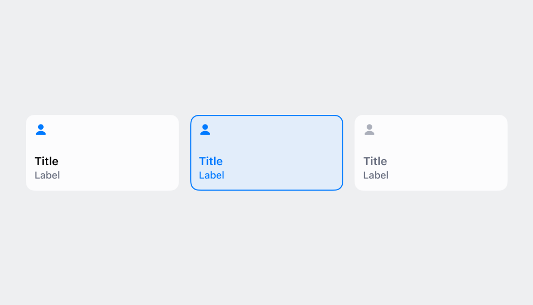
Tiles are customizable buttons that allow staff to complete actions quickly. Think of them as shortcuts--adding a 10% discount to an order, for example. Tiles provide contextual information and let merchants quickly access workflows, actions, and information from the smart grid and the top of detail pages. They’re dynamic and can change based on surrounding context, such as what’s in the cart.
Anchor to tileTile
- Anchor to titletitlestringrequired
The text set on the main label of the tile.
- Anchor to subtitlesubtitlestring
The text set on the secondary label of the tile.
- Anchor to enabledenabledboolean
Sets whether or not the tile can be tapped.
- Anchor to destructivedestructiveboolean
Sets whether or not the tile is in a red destructive appearance.
- Anchor to badgeValuebadgeValuenumber
The number value displayed in the top right corner of the tile.
- Anchor to onPressonPress() => void
The callback that is executed when the tile is tapped.
Was this section helpful?
Render a tile on smart grid
import React from 'react'
import { Tile, reactExtension, useApi } from '@shopify/ui-extensions-react/point-of-sale'

const TileComponent = () => {
  const api = useApi()
  return (
    <Tile
      title="My app"
      subtitle="Hello world!"
      onPress={() => {
        api.action.presentModal()
      }}
      enabled
    />
  )
}

export default reactExtension('pos.home.tile.render', () => {
  return <TileComponent />
})
Examples
Render a tile on smart grid
React
import React from 'react' import { Tile, reactExtension, useApi } from '@shopify/ui-extensions-react/point-of-sale' const TileComponent = () => { const api = useApi() return ( <Tile title="My app" subtitle="Hello world!" onPress={() => { api.action.presentModal() }} enabled /> ) } export default reactExtension('pos.home.tile.render', () => { return <TileComponent /> })TS
import {
  Tile,
  extension,
} from '@shopify/ui-extensions/point-of-sale';

export default extension(
  'pos.home.tile.render',
  (root, api) => {
    const tile = root.createComponent(Tile, {
      title: 'My app',
      subtitle: 'Hello world!',
      enabled: true,
      onPress: () => {
        api.action.presentModal();
      },
    });

    root.append(tile);
  },
);
Preview