Money
This is the right component for letting users enter Money digits.
Anchor to moneyfieldpropsMoneyFieldProps
- Anchor to labellabelstringrequired
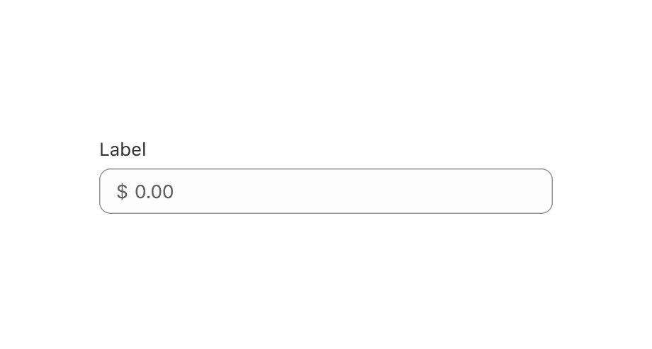
Content to use as the field label.
- Anchor to disableddisabledboolean
Whether the field can be modified.
- Anchor to errorerrorstring
Indicate an error to the user. The field will be given a specific stylistic treatment to communicate problems that have to be resolved immediately.
- string
A unique identifier for the field.
- Anchor to namenamestring
An identifier for the field that is unique within the nearest containing
Formcomponent.- Anchor to onBluronBlur() => void
Callback when focus is removed.
- Anchor to onChangeonChange(value: number | Money) => void
Callback when the user has finished editing a field. Unlike
callbacks you may be familiar with from React component libraries, this callback is not run on every change to the input. Text fields are “partially controlled” components, which means that while the user edits the field, its state is controlled by the component. Once the user has signalled that they have finished editing the field (typically, by blurring the field),is called if the input actually changed from the most recentvalueproperty. At that point, you are expected to store this “committed value” in state, and reflect it in the text field’svalueproperty.This state management model is important given how UI Extensions are rendered. UI Extension components run on a separate thread from the UI, so they can’t respond to input synchronously. A pattern popularized by controlled React components is to have the component be the source of truth for the input
value, and update thevalueon every user input. The delay in responding to events from a UI extension is only a few milliseconds, but attempting to strictly store state with this delay can cause issues if a user types quickly, or if the user is using a lower-powered device. Having the UI thread take ownership for “in progress” input, and only synchronizing when the user is finished with a field, avoids this risk.It can still sometimes be useful to be notified when the user makes any input in the field. If you need this capability, you can use the
prop. However, never use that property to create tightly controlled state for thevalue.This callback is called with the current value of the field. If the value of a field is the same as the current
valueprop provided to the field, thecallback will not be run.- Anchor to onFocusonFocus() => void
Callback when input is focused.
- Anchor to onInputonInput(value: number | Money) => void
Callback when the user makes any changes in the field. As noted in the documentation for
, you must not use this to updatevalue— use thecallback for that purpose. Use theprop when you need to do something as soon as the user makes a change, like clearing validation errors that apply to the field as soon as the user begins making the necessary adjustments.This callback is called with the current value of the field.
- Anchor to placeholderplaceholderstring
A short hint that describes the expected value of the field.
- Anchor to readOnlyreadOnlyboolean
Whether the field is read-only.
- Anchor to defaultValuedefaultValuestring | string[]
A default value to populate for uncontrolled components.
- Anchor to requiredrequiredboolean
Whether the field needs a value. This requirement adds semantic value to the field, but it will not cause an error to appear automatically. If you want to present an error when this field is empty, you can do so with the
errorprop.- Anchor to valuevalueT
The current value for the field. If omitted, the field will be empty. You should update this value in response to the
callback.- number
The highest decimal or integer to be accepted for the field. When used with
stepthe value will round down to the max number.Note: a user will still be able to use the keyboard to input a number higher than the max. It is up to the developer to add appropriate validation.
- numberDefault: 0
The lowest decimal or integer to be accepted for the field. When used with
stepthe value will round up to the min number.Note: a user will still be able to use the keyboard to input a number lower than the min. It is up to the developer to add appropriate validation.
- Anchor to stepstepnumberDefault: 1
The amount the value can increase or decrease by. This can be an integer or decimal. If a
maxorminis specified withstepwhen increasing/decreasing the value via the buttons, the final value will always round to themaxorminrather than the closest valid amount.- Anchor to autocompleteautocompleteboolean | "transaction-amount" | `section-${string} transaction-amount` | "shipping transaction-amount" | "billing transaction-amount" | `section-${string} shipping transaction-amount` | `section-${string} billing transaction-amount`
A hint as to the intended content of the field.
When set to
true, this property indicates that the field should support autofill, but you do not have any more semantic information on the intended contents.When set to
false, you are indicating that this field contains sensitive information, or contents that are never saved, like one-time codes.Alternatively, you can provide value which describes the specific data you would like to be entered into this field during autofill.
MoneyFieldProps
- disabled
Whether the field can be modified.
boolean - error
Indicate an error to the user. The field will be given a specific stylistic treatment to communicate problems that have to be resolved immediately.
string - id
A unique identifier for the field.
string - label
Content to use as the field label.
string - name
An identifier for the field that is unique within the nearest containing `Form` component.
string - onBlur
Callback when focus is removed.
() => void - onChange
Callback when the user has **finished editing** a field. Unlike `onChange` callbacks you may be familiar with from React component libraries, this callback is **not** run on every change to the input. Text fields are “partially controlled” components, which means that while the user edits the field, its state is controlled by the component. Once the user has signalled that they have finished editing the field (typically, by blurring the field), `onChange` is called if the input actually changed from the most recent `value` property. At that point, you are expected to store this “committed value” in state, and reflect it in the text field’s `value` property. This state management model is important given how UI Extensions are rendered. UI Extension components run on a separate thread from the UI, so they can’t respond to input synchronously. A pattern popularized by [controlled React components](https://reactjs.org/docs/forms.html#controlled-components) is to have the component be the source of truth for the input `value`, and update the `value` on every user input. The delay in responding to events from a UI extension is only a few milliseconds, but attempting to strictly store state with this delay can cause issues if a user types quickly, or if the user is using a lower-powered device. Having the UI thread take ownership for “in progress” input, and only synchronizing when the user is finished with a field, avoids this risk. It can still sometimes be useful to be notified when the user makes any input in the field. If you need this capability, you can use the `onInput` prop. However, never use that property to create tightly controlled state for the `value`. This callback is called with the current value of the field. If the value of a field is the same as the current `value` prop provided to the field, the `onChange` callback will not be run.
(value: number | Money) => void - onFocus
Callback when input is focused.
() => void - onInput
Callback when the user makes any changes in the field. As noted in the documentation for `onChange`, you **must not** use this to update `value` — use the `onChange` callback for that purpose. Use the `onInput` prop when you need to do something as soon as the user makes a change, like clearing validation errors that apply to the field as soon as the user begins making the necessary adjustments. This callback is called with the current value of the field.
(value: number | Money) => void - placeholder
A short hint that describes the expected value of the field.
string - readOnly
Whether the field is read-only.
boolean - defaultValue
A default value to populate for uncontrolled components.
string | string[] - required
Whether the field needs a value. This requirement adds semantic value to the field, but it will not cause an error to appear automatically. If you want to present an error when this field is empty, you can do so with the `error` prop.
boolean - value
The current value for the field. If omitted, the field will be empty. You should update this value in response to the `onChange` callback.
T - max
The highest decimal or integer to be accepted for the field. When used with `step` the value will round down to the max number. Note: a user will still be able to use the keyboard to input a number higher than the max. It is up to the developer to add appropriate validation.
number - min
The lowest decimal or integer to be accepted for the field. When used with `step` the value will round up to the min number. Note: a user will still be able to use the keyboard to input a number lower than the min. It is up to the developer to add appropriate validation.
number - step
The amount the value can increase or decrease by. This can be an integer or decimal. If a `max` or `min` is specified with `step` when increasing/decreasing the value via the buttons, the final value will always round to the `max` or `min` rather than the closest valid amount.
number - autocomplete
A hint as to the intended content of the field. When set to `true`, this property indicates that the field should support autofill, but you do not have any more semantic information on the intended contents. When set to `false`, you are indicating that this field contains sensitive information, or contents that are never saved, like one-time codes. Alternatively, you can provide value which describes the specific data you would like to be entered into this field during autofill.
boolean | "transaction-amount" | `section-${string} transaction-amount` | "shipping transaction-amount" | "billing transaction-amount" | `section-${string} shipping transaction-amount` | `section-${string} billing transaction-amount`
export interface MoneyFieldProps
  extends InputProps<number | Money>,
    NumberConstraintsProps,
    AutocompleteProps<MoneyAutocompleteField> {}
Money
- amount
A decimal money amount.
number - currencyCode
A currency.
CurrencyCode
export interface Money {
  /**
   * A decimal money amount.
   */
  amount: number;

  /**
   * A currency.
   */
  currencyCode: CurrencyCode;
}
CurrencyCode
'USD' | 'EUR' | 'GBP' | 'CAD' | 'AFN' | 'ALL' | 'DZD' | 'AOA' | 'ARS' | 'AMD' | 'AWG' | 'AUD' | 'BBD' | 'AZN' | 'BDT' | 'BSD' | 'BHD' | 'BIF' | 'BZD' | 'BMD' | 'BTN' | 'BAM' | 'BRL' | 'BOB' | 'BWP' | 'BND' | 'BGN' | 'MMK' | 'KHR' | 'CVE' | 'KYD' | 'XAF' | 'CLP' | 'CNY' | 'COP' | 'KMF' | 'CDF' | 'CRC' | 'HRK' | 'CZK' | 'DKK' | 'DOP' | 'XCD' | 'EGP' | 'ETB' | 'XPF' | 'FJD' | 'GMD' | 'GHS' | 'GTQ' | 'GYD' | 'GEL' | 'HTG' | 'HNL' | 'HKD' | 'HUF' | 'ISK' | 'INR' | 'IDR' | 'ILS' | 'IQD' | 'JMD' | 'JPY' | 'JEP' | 'JOD' | 'KZT' | 'KES' | 'KWD' | 'KGS' | 'LAK' | 'LVL' | 'LBP' | 'LSL' | 'LRD' | 'LTL' | 'MGA' | 'MKD' | 'MOP' | 'MWK' | 'MVR' | 'MXN' | 'MYR' | 'MUR' | 'MDL' | 'MAD' | 'MNT' | 'MZN' | 'NAD' | 'NPR' | 'ANG' | 'NZD' | 'NIO' | 'NGN' | 'NOK' | 'OMR' | 'PAB' | 'PKR' | 'PGK' | 'PYG' | 'PEN' | 'PHP' | 'PLN' | 'QAR' | 'RON' | 'RUB' | 'RWF' | 'WST' | 'SAR' | 'RSD' | 'SCR' | 'SGD' | 'SDG' | 'SYP' | 'ZAR' | 'KRW' | 'SSP' | 'SBD' | 'LKR' | 'SRD' | 'SZL' | 'SEK' | 'CHF' | 'TWD' | 'THB' | 'TZS' | 'TTD' | 'TND' | 'TRY' | 'TMT' | 'UGX' | 'UAH' | 'AED' | 'UYU' | 'UZS' | 'VUV' | 'VND' | 'XOF' | 'YER' | 'ZMW' | 'BYN' | 'BYR' | 'DJF' | 'ERN' | 'FKP' | 'GIP' | 'GNF' | 'IRR' | 'KID' | 'LYD' | 'MRU' | 'SLL' | 'SHP' | 'SOS' | 'STD' | 'STN' | 'TJS' | 'TOP' | 'VED' | 'VEF' | 'VES' | 'XXX'Simple MoneyField example
examples
Simple MoneyField example
React
import {render, MoneyField} from '@shopify/ui-extensions-react/admin';
import {useState} from 'react';

render('Playground', () => <App />);

function App() {
  const [value, setValue] = useState({ amount: 100, currencyCode: 'USD' });

  return <MoneyField label="Enter an amount" value={value} onChange={setValue} />;
}
JS
import {extend, MoneyFIeld} from '@shopify/ui-extensions/admin';

extend('Playground', (root) => {
  const urlField = root.createComponent(MoneyFIeld, {
    label: 'Enter amount',
  });

  root.appendChild(urlField);
});
Preview