Modal API
App Bridge isn't versioned with Polaris. App Bridge APIs and web components are identical in every App Home reference version.
App Bridge isn't versioned with Polaris. App Bridge APIs and web components are identical in every App Home reference version.
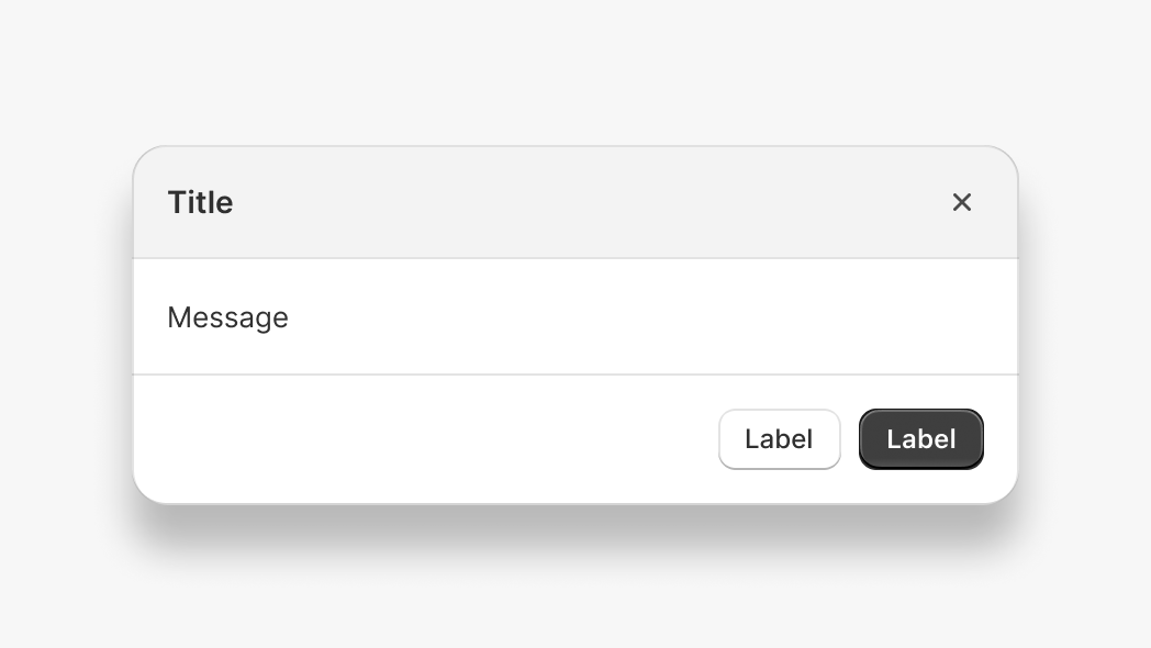
The Modal API lets you display an overlay that prevents interaction with the rest of the app until dismissed. Use modals for confirmations, forms, or important information that requires merchant acknowledgement before proceeding.
Anchor to Use casesUse cases
- Confirmation dialogs: Display confirmation prompts before destructive actions like deleting resources.
- Detail views: Show detailed information in an overlay without navigating away from the current page.
- Form workflows: Present focused forms for data entry in a distraction-free overlay.
- Content preview: Preview content like templates or messages before publishing.
Anchor to MethodsMethods
The modal function provides methods to control modal visibility by a component's ID. These methods work with the s-modal component and are alternatives to calling instance methods directly on the element.
- Anchor to hidehidehide(id: string) => Promise<void>(id: string) => Promise<void>
Hides the modal element. An alternative to the
instance method on thes-modalcomponent.- Anchor to showshowshow(id: string) => Promise<void>(id: string) => Promise<void>
Shows the modal element. An alternative to the
instance method on thes-modalcomponent.- Anchor to toggletoggletoggle(id: string) => Promise<void>(id: string) => Promise<void>
Toggles the modal element visibility. An alternative to the
instance method on thes-modalcomponent.
html
Preview
Examples
Show a modal
Description
Show a modal. This example opens a modal using the `show` method with a unique modal ID. The modal remains visible until the merchant dismisses it or you call the `hide` method.
html
<s-modal id="my-modal">
  <s-text>Hello, World!</s-text>
</s-modal>

<s-button onClick="shopify.modal.show('my-modal')">
  Open Modal
</s-button>
Hide a modal
Description
Hide a modal. This example closes an open modal using the `hide` method with the modal ID. Use this when you need to programmatically dismiss a modal after an action completes or when a condition is met.
html
<s-modal id="my-modal">
  <s-text>Hello, World!</s-text>
  <s-button onClick="shopify.modal.hide('my-modal')">
    Close
  </s-button>
</s-modal>

<s-button onClick="shopify.modal.show('my-modal')">
  Open Modal
</s-button>
Toggle a modal
Description
Toggle a modal. This example switches the modal visibility using the `toggle` method. If the modal is hidden it becomes visible, and if visible it becomes hidden. Use this for UI elements that open and close the same modal.
html
<s-modal id="my-modal">
  <s-text>Hello, World!</s-text>
</s-modal>

<s-button onClick="shopify.modal.toggle('my-modal')">
  Toggle Modal
</s-button>