Skeleton
SkeletonImage is used to provide a low fidelity representation of an image before it appears on the page.
Anchor to skeletonimagepropsSkeletonImageProps
- Anchor to blockSizeblockSize<number | `${number}%` | 'fill'>
Adjust the block size of the skeleton.
- Anchor to inlineSizeinlineSize<number | `${number}%` | 'fill'>
Adjust the inline size of the skeleton.
- Anchor to aspectRatioaspectRationumber
Displays the skeleton at the specified aspect ratio (fills the width of the parent container and sets the height accordingly).
- string
A unique identifier for the component.
SkeletonImageProps
- blockSize
Adjust the block size of the skeleton.
MaybeResponsiveConditionalStyle<number | `${number}%` | 'fill'> - inlineSize
Adjust the inline size of the skeleton.
MaybeResponsiveConditionalStyle<number | `${number}%` | 'fill'> - aspectRatio
Displays the skeleton at the specified aspect ratio (fills the width of the parent container and sets the height accordingly).
number - id
A unique identifier for the component.
string
export interface SkeletonImageProps extends IdProps {
  /**
   * Adjust the block size of the skeleton.
   */
  blockSize?: MaybeResponsiveConditionalStyle<number | `${number}%` | 'fill'>;
  /**
   * Adjust the inline size of the skeleton.
   */
  inlineSize?: MaybeResponsiveConditionalStyle<number | `${number}%` | 'fill'>;
  /**
   * Displays the skeleton at the specified aspect ratio (fills the width of the
   * parent container and sets the height accordingly).
   */
  aspectRatio?: number;
}
MaybeResponsiveConditionalStyle
A type that represents a value that can be a conditional style. The conditions are based on the viewport size. We highly recommend using the `Style` helper which simplifies the creation of conditional styles. To learn more check out the [conditional styles](/api/checkout-ui-extensions/components/utilities/stylehelper) documentation.
T | ConditionalStyle<T, ViewportSizeCondition>ConditionalStyle
- default
The default value applied when none of the conditional values specified in `conditionals` are met.
T - conditionals
An array of conditional values.
ConditionalValue<T, AcceptedConditions>[]
export interface ConditionalStyle<
  T,
  AcceptedConditions extends BaseConditions = Conditions,
> {
  /**
   * The default value applied when none of the conditional values
   * specified in `conditionals` are met.
   */
  default?: T;
  /**
   * An array of conditional values.
   */
  conditionals: ConditionalValue<T, AcceptedConditions>[];
}
ConditionalValue
- conditions
The conditions that must be met for the value to be applied. At least one condition must be specified.
AcceptedConditions - value
The value that will be applied if the conditions are met.
T
export interface ConditionalValue<
  T,
  AcceptedConditions extends BaseConditions = Conditions,
> {
  /**
   * The conditions that must be met for the value to be applied. At least one
   * condition must be specified.
   */
  conditions: AcceptedConditions;
  /**
   * The value that will be applied if the conditions are met.
   */
  value: T;
}
ViewportSizeCondition
- viewportInlineSize
{ min: ViewportInlineSize; }
export interface ViewportSizeCondition {
  viewportInlineSize: {min: ViewportInlineSize};
}
ViewportInlineSize
'small' | 'medium' | 'large'Basic SkeletonImage
examples
Basic SkeletonImage
React
import {
  reactExtension,
  SkeletonImage,
} from '@shopify/ui-extensions-react/checkout';

export default reactExtension(
  'purchase.checkout.block.render',
  () => <Extension />,
);

function Extension() {
  return (
    <SkeletonImage
      inlineSize={300}
      blockSize={300}
    />
  );
}
JS
import {extension, SkeletonImage} from '@shopify/ui-extensions/checkout';

export default extension('purchase.checkout.block.render', (root) => {
  const skeletonImage = root.createComponent(SkeletonImage, {
    inlineSize: 300,
    blockSize: 300,
  });

  root.appendChild(skeletonImage);
});
Preview

Anchor to examplesExamples
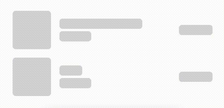
Anchor to example-using-skeleton-loaders-to-prevent-layout-shifts-on-content-load.Using skeleton loaders to prevent layout shifts on content load.
When adding content to a layout, incorporate a skeleton loader that renders the approximate size and position of the content during loading. This will provide a seamless transition from skeleton loaders to the content, and prevent any layout shift when the resulting content loads.
Using skeleton loaders to prevent layout shifts on content load.
examples
Using skeleton loaders to prevent layout shifts on content load.
description
When adding content to a layout, incorporate a skeleton loader that renders the approximate size and position of the content during loading. This will provide a seamless transition from skeleton loaders to the content, and prevent any layout shift when the resulting content loads.
React
import {
  reactExtension,
  View,
  BlockStack,
  InlineLayout,
  SkeletonImage,
  Image,
  Icon,
  SkeletonText,
  Text,
} from '@shopify/ui-extensions-react/checkout';

export default reactExtension(
  'purchase.checkout.block.render',
  () => <LoadingStateSkeletons />,
);

export const ProductThumbnail = ({
  source = 'https://yourawesomeimage.com',
}) => (
  <View
    minBlockSize={64}
    cornerRadius="large"
    maxInlineSize={64}
    minInlineSize={64}
    border="base"
  >
    {source ? (
      <Image
        fit="cover"
        aspectRatio={1}
        source={source}
        cornerRadius="large"
      />
    ) : (
      <View maxInlineSize={33}>
        <Icon source="camera" size="fill" />
      </View>
    )}
  </View>
);
export const LoadingStateSkeletons = () => {
  const loading = true;
  const [item1, item2] = [
    {
      title: 'Felipe Toledo WildFire',
      variantTitle: 'Medium',
      price: '$330.00',
    },
    {
      title: 'Roller',
      variantTitle: 'Medium',
      price: '$248.00',
    },
  ];
  const itemInfo = ({title, variantTitle}) =>
    loading ? (
      <>
        <SkeletonText>{title}</SkeletonText>
        <SkeletonText>
          {variantTitle}
        </SkeletonText>
      </>
    ) : (
      <>
        <Text emphasis="bold">{title}</Text>
        <Text appearance="subdued">
          {variantTitle}
        </Text>
      </>
    );
  const order = (item) => (
    <InlineLayout
      columns={['auto', 'fill', 'auto']}
      spacing="base"
      blockAlignment="center"
    >
      {loading ? (
        <SkeletonImage
          blockSize={64}
          inlineSize={64}
        />
      ) : (
        <ProductThumbnail />
      )}
      <BlockStack spacing="extraTight">
        {itemInfo(item)}
      </BlockStack>
      {loading ? (
        <SkeletonText>{item.price}</SkeletonText>
      ) : (
        <Text emphasis="bold">{item.price}</Text>
      )}
    </InlineLayout>
  );
  return (
    <View maxInlineSize={400}>
      <BlockStack>
        {order(item1)}
        {order(item2)}
      </BlockStack>
    </View>
  );
};
JavaScript
import {
  extension,
  BlockStack,
  View,
  InlineLayout,
  Image,
  Icon,
  Text,
  SkeletonImage,
  SkeletonText,
} from '@shopify/ui-extensions/checkout';

export default extension(
  'purchase.checkout.block.render',
  (root) => {
    const source = 'https://yourawesomeimage.com';
    const loading = true;
    const [item1, item2] = [
      {
        title: 'Felipe Toledo WildFire',
        variantTitle: 'Medium',
        price: '$330.00',
      },
      {
        title: 'Roller',
        variantTitle: 'Medium',
        price: '$248.00',
      },
    ];
    const thumbnail = root.createComponent(
      View,
      {
        minBlockSize: 64,
        cornerRadius: 'large',
        maxInlineSize: 64,
        minInlineSize: 64,
        border: 'base',
      },
      [
        source
          ? root.createComponent(Image, {
              fit: 'cover',
              aspectRatio: 1,
              source,
              cornerRadius: 'large',
            })
          : root.createComponent(
              View,
              {maxInlineSize: 33},
              [
                root.createComponent(Icon, {
                  source: 'camera',
                  size: 'fill',
                }),
              ],
            ),
      ],
    );
    const itemInfo = ({title, variantTitle}) =>
      root.createComponent(
        BlockStack,
        {
          spacing: 'extraTight',
        },
        [
          loading
            ? (root.createComponent(
                SkeletonText,
                {},
                title,
              ),
              root.createComponent(
                SkeletonText,
                {},
                variantTitle,
              ))
            : (root.createComponent(
                Text,
                {},
                title,
              ),
              root.createComponent(
                Text,
                {},
                variantTitle,
              )),
        ],
      );
    const order = (item) =>
      root.createComponent(
        InlineLayout,
        {
          columns: ['auto', 'fill', 'auto'],
          spacing: 'base',
          blockAlignment: 'center',
        },
        [
          loading
            ? root.createComponent(
                SkeletonImage,
                {
                  blockSize: 64,
                  inlineSize: 64,
                },
              )
            : thumbnail,
          itemInfo(item),
          loading
            ? root.createComponent(
                SkeletonText,
                {},
                item.price,
              )
            : root.createComponent(
                Text,
                {},
                item.price,
              ),
        ],
      );
    const view = root.createComponent(
      View,
      {
        maxInlineSize: 400,
      },
      [
        root.createComponent(BlockStack, {}, [
          order(item1),
          order(item2),
        ]),
      ],
    );
    root.appendChild(view);
  },
);
Preview