Modal
Displays content in an overlay. Use to create a distraction-free experience such as a confirmation dialog or a settings panel.
Anchor to propertiesProperties
- Anchor to accessibilityLabelaccessibilityLabelstring
A label that describes the purpose of the modal. When set, it will be announced to users using assistive technologies and will provide them with more context.
This overrides the
headingprop for screen readers.- Anchor to headingheadingstring
A title that describes the content of the Modal.
- string
A unique identifier for the element.
- Anchor to paddingpadding'base' | 'none'Default: 'base'
Adjust the padding around the Modal content.
base: applies padding that is appropriate for the element.none: removes all padding from the element. This can be useful when elements inside the Modal need to span to the edge of the Modal. For example, a full-width image. In this case, rely onBoxwith a padding of 'base' to bring back the desired padding for the rest of the content.- Anchor to sizesize'small' | 'large' | 'base' | 'small-100' | 'large-100' | 'max'
Adjust the size of the Modal.
max: expands the Modal to its maximum size as defined by the host application, on both the horizontal and vertical axes.
Anchor to eventsEvents
- Anchor to afterhideafterhide((event: CallbackEventListener<typeof tagName>) => void) | null
Callback fired when the overlay is hidden after any animations to hide the overlay have finished.
- Anchor to aftershowaftershow((event: CallbackEventListener<typeof tagName>) => void) | null
Callback fired when the overlay is shown after any animations to show the overlay have finished.
- Anchor to hidehide((event: CallbackEventListener<typeof tagName>) => void) | null
Callback fired after the overlay is hidden.
- Anchor to showshow((event: CallbackEventListener<typeof tagName>) => void) | null
Callback fired after the overlay is shown.
CallbackEventListener
(EventListener & {
    (event: CallbackEvent<TTagName, TEvent>): void;
}) | null
CallbackEvent
TEvent & {
    currentTarget: HTMLElementTagNameMap[TTagName];
}Anchor to slotsSlots
- Anchor to primary-actionprimary-actionHTMLElement
The primary action to perform, provided as a button type element.
- Anchor to secondary-actionssecondary-actionsHTMLElement
The secondary actions to perform, provided as button type elements.
Anchor to methodsMethods
- Anchor to hideOverlayhideOverlay() => voidrequired
Method to hide an overlay.
Code
Examples
Code
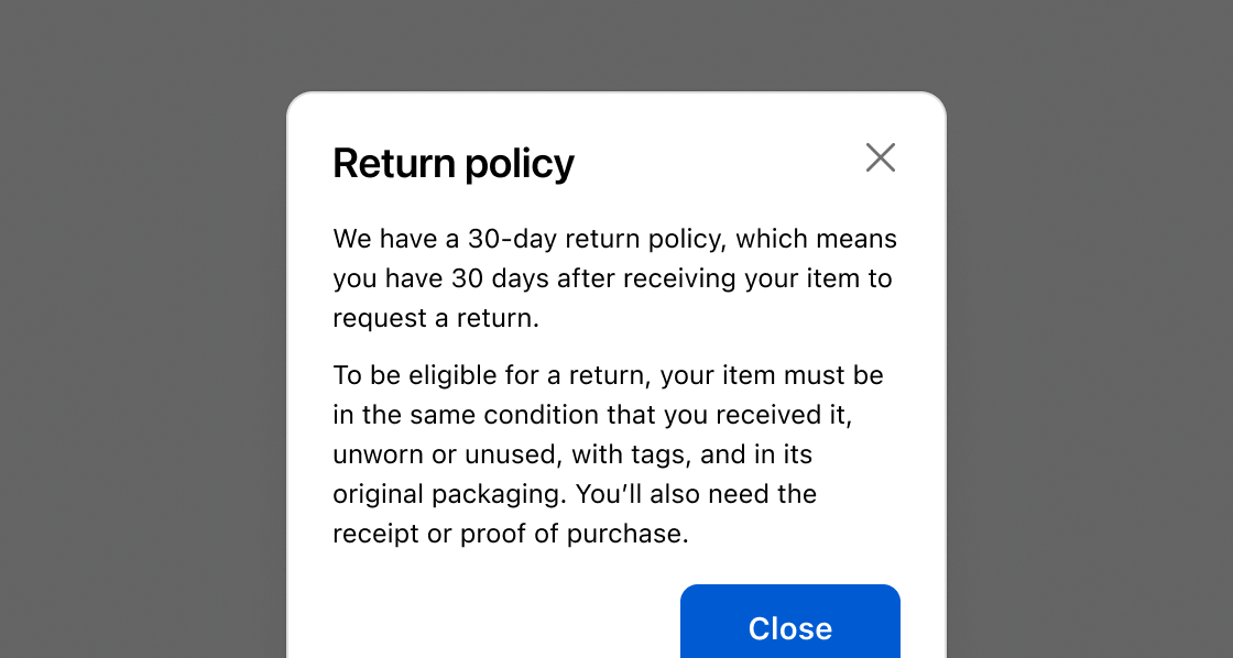
Default
<s-button command="--show" commandfor="modal-1">Add Product</s-button>
<s-modal id="modal-1" heading="Return Policy">
  <s-paragraph>
    We have a 30-day return policy, which means you have 30 days after receiving
    your item to request a return.
  </s-paragraph>
  <s-paragraph>
    To be eligible for a return, your item must be in the same condition that
    you received it, unworn or unused, with tags, and in its original packaging.
    You’ll also need the receipt or proof of purchase.
  </s-paragraph>
  <s-button
    variant="primary"
    command="--hide"
    commandfor="modal-1"
    slot="primary-action"
  >
    Close
  </s-button>
</s-modal>
Preview