---
title: Badge
description: >-
Inform users about the status of an object or indicate that an action has been
completed.
api_version: 2025-10
api_name: checkout_ui_extensions
source_url:
html: >-
https://shopify.dev/docs/api/checkout-ui-extensions/2025-10-rc/polaris-web-components/titles-and-text/badge
md: >-
https://shopify.dev/docs/api/checkout-ui-extensions/2025-10-rc/polaris-web-components/titles-and-text/badge.txt
---
# Badge
Inform users about the status of an object or indicate that an action has been completed.
## Properties
* color
'base' | 'subdued'
Modify the color to be more or less intense.
* icon
'' | ReducedIconTypes
The type of icon to be displayed in the badge.
* iconPosition
'start' | 'end'
The position of the icon in relation to the text.
* id
string
A unique identifier for the element.
* size
'small' | 'base' | 'small-100'
Adjusts the size.
* tone
'auto' | 'neutral' | 'critical'
Sets the tone of the Badge, based on the intention of the information being conveyed.
### ReducedIconTypes
```ts
'alert-circle' | 'alert-triangle-filled' | 'alert-triangle' | 'arrow-down' | 'arrow-left' | 'arrow-right' | 'arrow-up-right' | 'arrow-up' | 'bag' | 'bullet' | 'calendar' | 'camera' | 'caret-down' | 'cart' | 'cash-dollar' | 'categories' | 'check-circle' | 'check' | 'chevron-down' | 'chevron-left' | 'chevron-right' | 'chevron-up' | 'circle' | 'clipboard' | 'clock' | 'credit-card' | 'delete' | 'delivered' | 'delivery' | 'disabled' | 'discount' | 'edit' | 'email' | 'empty' | 'external' | 'filter' | 'geolocation' | 'gift-card' | 'globe' | 'grid' | 'image' | 'info-filled' | 'info' | 'list-bulleted' | 'location' | 'lock' | 'map' | 'menu-horizontal' | 'menu-vertical' | 'menu' | 'minus' | 'mobile' | 'note' | 'order' | 'organization' | 'plus' | 'profile' | 'question-circle-filled' | 'question-circle' | 'reorder' | 'reset' | 'return' | 'savings' | 'search' | 'settings' | 'star-filled' | 'star-half' | 'star' | 'store' | 'truck' | 'upload' | 'x-circle-filled' | 'x-circle' | 'x'
```
### Examples
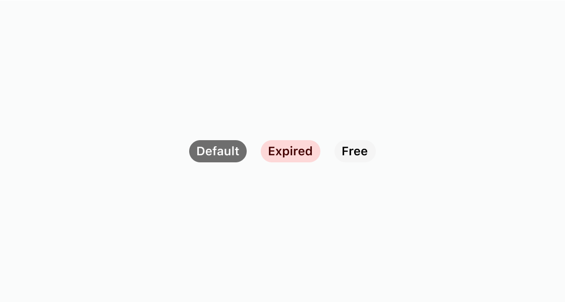
* #### Code
##### Default
```html
Default
Expired
Free
```
## Preview