Button
ButtonGroup is used to display multiple buttons in a layout that is contextual based on the screen width or parent component. When there is more than one secondary action, they get collapsed.
Anchor to propertiesProperties
- Anchor to accessibilityLabelaccessibilityLabelstring
Label for the button group that describes the content of the group for screen reader users to understand what's included.
- string
A unique identifier for the element.
ButtonGroupPropsDocs
- accessibilityLabel
Label for the button group that describes the content of the group for screen reader users to understand what's included.
string - id
A unique identifier for the element.
string
ButtonGroupPropsAnchor to slotsSlots
- Anchor to primary-actionprimary-actionHTMLElement
The primary action to perform, provided as a button type element.
- Anchor to secondary-actionssecondary-actionsHTMLElement
The secondary actions to perform, provided as button type elements.
ButtonGroupElementSlotsDocs
- primary-action
The primary action to perform, provided as a button type element.
HTMLElement - secondary-actions
The secondary actions to perform, provided as button type elements.
HTMLElement
ButtonGroupElementSlotsBasic ButtonGroup
Preact
examples
Basic ButtonGroup
Preact
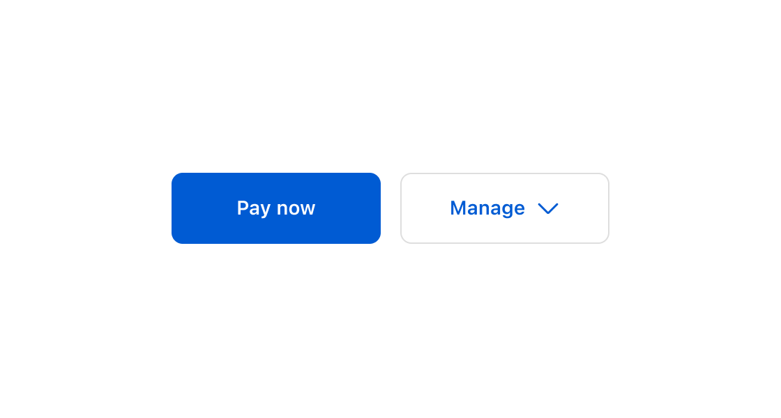
import '@shopify/ui-extensions/preact';
import {render} from 'preact';

export default async () => {
  render(<Extension />, document.body);
};

function Extension() {
  return (
    <s-button-group accessibilityLabel="Order actions">
      <s-button slot="primary-action" variant="primary">
        Pay now
      </s-button>
      <s-button slot="secondary-actions" variant="secondary">
        Edit order
      </s-button>
      <s-button slot="secondary-actions" variant="secondary">
        Cancel order
      </s-button>
    </s-button-group>
  );
}
Preview