Customer
A modal to complete an order action flow. This component can only be used to populate the customer-account.order.action.render extension target, which renders as a result of the customer clicking the order action button rendered via the customer-account.order.action.menu-item.render extension target.
Anchor to propertiesProperties
- Anchor to headingheadingstringrequired
Sets the heading of the Action container.
- string
A unique identifier for the element.
CustomerAccountActionPropsDocs
- heading
Sets the heading of the Action container.
string - id
A unique identifier for the element.
string
CustomerAccountActionPropsAnchor to slotsSlots
- Anchor to primary-actionprimary-actionHTMLElement
The primary action to perform, provided as a button type element.
- Anchor to secondary-actionssecondary-actionsHTMLElement
The secondary actions to perform, provided as button type elements.
CustomerAccountActionElementSlotsDocs
- primary-action
The primary action to perform, provided as a button type element.
HTMLElement - secondary-actions
The secondary actions to perform, provided as button type elements.
HTMLElement
CustomerAccountActionElementSlotsSupported props for Buttons used inside CustomerAccountAction slots.children only support text.
- string
A label that describes the purpose or contents of the Button. It will be read to users using assistive technologies such as screen readers.
Use this when using only an icon or the button text is not enough context for users using assistive technologies.
- ((event: CallbackEventListener<typeof buttonTagName>) => void) | null
Callback when the button is activated. This will be called before the action indicated by
type.- '--auto' | '--show' | '--hide' | '--toggle' | '--copy'Default: '--auto'
Sets the action the
should take when this clickable is activated.See the documentation of particular components for the actions they support.
--auto: a default action for the target component.--show: shows the target component.--hide: hides the target component.--toggle: toggles the target component.--copy: copies the target ClipboardItem.
- string
ID of a component that should respond to activations (e.g. clicks) on this component.
See
commandfor how to control the behavior of the target.- booleanDefault: false
Disables the button, disallowing any interaction.
- string
The URL to link to.
- If set, it will navigate to the location specified by
hrefafter executing thecallback. - If a
is set, thecommandwill be executed instead of the navigation.
- If set, it will navigate to the location specified by
- booleanDefault: false
Replaces content with a loading indicator.
Docs_CustomerAccountAction_SlotButton
- accessibilityLabel
A label that describes the purpose or contents of the Button. It will be read to users using assistive technologies such as screen readers. Use this when using only an icon or the button text is not enough context for users using assistive technologies.
string - click
Callback when the button is activated. This will be called before the action indicated by `type`.
((event: CallbackEventListener<typeof buttonTagName>) => void) | null - command
Sets the action the `commandFor` should take when this clickable is activated. See the documentation of particular components for the actions they support. - `--auto`: a default action for the target component. - `--show`: shows the target component. - `--hide`: hides the target component. - `--toggle`: toggles the target component. - `--copy`: copies the target ClipboardItem.
'--auto' | '--show' | '--hide' | '--toggle' | '--copy' - commandFor
ID of a component that should respond to activations (e.g. clicks) on this component. See `command` for how to control the behavior of the target.
string - disabled
Disables the button, disallowing any interaction.
boolean - href
The URL to link to. - If set, it will navigate to the location specified by `href` after executing the `onClick` callback. - If a `commandFor` is set, the `command` will be executed instead of the navigation.
string - loading
Replaces content with a loading indicator.
boolean
export interface Docs_CustomerAccountAction_SlotButton
  extends Pick<
    ButtonProps,
    | 'click'
    | 'loading'
    | 'disabled'
    | 'accessibilityLabel'
    | 'href'
    | 'command'
    | 'commandFor'
  > {}
CallbackEventListener
(EventListener & {
      (event: CallbackEvent<TTagName, TEvent>): void;
    }) | null
CallbackEvent
TEvent & {
  currentTarget: HTMLElementTagNameMap[TTagName];
}Basic CustomerAccountAction
Preact
examples
Basic CustomerAccountAction
Preact
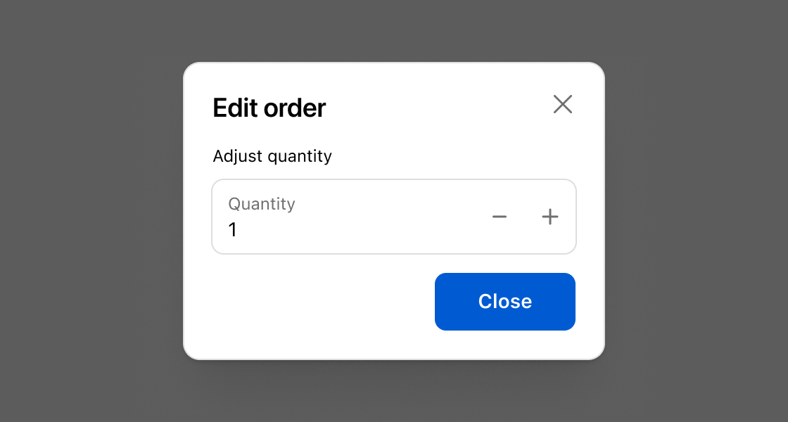
import '@shopify/ui-extensions/preact';
import {render} from 'preact';

export default async () => {
  render(<Extension />, document.body);
};

function Extension() {
  return (
    <s-customer-account-action heading="Edit order">
      Extension content
      <s-button slot="primary-action" onClick={() => shopify.close()}>
        Close
      </s-button>
    </s-customer-account-action>
  );
}
Preview
Anchor to best-practicesBest Practices
- Use CustomerAccountAction to shift focus toward information and functionality needed to confirm or complete an order action.
- If the order action experience you’re building requires complex forms or large amounts of information, consider building a full-page extension instead.
- See Polaris for more best practices and content guidelines for designing Modals.