Menu
Use a menu to display a list of actions in a popover. Actions can open a modal, trigger an event, or link to an external page.
Anchor to propertiesProperties
- Anchor to accessibilityLabelaccessibilityLabelstring
A label to describe the purpose of the menu that is announced by screen readers.
- string
A unique identifier for the element.
MenuPropsDocs
- accessibilityLabel
A label to describe the purpose of the menu that is announced by screen readers.
string - id
A unique identifier for the element.
string
MenuPropsThe Menu component exclusively accepts Button elements with restricted props as its children. The tone prop will always be set to monochrome by default.
- string
A label that describes the purpose or contents of the Button. It will be read to users using assistive technologies such as screen readers.
Use this when using only an icon or the button text is not enough context for users using assistive technologies.
- ((event: CallbackEventListener<typeof buttonTagName>) => void) | null
Callback when the button is activated. This will be called before the action indicated by
type.- '--auto' | '--show' | '--hide' | '--toggle' | '--copy'Default: '--auto'
Sets the action the
should take when this clickable is activated.See the documentation of particular components for the actions they support.
--auto: a default action for the target component.--show: shows the target component.--hide: hides the target component.--toggle: toggles the target component.--copy: copies the target ClipboardItem.
- string
ID of a component that should respond to activations (e.g. clicks) on this component.
See
commandfor how to control the behavior of the target.- booleanDefault: false
Disables the button, disallowing any interaction.
- string
The URL to link to.
- If set, it will navigate to the location specified by
hrefafter executing thecallback. - If a
is set, thecommandwill be executed instead of the navigation.
- If set, it will navigate to the location specified by
- string
A unique identifier for the element.
- booleanDefault: false
Replaces content with a loading indicator.
- 'auto' | '_self' | '_blank'Default: 'auto'
Specifies where to display the linked URL
- 'auto' | 'neutral' | 'critical'Default: 'auto'
Sets the tone of the Button, based on the intention of the information being conveyed.
- 'button' | 'submit'Default: 'button'
The behavior of the button.
'submit'- Used to indicate the component acts as a submit button, meaning it submits the closest form.'button'- Used to indicate the component acts as a button, meaning it has no default action.'reset'- Used to indicate the component acts as a reset button, meaning it resets the closest form (returning fields to their default values).
This property is ignored if the component supports
hrefor/commandand one of them is set.
Docs_Menu_Button_Action
- accessibilityLabel
A label that describes the purpose or contents of the Button. It will be read to users using assistive technologies such as screen readers. Use this when using only an icon or the button text is not enough context for users using assistive technologies.
string - click
Callback when the button is activated. This will be called before the action indicated by `type`.
((event: CallbackEventListener<typeof buttonTagName>) => void) | null - command
Sets the action the `commandFor` should take when this clickable is activated. See the documentation of particular components for the actions they support. - `--auto`: a default action for the target component. - `--show`: shows the target component. - `--hide`: hides the target component. - `--toggle`: toggles the target component. - `--copy`: copies the target ClipboardItem.
'--auto' | '--show' | '--hide' | '--toggle' | '--copy' - commandFor
ID of a component that should respond to activations (e.g. clicks) on this component. See `command` for how to control the behavior of the target.
string - disabled
Disables the button, disallowing any interaction.
boolean - href
The URL to link to. - If set, it will navigate to the location specified by `href` after executing the `onClick` callback. - If a `commandFor` is set, the `command` will be executed instead of the navigation.
string - id
A unique identifier for the element.
string - loading
Replaces content with a loading indicator.
boolean - target
Specifies where to display the linked URL
'auto' | '_self' | '_blank' - tone
Sets the tone of the Button, based on the intention of the information being conveyed.
'auto' | 'neutral' | 'critical' - type
The behavior of the button. - `'submit'` - Used to indicate the component acts as a submit button, meaning it submits the closest form. - `'button'` - Used to indicate the component acts as a button, meaning it has no default action. - `'reset'` - Used to indicate the component acts as a reset button, meaning it resets the closest form (returning fields to their default values). This property is ignored if the component supports `href` or `commandFor`/`command` and one of them is set.
'button' | 'submit'
export interface Docs_Menu_Button_Action
  extends Omit<
    ButtonProps,
    'variant' | 'textDecoration' | 'inlineAlignment' | 'inlineSize' | 'size'
  > {}
CallbackEventListener
(EventListener & {
      (event: CallbackEvent<TTagName, TEvent>): void;
    }) | null
CallbackEvent
TEvent & {
  currentTarget: HTMLElementTagNameMap[TTagName];
}Basic Menu
Preact
examples
Basic Menu
Preact
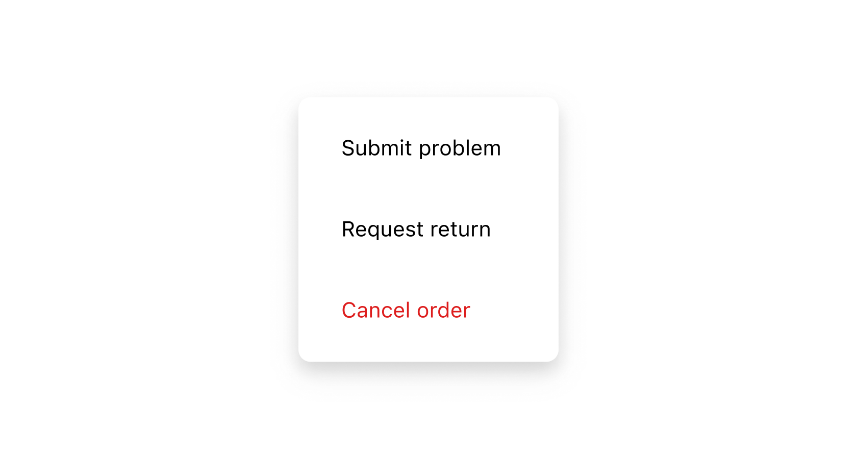
import '@shopify/ui-extensions/preact';
import {render} from 'preact';

export default async () => {
  render(<Extension />, document.body);
};

function Extension() {
  return (
    <>
      <s-button commandFor="order-actions-menu">Manage</s-button>
      <s-menu
        id="order-actions-menu"
        accessibilityLabel="List of order actions"
      >
        <s-button onClick={() => console.log('Submit problem')}>
          Submit problem
        </s-button>
        <s-button href="https://shopify.com">Request return</s-button>
        <s-button tone="critical">Cancel order</s-button>
      </s-menu>
    </>
  );
}
Preview
Anchor to best-practicesBest Practices
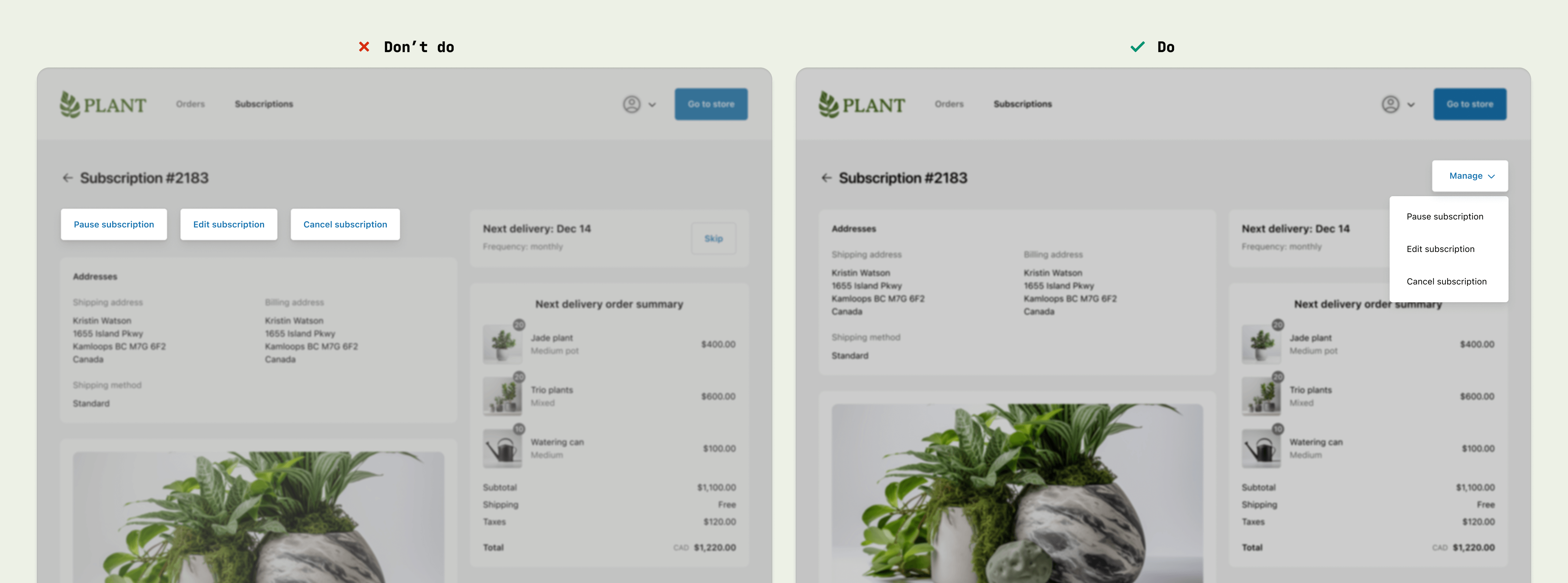
Consolidate actions into one menu
- Use the menu component in the upper-right corner of full-page extensions, to be consistent with the Order status page.
- Use menus to consolidate page-level actions, instead of adding multiple buttons around the page.
Content guidelines
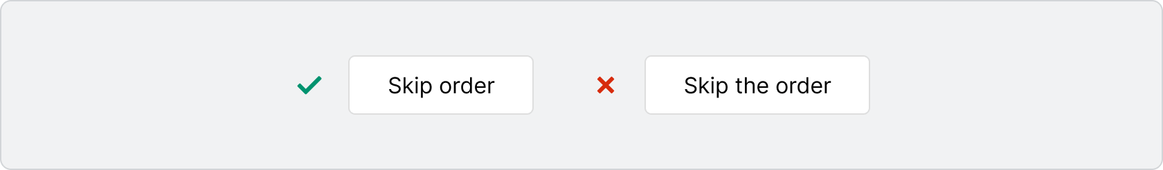
When writing button labels:
- Aim for 2 words (verb and noun).
- Lead with a strong verb that encourages action.
- Avoid unnecessary words and articles such as “the,” “an,” or “a.”
- Use sentence case.