Section
Groups related content into clearly-defined thematic areas. Sections have contextual styling that automatically adapts based on nesting depth. They also adjust heading levels to maintain a meaningful and accessible page structure.
Anchor to propertiesProperties
- Anchor to accessibilityLabelaccessibilityLabelstring
A label used to describe the section that will be announced by assistive technologies.
When no
headingproperty is provided or included as a children of the Section, you must provide anto describe the Section. This is important as it allows assistive technologies to provide the right context to users.- Anchor to headingheadingstring
A title that describes the content of the section.
- string
A unique identifier for the element.
SectionPropsDocs
- accessibilityLabel
A label used to describe the section that will be announced by assistive technologies. When no `heading` property is provided or included as a children of the Section, you **must** provide an `accessibilityLabel` to describe the Section. This is important as it allows assistive technologies to provide the right context to users.
string - heading
A title that describes the content of the section.
string - id
A unique identifier for the element.
string
SectionPropsAnchor to slotsSlots
- Anchor to primary-actionprimary-actionHTMLElement
The primary action to perform, provided as a button type element.
- Anchor to secondary-actionssecondary-actionsHTMLElement
The secondary actions to perform, provided as button type elements.
SectionElementSlotsDocs
- primary-action
The primary action to perform, provided as a button type element.
HTMLElement - secondary-actions
The secondary actions to perform, provided as button type elements.
HTMLElement
SectionElementSlotsBasic Section
Preact
examples
Basic Section
Preact
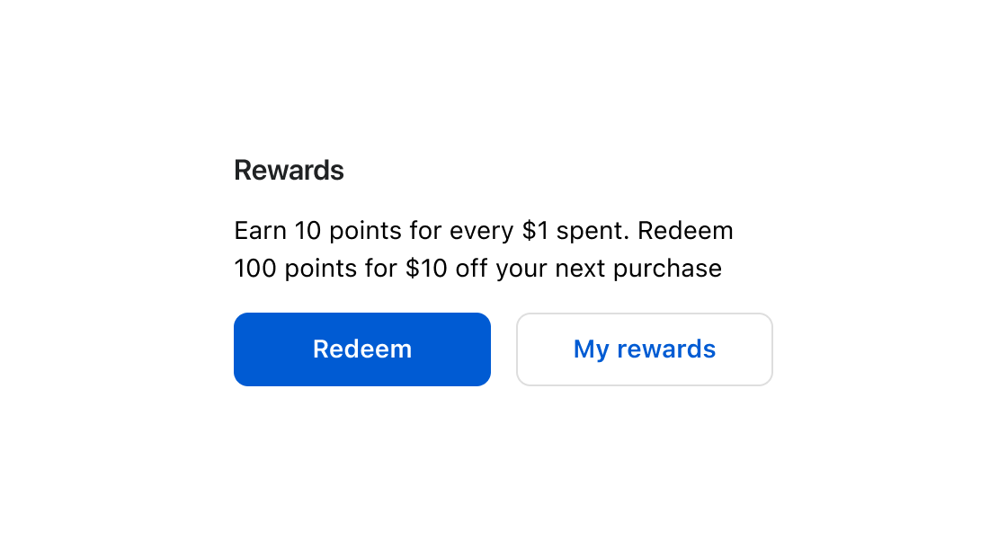
import '@shopify/ui-extensions/preact';
import {render} from 'preact';

export default async () => {
  render(<Extension />, document.body);
};

function Extension() {
  return (
    <s-section heading="Rewards">
      <s-button slot="primary-action" variant="primary">
        Redeem
      </s-button>
      <s-button slot="secondary-action" variant="secondary">
        My rewards
      </s-button>
      <s-paragraph>
        Earn 10 points for every $1 spent. Redeem 100 points for $10 off your
        next purchase.
      </s-paragraph>
    </s-section>
  );
}
Preview
Anchor to useful-forUseful for
- Organizing your page in a logical structure based on nesting levels.
- Creating consistency across pages.
Anchor to considerationsConsiderations
- When adding headings inside sections they automatically use a specific style, which helps keep the content organized and clear.