Page
The outer wrapper of the page—including the page title, subtitle, and page-level actions—displayed in a familiar and consistent style that sets expectations about the purpose of the page.
Anchor to propertiesProperties
- Anchor to headingheadingstring
The main page heading
- string
A unique identifier for the element.
- Anchor to subheadingsubheadingstring
The text to be used as subheading.
Was this section helpful?
Anchor to slotsSlots
- HTMLElement
The breadcrumb actions to perform, provided as button type elements.
- Anchor to primary-actionprimary-actionHTMLElement
The primary action to perform, provided as a button type element.
- Anchor to secondary-actionssecondary-actionsHTMLElement
The secondary actions to perform, provided as button type elements.
Was this section helpful?
Supported props for Button used inside Page breadcrumb-actions slot.children are not supported.
Use instead.
- stringrequired
A label used for buyers using assistive technologies. Needed because
childrenpassed to this component will be discarded.- ((event: CallbackEventListener<typeof buttonTagName>) => void) | null
Callback when the button is activated. This will be called before the action indicated by
type.- string
The URL to link to.
- If set, it will navigate to the location specified by
hrefafter executing thecallback. - If a
is set, thecommandwill be executed instead of the navigation.
- If set, it will navigate to the location specified by
CallbackEventListener
(EventListener & {
      (event: CallbackEvent<TTagName, TEvent>): void;
    }) | null
CallbackEvent
TEvent & {
  currentTarget: HTMLElementTagNameMap[TTagName];
}
Was this section helpful?
Supported props for Buttons used inside Page primary-action slot.children only support text.
- string
A label that describes the purpose or contents of the Button. It will be read to users using assistive technologies such as screen readers.
Use this when using only an icon or the button text is not enough context for users using assistive technologies.
- ((event: CallbackEventListener<typeof buttonTagName>) => void) | null
Callback when the button is activated. This will be called before the action indicated by
type.- '--auto' | '--show' | '--hide' | '--toggle' | '--copy'Default: '--auto'
Sets the action the
should take when this clickable is activated.See the documentation of particular components for the actions they support.
--auto: a default action for the target component.--show: shows the target component.--hide: hides the target component.--toggle: toggles the target component.--copy: copies the target ClipboardItem.
- string
ID of a component that should respond to activations (e.g. clicks) on this component.
See
commandfor how to control the behavior of the target.- booleanDefault: false
Disables the button, disallowing any interaction.
- string
The URL to link to.
- If set, it will navigate to the location specified by
hrefafter executing thecallback. - If a
is set, thecommandwill be executed instead of the navigation.
- If set, it will navigate to the location specified by
- booleanDefault: false
Replaces content with a loading indicator.
CallbackEventListener
(EventListener & {
      (event: CallbackEvent<TTagName, TEvent>): void;
    }) | null
CallbackEvent
TEvent & {
  currentTarget: HTMLElementTagNameMap[TTagName];
}
Was this section helpful?
Supported props for Button used inside Page secondary-actions slot.children only support text.
- string
A label that describes the purpose or contents of the Button. It will be read to users using assistive technologies such as screen readers.
Use this when using only an icon or the button text is not enough context for users using assistive technologies.
- ((event: CallbackEventListener<typeof buttonTagName>) => void) | null
Callback when the button is activated. This will be called before the action indicated by
type.- '--auto' | '--show' | '--hide' | '--toggle' | '--copy'Default: '--auto'
Sets the action the
should take when this clickable is activated.See the documentation of particular components for the actions they support.
--auto: a default action for the target component.--show: shows the target component.--hide: hides the target component.--toggle: toggles the target component.--copy: copies the target ClipboardItem.
- string
ID of a component that should respond to activations (e.g. clicks) on this component.
See
commandfor how to control the behavior of the target.- booleanDefault: false
Disables the button, disallowing any interaction.
- string
The URL to link to.
- If set, it will navigate to the location specified by
hrefafter executing thecallback. - If a
is set, thecommandwill be executed instead of the navigation.
- If set, it will navigate to the location specified by
- booleanDefault: false
Replaces content with a loading indicator.
CallbackEventListener
(EventListener & {
      (event: CallbackEvent<TTagName, TEvent>): void;
    }) | null
CallbackEvent
TEvent & {
  currentTarget: HTMLElementTagNameMap[TTagName];
}
Was this section helpful?
Basic Page
Preact
import '@shopify/ui-extensions/preact';
import {render} from 'preact';
export default async () => {
render(<Extension />, document.body);
};
function Extension() {
return (
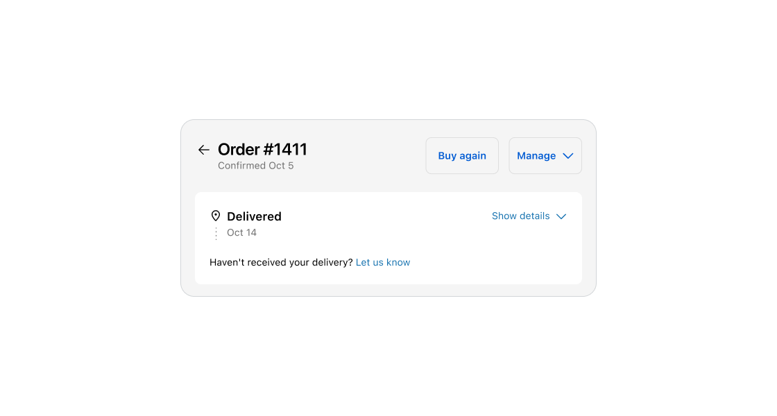
<s-page heading="Order #1411" subheading="Confirmed Oct 5">
<s-button
slot="primary-action"
onClick={() => console.log('Primary action')}
>
Buy again
</s-button>
<s-button
slot="secondary-actions"
onClick={() => console.log('Secondary action 1')}
>
Secondary action 1
</s-button>
<s-button
slot="secondary-actions"
onClick={() => console.log('Secondary action 2')}
>
Secondary action 2
</s-button>
<s-button
slot="breadcrumb-actions"
accessibilitylabel="Button"
href="shopify://customer-account/orders"
/>
Content
</s-page>
);
}
Examples
Basic Page
Preact
import '@shopify/ui-extensions/preact'; import {render} from 'preact'; export default async () => { render(<Extension />, document.body); }; function Extension() { return ( <s-page heading="Order #1411" subheading="Confirmed Oct 5"> <s-button slot="primary-action" onClick={() => console.log('Primary action')} > Buy again </s-button> <s-button slot="secondary-actions" onClick={() => console.log('Secondary action 1')} > Secondary action 1 </s-button> <s-button slot="secondary-actions" onClick={() => console.log('Secondary action 2')} > Secondary action 2 </s-button> <s-button slot="breadcrumb-actions" accessibilitylabel="Button" href="shopify://customer-account/orders" /> Content </s-page> ); }
Preview
Anchor to best-practicesBest Practices
Heading
- Set clear expectations about the purpose and main topic of the page.
- Aim for 1-3 words.
- Use sentence case.
Subheading
- Use to provide additional context or information that enhances the customer’s understanding of the page.
- Use subheadings sparingly and only when they add useful information that is distinct from the heading.
Buttons
- Use for page-level actions only.
- If there is a single primary action for the page, display it as a primary button. Display all other page-level actions as secondary buttons.
- See UX guidelines to learn more about the button logic for order actions.
Was this section helpful?