Build a discount extension
Learn how to develop a scaffolded POS UI extension into a simple discount extension.
Anchor to introIntro
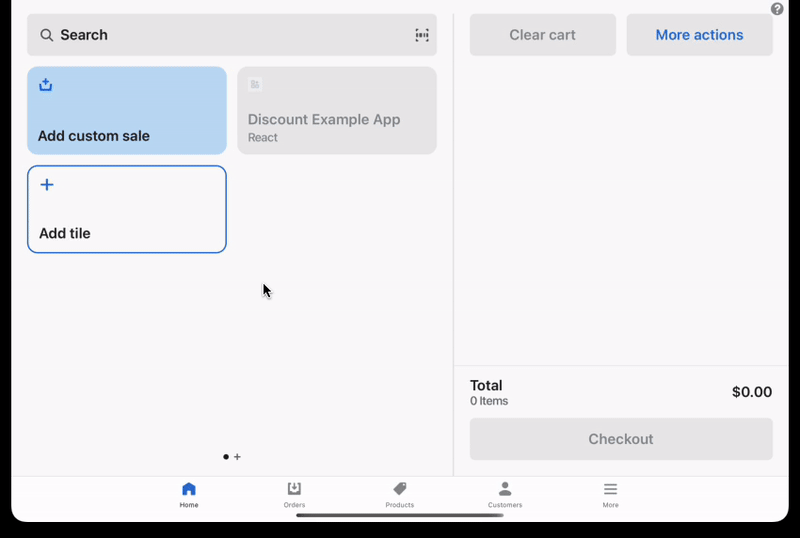
This tutorial shows you how to use the pos.home.tile.render and pos.home.modal.render extension targets to build a simple POS UI extension that quickly applies discounts to items in the cart.
You'll develop the scaffolded extension into a smart grid tile that becomes enabled when the cart reaches a total value. When tapped, the tile opens a modal that presents buttons representing available discounts. When tapped, these buttons apply a discount to the cart and present a toast for notification of success.
Anchor to what-youll-learnWhat you'll learn
In this tutorial, you'll learn how to do the following tasks:
- Enable or disable the tile based on cart contents.
- Add buttons to the modal that apply a discount and show a toast when tapped.
- Give your extension a useful description.
- Deploy your extension to Shopify, create a version, and publish.
Anchor to requirementsRequirements
- You've completed the Getting started with POS UI extensions guide.
Anchor to sample-codeSample code
The sample code imports some extension components to build the UI. The tile contains the logic to control its enablement based on the cart subtotal. The modal contains the logic to apply discounts based on button tap.
You can copy and paste the following code into your index file. You can also update your extension's configuration file following the shopify.extension.toml example.
The rest of the tutorial walks through this sample code step-by-step.
Discount extension
Examples
Discount extension
Tile (React)
import React, { useState } from 'react';

import { Tile, useApi, reactExtension } from '@shopify/ui-extensions-react/point-of-sale';

const SmartGridTile = () => {
  const api = useApi<'pos.home.tile.render'>();

  const shouldEnable = (subtotal: string): boolean => {
    return Number(subtotal) > 100
  }

  // You can use the initial cart value to set up state
  const [enabled, setEnabled] = useState(shouldEnable(api.cart.subscribable.initial.subtotal));

  // You can subscribe to changes in the cart to mutate state
  api.cart.subscribable.subscribe((cart) => {
    setEnabled(shouldEnable(cart.subtotal));
  });

  return (
    <Tile
      title='Discount Example App'
      subtitle='React'
      onPress={api.action.presentModal}
      enabled={enabled}
    />
  );
};

export default reactExtension('pos.home.tile.render', () => {
  return <SmartGridTile />
})
Modal (React)
import React from 'react';

import { CartDiscountType } from '@shopify/ui-extensions/point-of-sale'
import { ScrollView, Button, Navigator, Screen, useApi, reactExtension } from '@shopify/ui-extensions-react/point-of-sale';

const SmartGridModal = () => {
  const api = useApi<'pos.home.modal.render'>();

  const onButtonPress = (type: CartDiscountType, title: string, amount: string) => {
    // You can apply a discount through the cart API
    api.cart.applyCartDiscount(type, title, amount);

    // You can show a toast to notify the user of something
    api.toast.show('Discount applied');
  }

  return (
    <Navigator>
      <Screen name='Discounts' title='Available Discounts'>
        <ScrollView>
          <Button title='25%' onPress={() => onButtonPress('Percentage', '25% off', '25')} />
          <Button title='$10' onPress={() => onButtonPress('FixedAmount', '$10 off', '10')} />
        </ScrollView>
      </Screen>
    </Navigator>
  )
}

export default reactExtension('pos.home.modal.render', () => {
  return <SmartGridModal />
})
Tile (TS)
import {extension, Tile} from '@shopify/ui-extensions/point-of-sale';

export default extension('pos.home.tile.render', (root, api) => {
  const shouldEnable = (subtotal: string): boolean => {
    return Number(subtotal) > 100;
  };
  // You can use the initial cart value to set up state
  const tile = root.createComponent(Tile, {
    title: 'Discount Example App',
    subtitle: 'Javascript',
    enabled: shouldEnable(api.cart.subscribable.initial.subtotal),
    onPress: api.action.presentModal,
  });

  // You can subscribe to changes in the cart to mutate state
  api.cart.subscribable.subscribe((cart) => {
    tile.updateProps({enabled: shouldEnable(cart.subtotal)});
  });

  root.append(tile);
});
Modal (TS)
import {
  extension,
  Screen,
  Button,
  CartDiscountType,
  ScrollView,
} from '@shopify/ui-extensions/point-of-sale';

export default extension('pos.home.modal.render', (root, api) => {
  const onButtonPress = (
    type: CartDiscountType,
    title: string,
    amount: string,
  ) => {
    // You can apply a discount through the cart API
    api.cart.applyCartDiscount(type, title, amount);

    // You can show a toast to notify the user of something
    api.toast.show('Discount applied');
  };

  let mainScreen = root.createComponent(Screen, {
    name: 'Discounts',
    title: 'Available Discounts',
  });
  let scrollView = root.createComponent(ScrollView);

  const percentageDiscountButton = root.createComponent(Button, {
    title: '25%',
    onPress: () => {
      onButtonPress('Percentage', '25% off', '25');
    },
  });

  const fixedAmountDiscountButton = root.createComponent(Button, {
    title: '$10',
    onPress: () => {
      onButtonPress('FixedAmount', '$10 off', '10');
    },
  });

  scrollView.append(percentageDiscountButton);
  scrollView.append(fixedAmountDiscountButton);
  mainScreen.append(scrollView);
  root.append(mainScreen);
});
Anchor to step-1-enable-the-tileStep 1: Enable or disable the tile based on cart contents
You can enable or disable the tile based on cart contents by accessing its subscribable. In the tile code, initialize state based on the initial value of the subscribable.
Enable the tile based on cart contents
Examples
Enable the tile based on cart contents
React
const [enabled, setEnabled] = useState(shouldEnable(api.cart.subscribable.initial.subtotal));TS
const tile = root.createComponent(Tile, {
  title: 'Discount Example App',
  subtitle: 'Javascript',
  enabled: shouldEnable(api.cart.subscribable.initial.subtotal),
  onPress: api.action.presentModal
});
Anchor to step-2-subscribe-to-cartStep 2: Subscribe to cart changes
In the tile code, subscribe to cart changes and mutate state based on the updated cart.
Subscribe to cart changes
Examples
Subscribe to cart changes
React
api.cart.subscribable.subscribe((cart) => {
  setEnabled(shouldEnable(cart.subtotal));
});
TS
api.cart.subscribable.subscribe((cart) => {
  tile.updateProps({ enabled: shouldEnable(cart.subtotal) });
})
You can add buttons to the modal that trigger some action on press.
Create the buttons on the modal. Note that most components belong in a ScrollView.
Add buttons to the modal
Examples
Add buttons to the modal
React
<ScrollView>
  <Button title='25%' onPress={() => onButtonPress('Percentage', '25% off', '25')} />
  <Button title='$10' onPress={() => onButtonPress('FixedAmount', '$10 off', '10')} />
</ScrollView>
TS
const percentageDiscountButton = root.createComponent(Button, {
  title: '25%',
  onPress: () => { onButtonPress('Percentage', '25% off', '25') }
});

const fixedAmountDiscountButton = root.createComponent(Button, {
  title: '$10',
  onPress: () => { onButtonPress('FixedAmount', '$10 off', '10') }
});

scrollView.appendChild(percentageDiscountButton);
scrollView.appendChild(fixedAmountDiscountButton);
Anchor to step-4-define-onpressStep 4: Define onPress
Define an function to apply the discount and show the toast.
Define onPress
Examples
Define onPress
React
onPress={() => onButtonPress('FixedAmount', '$10 off', '10')}TS
const onButtonPress = (type: DiscountType, title: string, amount: string) => {
  api.cart.applyCartDiscount(type, title, amount);
  api.toast.show('Discount applied');
};
Anchor to step-5-give-descriptionStep 5: Give your extension a useful description
Your extension's description will be visible to the merchant when they discover and add it to their POS.
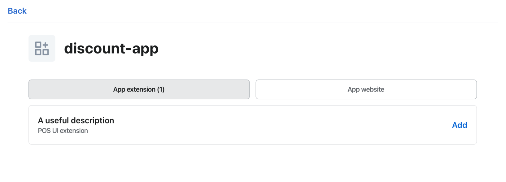 When you generate a POS UI Extension from Shopify CLI, the extension description defaults to the name of the extension. You can update the description in the generated
 toml file (shopify.extension.toml).
name is an internal value that is visible in the Partner Dashboard as the title of an extension on the page that displays the extensions list.
Description configuration
shopify.extension.toml
Examples
Description configuration
shopify.extension.toml
...
name = "Loyalty discount"
handle = "Loyalty discount"
description = "Add loyalty discount"
...
Anchor to step-6-deploy-releaseStep 6: Deploy and release
Refer to Deploy app extensions for more information.
Anchor to next-stepsNext steps
Debug POS UI Extension.
Learn more about building with POS UI extensions by exploring the POS UI extension reference.