Button
Triggers actions or events, such as opening dialogs or navigating to other pages. Use Button to let users perform specific tasks or initiate interactions throughout the interface.
Anchor to propertiesProperties
- Anchor to commandcommand'--auto' | '--show' | '--hide' | '--toggle'Default: '--auto'
Sets the action the
should take when this clickable is activated.See the documentation of particular components for the actions they support.
--auto: a default action for the target component.--show: shows the target component.--hide: hides the target component.--toggle: toggles the target component.
- Anchor to commandForcommandForstring
ID of a component that should respond to activations (e.g. clicks) on this component.
See
commandfor how to control the behavior of the target.- Anchor to disableddisabledbooleanDefault: false
Disables the Button meaning it cannot be clicked or receive focus.
- Anchor to loadingloadingbooleanDefault: false
Replaces content with a loading indicator while a background action is being performed.
This also disables the Button.
- Anchor to tonetone'auto' | 'neutral' | 'caution' | 'warning' | 'critical'Default: 'auto'
Sets the tone of the Button, based on the intention of the information being conveyed.
- Anchor to variantvariant'primary' | 'secondary'Default: 'auto' - the variant is automatically determined by the Button's context
Changes the visual appearance of the Button.
Anchor to eventsEvents
- Anchor to clickclick(event: CallbackEvent<"s-divider">) => void
CallbackEvent
- bubbles
boolean - cancelable
boolean - composed
boolean - currentTarget
HTMLElementTagNameMap[T] - detail
any - eventPhase
number - target
HTMLElementTagNameMap[T] | null
interface CallbackEvent<T extends keyof HTMLElementTagNameMap> {
  currentTarget: HTMLElementTagNameMap[T];
  bubbles?: boolean;
  cancelable?: boolean;
  composed?: boolean;
  detail?: any;
  eventPhase: number;
  target: HTMLElementTagNameMap[T] | null;
}Code
Examples
Code
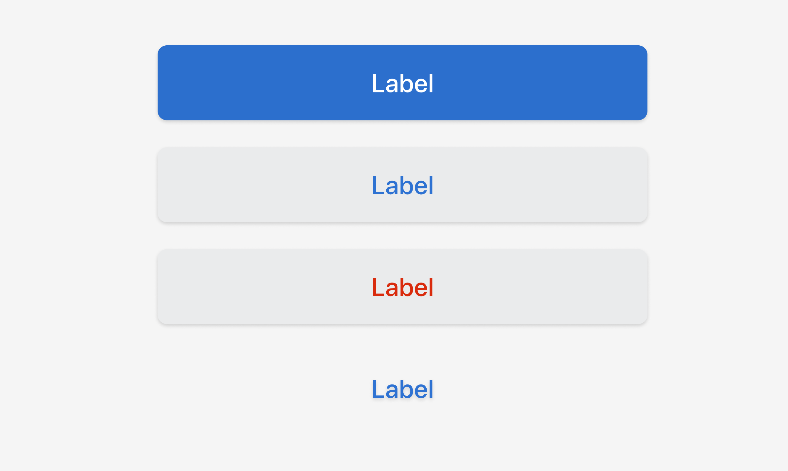
Default
<s-button variant="primary">Label</s-button>
<s-button variant="secondary">Label</s-button>
<s-button tone="critical">Label</s-button>
<s-button disabled>Label</s-button>
Preview