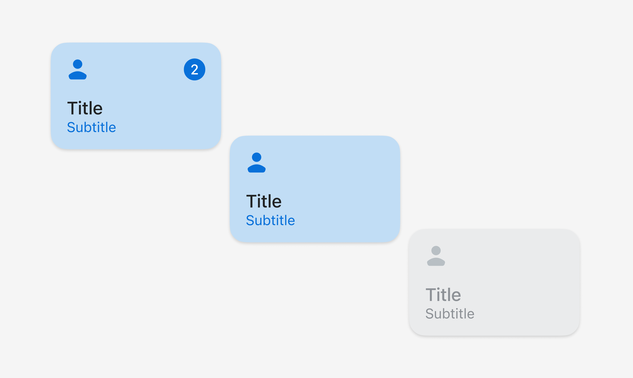
Tile
Tiles are customizable buttons that allow staff to complete actions quickly. Think of them as shortcuts--adding a 10% discount to an order, for example. Tiles provide contextual information and let merchants quickly access workflows, actions, and information from the smart grid and the top of detail pages. They're dynamic and can change based on surrounding context, such as what's in the cart.
Anchor to propertiesProperties
- Anchor to disableddisabledbooleanDefault: false
Disables the Button meaning it cannot be clicked or receive focus.
- Anchor to headingheadingstringDefault: ''
A title that describes the content of the Tile.
- string
A unique identifier for the element.
- Anchor to itemCountitemCountnumber
A numeric indicator rendered within the Tile (for example, a count or a step number).
- When provided, the indicator is displayed inside the tile.
- Intended for small integers. It may clamp, truncate, or abbreviate larger values.
- Anchor to subheadingsubheadingstringDefault: ''
Supporting text displayed below the heading.
- Anchor to tonetoneExtractStrict<ToneKeyword, 'auto' | 'neutral' | 'accent'>Default: 'auto'
Sets the tone of the Tile, based on the intention of the information being conveyed.
ExtractStrict
Like `Extract`, but ensures that the extracted type is a strict subtype of the input type.
ToneKeyword
Tone is a property for defining the color treatment of a component. A tone can apply a grouping of colors to a component. For example, critical may have a specific text color and background color. In some cases, like for Banner, the tone may also affect the semantic and accessibility treatment of the component.
'auto' | 'neutral' | 'info' | 'success' | 'caution' | 'warning' | 'critical' | 'accent' | 'custom'Anchor to eventsEvents
- Anchor to clickclick(event: CallbackEvent<"s-divider">) => void
CallbackEvent
- bubbles
boolean - cancelable
boolean - composed
boolean - currentTarget
HTMLElementTagNameMap[T] - detail
any - eventPhase
number - target
HTMLElementTagNameMap[T] | null
interface CallbackEvent<T extends keyof HTMLElementTagNameMap> {
  currentTarget: HTMLElementTagNameMap[T];
  bubbles?: boolean;
  cancelable?: boolean;
  composed?: boolean;
  detail?: any;
  eventPhase: number;
  target: HTMLElementTagNameMap[T] | null;
}Code
Examples
Code
Default
<s-tile heading="Title" subheading="Subtitle" itemCount="2" tone="accent"></s-tile>

<s-tile heading="Title" subheading="Subtitle" tone="accent"></s-tile>

<s-tile heading="Title" subheading="Subtitle" disabled></s-tile>
Preview