Banner
Use s-banner to display important information or messages to merchants. Banners communicate critical updates, warnings, or success messages in a prominent way.
Anchor to propertiesProperties
- Anchor to headingheadingstringDefault: ''
The title of the banner.
- boolean
Determines whether the banner is hidden.
- string
A unique identifier for the element.
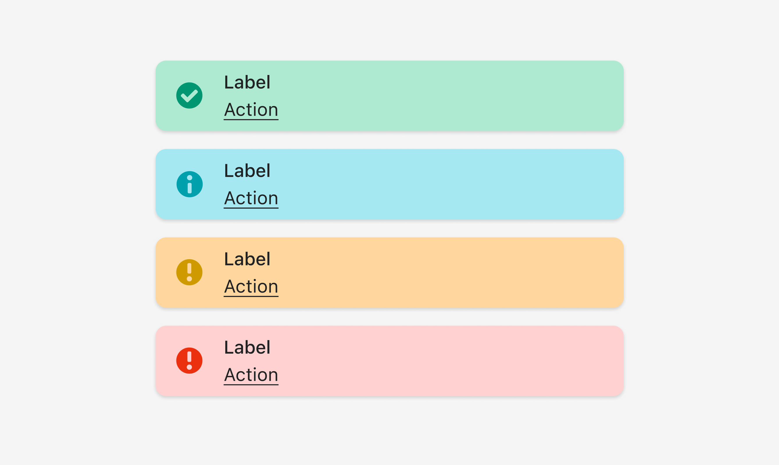
- Anchor to tonetone'info' | 'success' | 'warning' | 'critical'
Sets the tone of the Banner, based on the intention of the information being conveyed.
Was this section helpful?
Anchor to slotsSlots
- Anchor to primary-actionprimary-actionHTMLElement
The action taken when the Banner is pressed.
Was this section helpful?
Code
<s-banner heading="Label" tone="success">
  <s-button slot="primary-action">Action</s-button>
</s-banner>

<s-banner heading="Label" tone="info">
  <s-button slot="primary-action">Action</s-button>
</s-banner>

<s-banner heading="Label" tone="warning">
  <s-button slot="primary-action">Action</s-button>
</s-banner>

<s-banner heading="Label" tone="critical">
  <s-button slot="primary-action">Action</s-button>
</s-banner>
Examples
Code
Default
<s-banner heading="Label" tone="success"> <s-button slot="primary-action">Action</s-button> </s-banner> <s-banner heading="Label" tone="info"> <s-button slot="primary-action">Action</s-button> </s-banner> <s-banner heading="Label" tone="warning"> <s-button slot="primary-action">Action</s-button> </s-banner> <s-banner heading="Label" tone="critical"> <s-button slot="primary-action">Action</s-button> </s-banner>
Preview