Choice
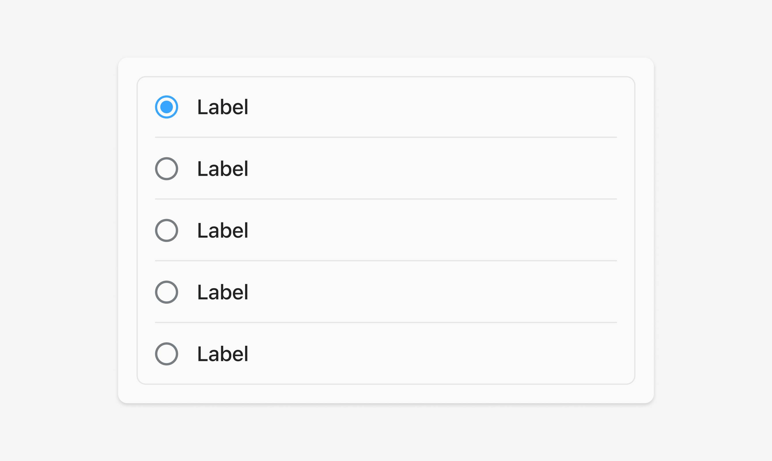
Use s-choice-list to group related choices together, allowing single or multiple selections. Provides a structured way to present options to users.
Anchor to propertiesProperties
- Anchor to multiplemultiplebooleanDefault: false
Whether multiple choices can be selected.
- Anchor to valuesvaluesstring[]
An array of the
values of the selected options.This is a convenience prop for setting the
selectedprop on child options.
Was this section helpful?
Anchor to eventsEvents
- Anchor to changechange(event: CallbackEvent<"s-divider">) => void
- Anchor to inputinput(event: CallbackEvent<"s-divider">) => void
CallbackEvent
- bubbles
boolean - cancelable
boolean - composed
boolean - currentTarget
HTMLElementTagNameMap[T] - detail
any - eventPhase
number - target
HTMLElementTagNameMap[T] | null
interface CallbackEvent<T extends keyof HTMLElementTagNameMap> {
  currentTarget: HTMLElementTagNameMap[T];
  bubbles?: boolean;
  cancelable?: boolean;
  composed?: boolean;
  detail?: any;
  eventPhase: number;
  target: HTMLElementTagNameMap[T] | null;
}
Was this section helpful?
Anchor to choiceChoice
Use s-choice to create individual selectable options within choice lists. Provides consistent styling and behavior for form selections.
- Anchor to disableddisabledbooleanDefault: false
Disables the control, disallowing any interaction.
- Anchor to selectedselectedbooleanDefault: false
Whether the control is active.
- Anchor to valuevaluestring
The value used in form data when the control is checked.
Was this section helpful?
Code
<s-choice-list>
  <s-choice value="small">Small</s-choice>
  <s-choice value="medium">Medium</s-choice>
  <s-choice value="large">Large</s-choice>
</s-choice-list>
Examples
Code
Default
<s-choice-list> <s-choice value="small">Small</s-choice> <s-choice value="medium">Medium</s-choice> <s-choice value="large">Large</s-choice> </s-choice-list>
Preview