Date
Use s-date-field to capture date input from users. Provides a consistent interface for date selection with proper validation.
Anchor to propertiesProperties
- Anchor to detailsdetailsstring
Additional text to provide context or guidance for the field. This text is displayed along with the field and its label to offer more information or instructions to the user.
This will also be exposed to screen reader users.
- Anchor to disableddisabledbooleanDefault: false
Disables the field, disallowing any interaction.
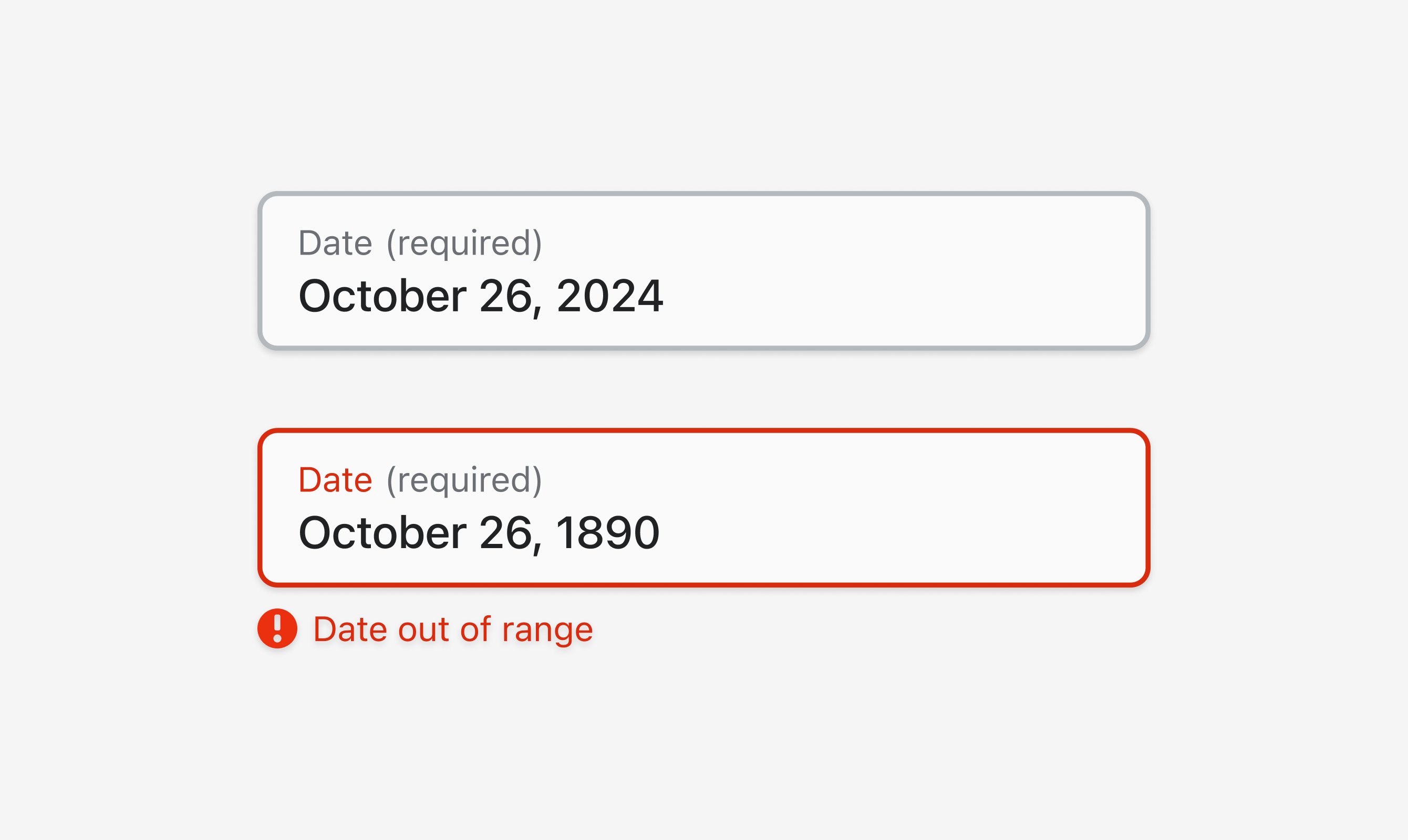
- Anchor to errorerrorstring
Indicate an error to the user. The field will be given a specific stylistic treatment to communicate problems that have to be resolved immediately.
- Anchor to labellabelstring
Content to use as the field label.
- Anchor to valuevaluestring
The current value for the field. If omitted, the field will be empty.
Was this section helpful?
Anchor to slotsSlots
- Anchor to accessoryaccessoryHTMLElement
Was this section helpful?
Anchor to eventsEvents
- Anchor to blurblur(event: CallbackEvent<"s-divider">) => void
- Anchor to changechange(event: CallbackEvent<"s-divider">) => void
- Anchor to focusfocus(event: CallbackEvent<"s-divider">) => void
- Anchor to inputinput(event: CallbackEvent<"s-divider">) => void
CallbackEvent
- bubbles
boolean - cancelable
boolean - composed
boolean - currentTarget
HTMLElementTagNameMap[T] - detail
any - eventPhase
number - target
HTMLElementTagNameMap[T] | null
interface CallbackEvent<T extends keyof HTMLElementTagNameMap> {
  currentTarget: HTMLElementTagNameMap[T];
  bubbles?: boolean;
  cancelable?: boolean;
  composed?: boolean;
  detail?: any;
  eventPhase: number;
  target: HTMLElementTagNameMap[T] | null;
}
Was this section helpful?
Code
<s-date-field
  label="Date"
  required
  value="2024-10-26"
  details="Select a date">
</s-date-field>

<s-date-field
  label="Date"
  required
  value="1890-10-26"
  error="Date out of range"
  details="Select a date">
</s-date-field>
Examples
Code
Default
<s-date-field label="Date" required value="2024-10-26" details="Select a date"> </s-date-field> <s-date-field label="Date" required value="1890-10-26" error="Date out of range" details="Select a date"> </s-date-field>
Preview