Date
Allow users to select a specific date.
Anchor to propertiesProperties
- string
A unique identifier for the element.
- Anchor to valuevaluestringDefault: ""
Current selected value.
The default means no date is selected.
If the provided value is invalid, no date is selected.
Otherwise:
- If
type="single", this is a date informat. - If
type="multiple", this is a comma-separated list of dates informat. - If
type="range", this is a range informat. The range is inclusive.
- If
Was this section helpful?
Anchor to eventsEvents
- Anchor to blurblur(event: CallbackEvent<"s-divider">) => void
- Anchor to changechange(event: CallbackEvent<"s-divider">) => void
- Anchor to focusfocus(event: CallbackEvent<"s-divider">) => void
- Anchor to inputinput(event: CallbackEvent<"s-divider">) => void
CallbackEvent
- bubbles
boolean - cancelable
boolean - composed
boolean - currentTarget
HTMLElementTagNameMap[T] - detail
any - eventPhase
number - target
HTMLElementTagNameMap[T] | null
interface CallbackEvent<T extends keyof HTMLElementTagNameMap> {
  currentTarget: HTMLElementTagNameMap[T];
  bubbles?: boolean;
  cancelable?: boolean;
  composed?: boolean;
  detail?: any;
  eventPhase: number;
  target: HTMLElementTagNameMap[T] | null;
}
Was this section helpful?
Code
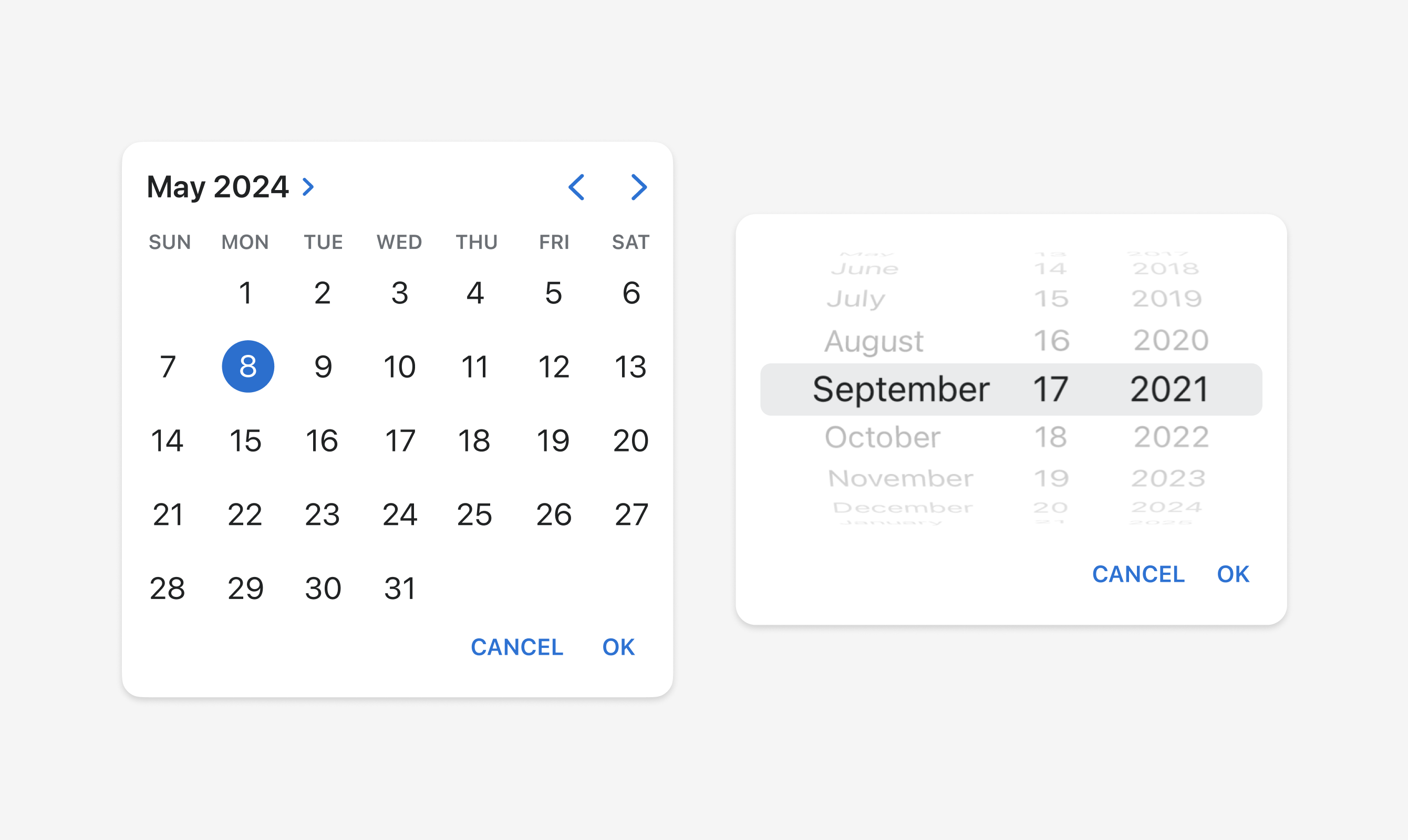
<s-button command="--show" commandFor="date-picker">
  Show
</s-button>
<s-date-picker
  id="date-picker"
  value="2024-05-08"
  onChange={onDateChange}
/>
Examples
Code
Default
<s-button command="--show" commandFor="date-picker"> Show </s-button> <s-date-picker id="date-picker" value="2024-05-08" onChange={onDateChange} />
Preview