Email
Use s-email-field to capture email addresses from users. Provides built-in email validation and appropriate keyboard layout.
Anchor to propertiesProperties
- Anchor to detailsdetailsstring
Additional text to provide context or guidance for the field. This text is displayed along with the field and its label to offer more information or instructions to the user.
This will also be exposed to screen reader users.
- Anchor to disableddisabledbooleanDefault: false
Disables the field, disallowing any interaction.
- Anchor to errorerrorstring
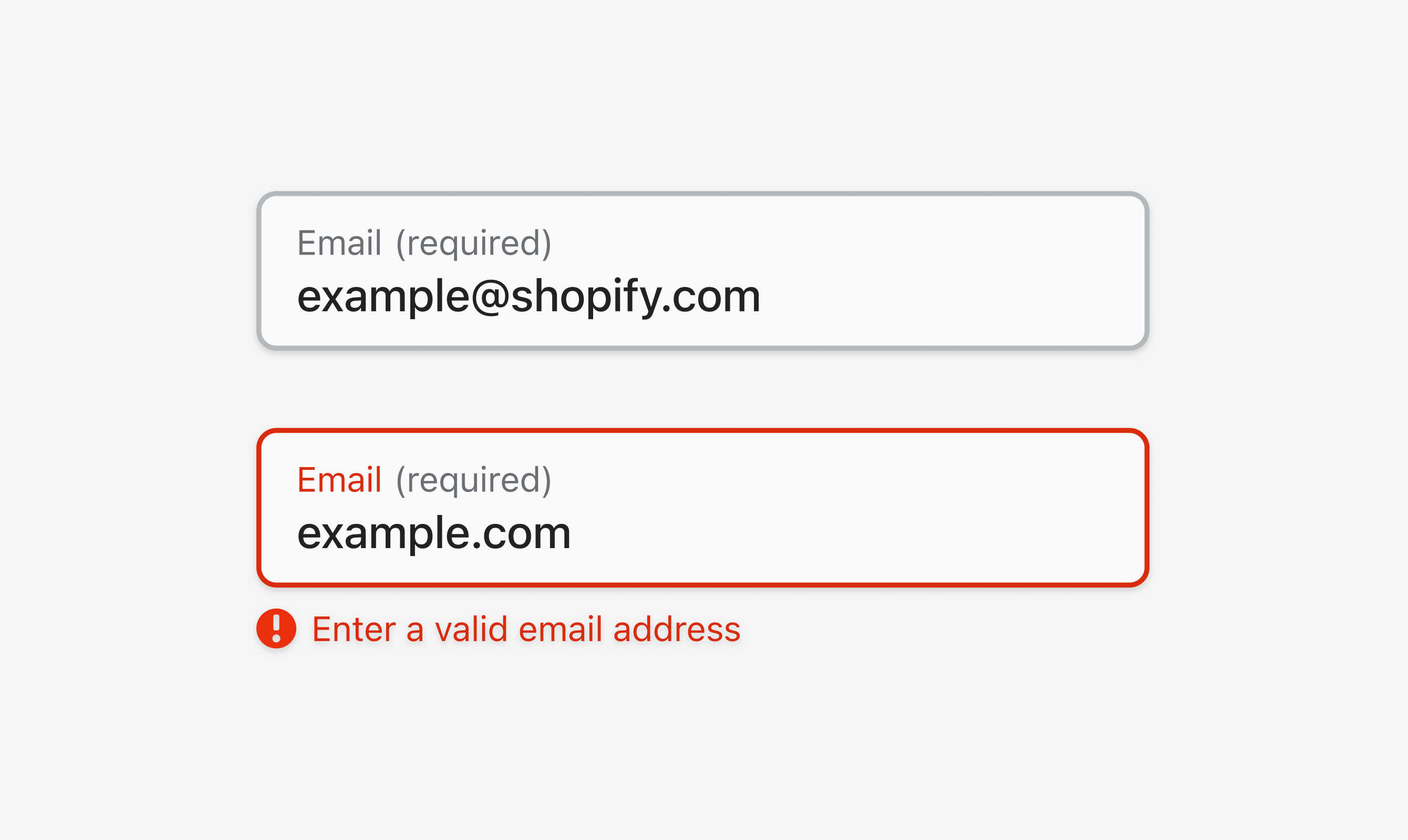
Indicate an error to the user. The field will be given a specific stylistic treatment to communicate problems that have to be resolved immediately.
- Anchor to labellabelstring
Content to use as the field label.
- Anchor to maxLengthmaxLengthnumberDefault: Infinity
Specifies the maximum number of characters allowed.
- Anchor to placeholderplaceholderstring
A short hint that describes the expected value of the field.
- Anchor to requiredrequiredbooleanDefault: false
Whether the field needs a value. This requirement adds semantic value to the field, but it will not cause an error to appear automatically. If you want to present an error when this field is empty, you can do so with the
errorproperty.- Anchor to valuevaluestring
The current value for the field. If omitted, the field will be empty.
Anchor to slotsSlots
- Anchor to accessoryaccessoryHTMLElement
Anchor to eventsEvents
- Anchor to blurblur(event: CallbackEvent<"s-divider">) => void
- Anchor to changechange(event: CallbackEvent<"s-divider">) => void
- Anchor to focusfocus(event: CallbackEvent<"s-divider">) => void
- Anchor to inputinput(event: CallbackEvent<"s-divider">) => void
CallbackEvent
- bubbles
boolean - cancelable
boolean - composed
boolean - currentTarget
HTMLElementTagNameMap[T] - detail
any - eventPhase
number - target
HTMLElementTagNameMap[T] | null
interface CallbackEvent<T extends keyof HTMLElementTagNameMap> {
  currentTarget: HTMLElementTagNameMap[T];
  bubbles?: boolean;
  cancelable?: boolean;
  composed?: boolean;
  detail?: any;
  eventPhase: number;
  target: HTMLElementTagNameMap[T] | null;
}Code
Examples
Code
Default
<s-email-field
  label="Email"
  placeholder="Enter your email"
  required
  value="example@shopify.com"></s-email-field>

<s-email-field
  label="Email"
  placeholder="Enter your email"
  required
  error="Enter a valid email address"
  value="example.com"></s-email-field>
Preview