Number
Use s-number-field to capture numeric input from users. Provides built-in number validation and appropriate keyboard layout for numeric entry.
Anchor to propertiesProperties
- Anchor to controlscontrols'auto' | 'stepper' | 'none'
Sets the type of controls displayed for the field.
stepper: displays buttons to increase or decrease the value of the field by the stepping interval defined in thestepproperty. Note that in POS adding stepper controls simplifies the behaviour of the Number Field itself. The field supports only integer values, is always-populated and automatically validates the value to be within the min and max bounds. Validation, label, details and placeholder are not supported when using Stepper controls.none: no controls are displayed and users must input the value manually.auto: the presence of the controls depends on the surface and context.
- Anchor to detailsdetailsstring
Additional text to provide context or guidance for the field. This text is displayed along with the field and its label to offer more information or instructions to the user.
This will also be exposed to screen reader users.
Details are not supported when using Stepper controls
- Anchor to disableddisabledbooleanDefault: false
Disables the field, disallowing any interaction.
- Anchor to errorerrorstring
Indicate an error to the user. The field will be given a specific stylistic treatment to communicate problems that have to be resolved immediately.
Error is not supported when using Stepper controls
- Anchor to inputModeinputMode'decimal' | 'numeric'Default: 'decimal'
Sets the virtual keyboard.
Input mode is not supported when using Stepper controls
- Anchor to labellabelstring
Content to use as the field label.
Label is not supported when using Stepper controls
- numberDefault: Infinity
The highest decimal or integer to be accepted for the field. When used with
stepthe value will round down to the max number.Note: a user will still be able to use the keyboard to input a number higher than the max. It is up to the developer to add appropriate validation.
- numberDefault: -Infinity
The lowest decimal or integer to be accepted for the field. When used with
stepthe value will round up to the min number.Note: a user will still be able to use the keyboard to input a number lower than the min. It is up to the developer to add appropriate validation.
- Anchor to placeholderplaceholderstring
A short hint that describes the expected value of the field.
Placeholder text is not supported when using Stepper controls due to constrained space for the number field, especially on phones.
- Anchor to requiredrequiredbooleanDefault: false Required is not supported when using Stepper controls
Whether the field needs a value. This requirement adds semantic value to the field, but it will not cause an error to appear automatically. If you want to present an error when this field is empty, you can do so with the
errorproperty.- Anchor to valuevaluestring
The current value for the field. If omitted, the field will be empty.
Anchor to slotsSlots
- Anchor to accessoryaccessoryHTMLElement
Additional content to be displayed in the field. Commonly used to display an icon that activates a tooltip providing more information.
Accessory is not supported when using Stepper controls
Anchor to eventsEvents
- Anchor to blurblur(event: CallbackEvent<"s-divider">) => void
- Anchor to changechange(event: CallbackEvent<"s-divider">) => void
- Anchor to focusfocus(event: CallbackEvent<"s-divider">) => void
- Anchor to inputinput(event: CallbackEvent<"s-divider">) => void
CallbackEvent
- bubbles
boolean - cancelable
boolean - composed
boolean - currentTarget
HTMLElementTagNameMap[T] - detail
any - eventPhase
number - target
HTMLElementTagNameMap[T] | null
interface CallbackEvent<T extends keyof HTMLElementTagNameMap> {
  currentTarget: HTMLElementTagNameMap[T];
  bubbles?: boolean;
  cancelable?: boolean;
  composed?: boolean;
  detail?: any;
  eventPhase: number;
  target: HTMLElementTagNameMap[T] | null;
}Code
Examples
Code
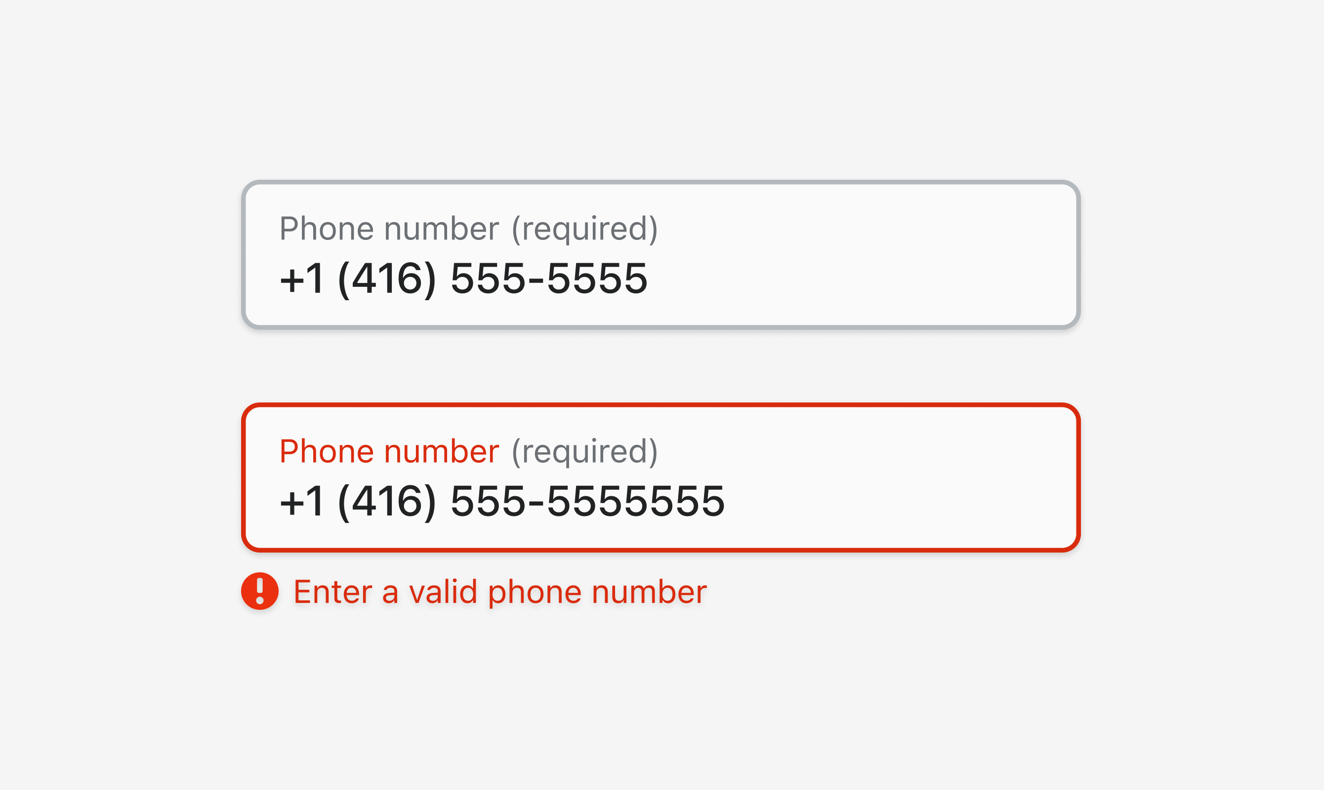
Default
<s-number-field label="Phone number" required value="+1 (416) 555-5555"></s-number-field>
<s-number-field label="Phone number" required value="+1 (416) 555-5555555" error="Enter a valid phone number"></s-number-field>
Preview