Modal
Use s-modal to display content in an overlay. Modals are used to display important information that requires the merchant's attention.
Anchor to propertiesProperties
- Anchor to headingheadingstring
A title that describes the content of the Modal.
- string
A unique identifier for the element.
Was this section helpful?
Anchor to slotsSlots
- Anchor to primary-actionprimary-actionHTMLElement
- Anchor to secondary-actionssecondary-actionsHTMLElement
Was this section helpful?
Anchor to eventsEvents
- Anchor to hidehide(event: CallbackEvent<"s-divider">) => void
- Anchor to showshow(event: CallbackEvent<"s-divider">) => void
CallbackEvent
- bubbles
boolean - cancelable
boolean - composed
boolean - currentTarget
HTMLElementTagNameMap[T] - detail
any - eventPhase
number - target
HTMLElementTagNameMap[T] | null
interface CallbackEvent<T extends keyof HTMLElementTagNameMap> {
  currentTarget: HTMLElementTagNameMap[T];
  bubbles?: boolean;
  cancelable?: boolean;
  composed?: boolean;
  detail?: any;
  eventPhase: number;
  target: HTMLElementTagNameMap[T] | null;
}
Was this section helpful?
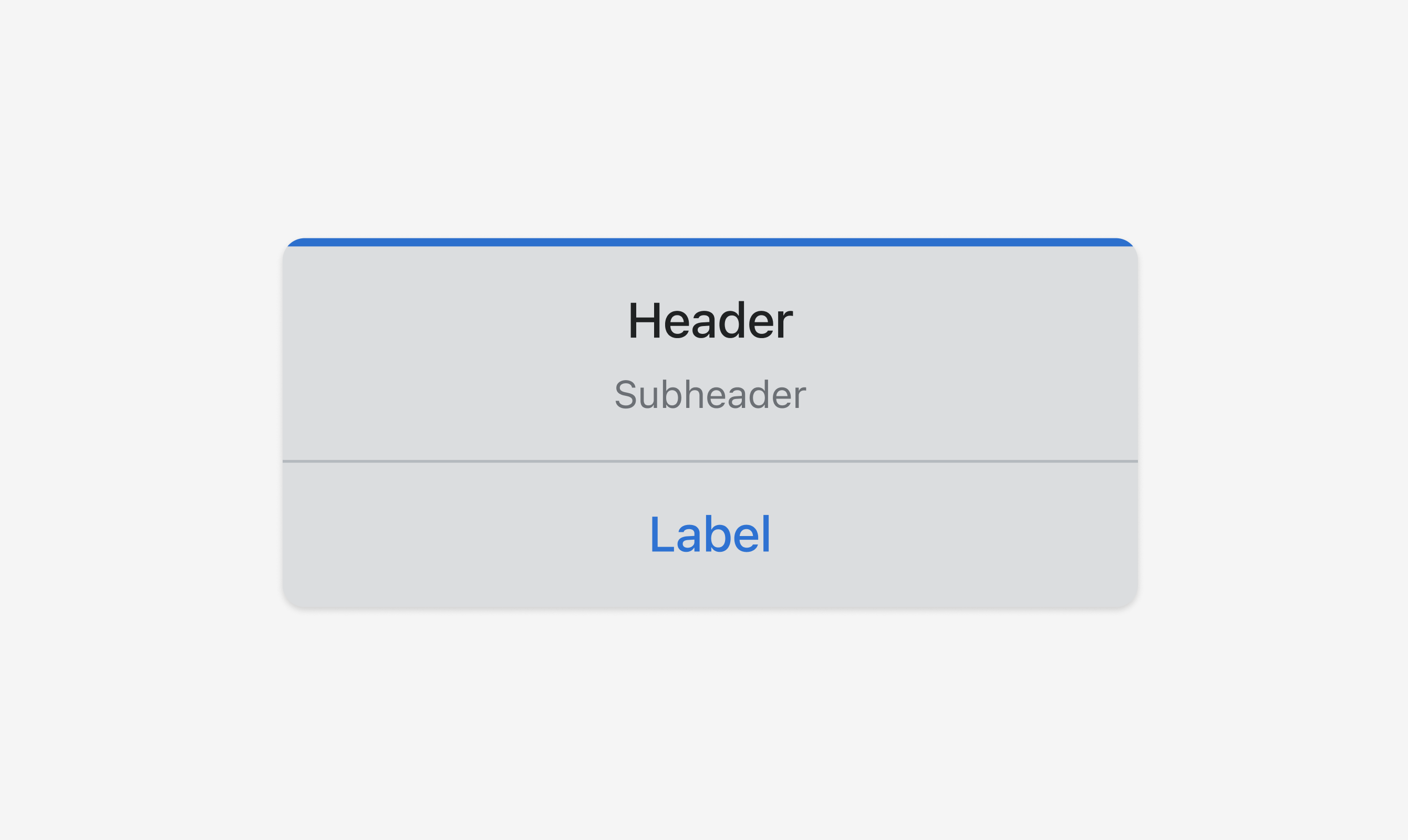
Code
<s-button command="--show" commandFor="modal">Open modal</s-button>
<s-modal id="modal" heading="Header">
  <s-stack alignItems="center" justifyContent="center" gap="base">
    <s-text color="subdued">Subheader</s-text>
  </s-stack>
  <s-button slot="primary-action" onClick={handlePrimaryAction}>
    Label
  </s-button>
</s-modal>
Examples
Code
Default
<s-button command="--show" commandFor="modal">Open modal</s-button> <s-modal id="modal" heading="Header"> <s-stack alignItems="center" justifyContent="center" gap="base"> <s-text color="subdued">Subheader</s-text> </s-stack> <s-button slot="primary-action" onClick={handlePrimaryAction}> Label </s-button> </s-modal>
Preview