Pos
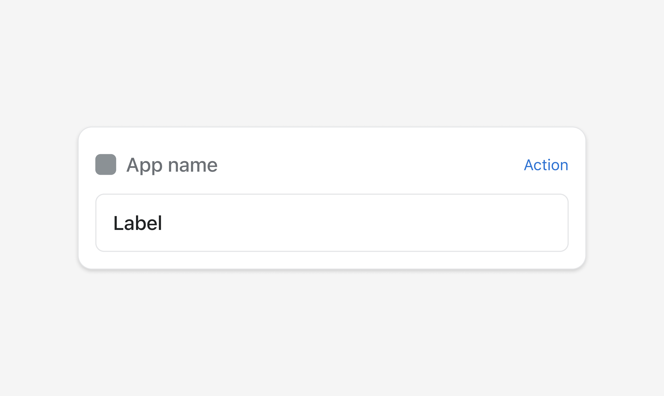
Use s-pos-block to create a surface on the specified block extension target, serving as a container to place content with an action button.
Anchor to propertiesProperties
- Anchor to headingheadingstringDefault: undefined
Adds title text displayed at the top left of the section
Mobile surfaces: Uses the standard POS Design System heading style for a section (not h2).
Was this section helpful?
Anchor to slotsSlots
- Anchor to secondary-actionssecondary-actionsHTMLElement
Was this section helpful?
Code
<s-pos-block>
  <s-button
    slot="secondary-actions"
    onClick={onActionClick}
  >
    Action
  </s-button>
  <s-box padding="base">
    <s-text>Label</s-text>
  </s-box>
</s-pos-block>
Examples
Code
Default
<s-pos-block> <s-button slot="secondary-actions" onClick={onActionClick} > Action </s-button> <s-box padding="base"> <s-text>Label</s-text> </s-box> </s-pos-block>
Preview