Section
Groups related content into clearly-defined thematic areas. Sections have contextual heading levels to maintain a meaningful and accessible page structure.
Anchor to propertiesProperties
- Anchor to headingheadingstringDefault: undefined
Adds title text displayed at the top left of the section
Mobile surfaces: Uses the standard POS Design System heading style for a section (not h2).
Was this section helpful?
Code
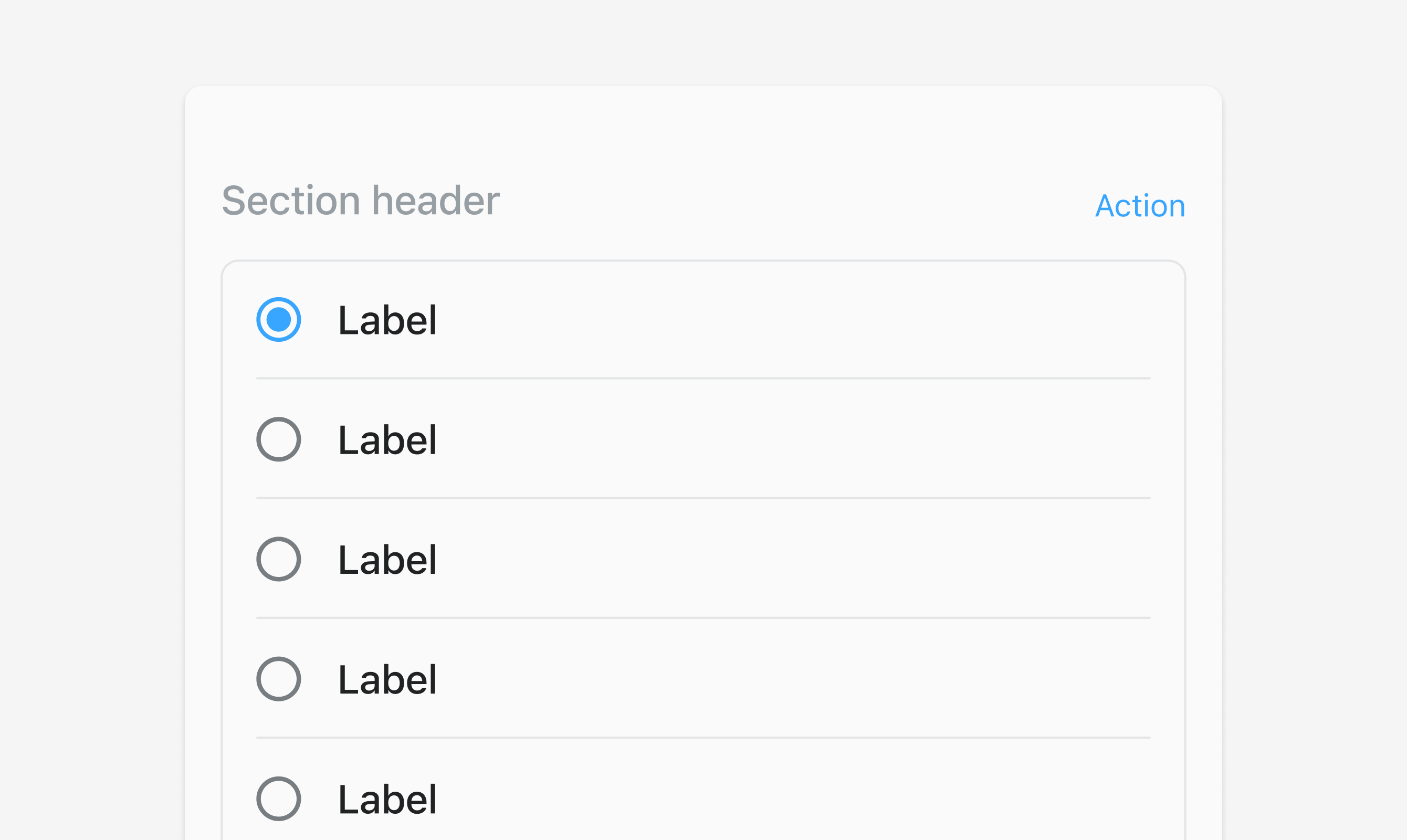
<s-section heading="Section header">
  <s-button slot="secondary-actions" onClick={onActionClick}>
    Action
  </s-button>
  <s-choice-list>
    {data.map((item) => (
      <s-choice value={item.value}>{item.label}</s-choice>
    ))}
  </s-choice-list>
</s-section>
Examples
Code
Default
<s-section heading="Section header"> <s-button slot="secondary-actions" onClick={onActionClick}> Action </s-button> <s-choice-list> {data.map((item) => ( <s-choice value={item.value}>{item.label}</s-choice> ))} </s-choice-list> </s-section>
Preview