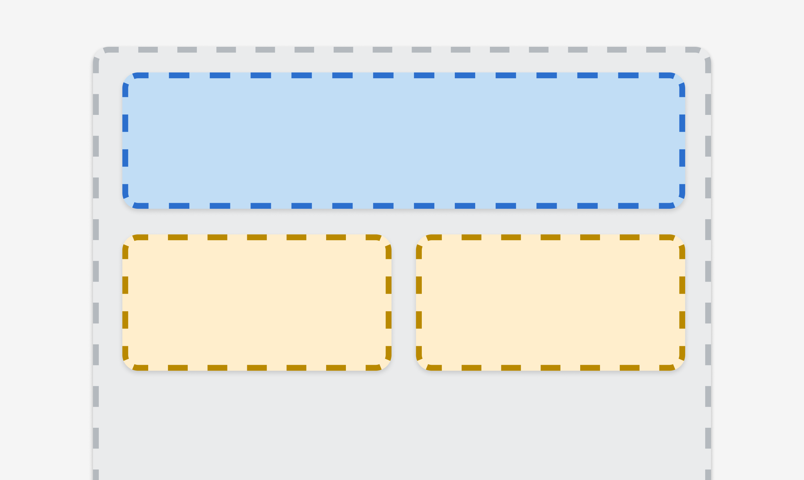
Stack
Organizes elements horizontally or vertically along the block or inline axis. Use to structure layouts, group related components, or control spacing between elements.
Anchor to propertiesProperties
- Anchor to alignContentalignContentMaybeResponsive<AlignContentKeyword>Default: 'normal'
Aligns the Stack along the cross axis.
- Anchor to alignItemsalignItemsMaybeResponsive<AlignItemsKeyword>Default: 'normal'
Aligns the Stack's children along the cross axis.
- Anchor to blockSizeblockSizeMaybeResponsive<SizeUnitsOrAuto>Default: 'auto'
Adjust the block size. Mobile surfaces: Avoid using percentage-based sizes. They do not behave as expected when placed within a scrollable container.
- Anchor to columnGapcolumnGapMaybeResponsive<'' | SpacingKeyword>Default: '' - meaning no override
Adjust spacing between elements in the inline axis.
This overrides the column value of
gap.- Anchor to directiondirectionMaybeResponsive<'block' | 'inline'>Default: 'block'
Sets how the children are placed within the Stack. This uses logical properties.
- MaybeResponsive<MaybeTwoValuesShorthandProperty<SpacingKeyword>>Default: 'none'
Adjust spacing between elements.
A single value applies to both axes. A pair of values (eg
large-100 large-500) can be used to set the inline and block axes respectively.- Anchor to inlineSizeinlineSizeMaybeResponsive<SizeUnitsOrAuto>Default: 'auto'
Adjust the inline size.
- Anchor to justifyContentjustifyContentMaybeResponsive<JustifyContentKeyword>Default: 'normal'
Aligns the Stack along the main axis.
- Anchor to maxBlockSizemaxBlockSizeMaybeResponsive<SizeUnitsOrNone>Default: 'none'
Adjust the maximum block size. Mobile surfaces: Avoid using percentage-based sizes. They do not behave as expected when placed within a scrollable container.
- Anchor to maxInlineSizemaxInlineSizeMaybeResponsive<SizeUnitsOrNone>Default: 'none'
Adjust the maximum inline size. Mobile surfaces: Avoid using percentage-based sizes. They do not behave as expected when placed within a scrollable container.
- Anchor to minBlockSizeminBlockSizeMaybeResponsive<SizeUnits>Default: '0'
Adjust the minimum block size. Mobile surfaces: Avoid using percentage-based sizes. They do not behave as expected when placed within a scrollable container.
- Anchor to minInlineSizeminInlineSizeMaybeResponsive<SizeUnits>Default: '0'
Adjust the minimum inline size. Mobile surfaces: Avoid using percentage-based sizes. They do not behave as expected when placed within a scrollable container.
- Anchor to paddingpaddingMaybeAllValuesShorthandProperty<PaddingKeyword>Default: 'none'
Adjust the padding of all edges.
1-to-4-value syntax is supported. Note that, contrary to the CSS, it uses flow-relative values and the order is:
- 4 values:
block-start inline-end block-end inline-start - 3 values:
block-start inline block-end - 2 values:
block inline
For example:
largemeans block-start, inline-end, block-end and inline-start paddings arelarge.large nonemeans block-start and block-end paddings arelarge, inline-start and inline-end paddings arenone.large none largemeans block-start padding islarge, inline-end padding isnone, block-end padding islargeand inline-start padding isnone.large none large smallmeans block-start padding islarge, inline-end padding isnone, block-end padding islargeand inline-start padding issmall.
A padding value of
autowill use the default padding for the closest container that has had its usual padding removed.- 4 values:
- Anchor to paddingBlockpaddingBlockMaybeTwoValuesShorthandProperty<'' | PaddingKeyword>Default: '' - meaning no override
Adjust the block-padding.
large nonemeans block-start padding islarge, block-end padding isnone.
This overrides the block value of
padding.- Anchor to paddingBlockEndpaddingBlockEnd'' | PaddingKeywordDefault: '' - meaning no override
Adjust the block-end padding.
This overrides the block-end value of
.- Anchor to paddingBlockStartpaddingBlockStart'' | PaddingKeywordDefault: '' - meaning no override
Adjust the block-start padding.
This overrides the block-start value of
.- Anchor to paddingInlinepaddingInlineMaybeTwoValuesShorthandProperty<'' | PaddingKeyword>Default: '' - meaning no override
Adjust the inline padding.
large nonemeans inline-start padding islarge, inline-end padding isnone.
This overrides the inline value of
padding.- Anchor to paddingInlineEndpaddingInlineEnd'' | PaddingKeywordDefault: '' - meaning no override
Adjust the inline-end padding.
This overrides the inline-end value of
.- Anchor to paddingInlineStartpaddingInlineStart'' | PaddingKeywordDefault: '' - meaning no override
Adjust the inline-start padding.
This overrides the inline-start value of
.- Anchor to rowGaprowGapMaybeResponsive<'' | SpacingKeyword>Default: '' - meaning no override
Adjust spacing between elements in the block axis.
This overrides the row value of
gap.
MaybeResponsive
T | `@container${string}`AlignContentKeyword
Align content sets the distribution of space between and around content items along a flexbox's cross axis, or a grid or block-level element's block axis.
'normal' | BaselinePosition | ContentDistribution | OverflowPosition | ContentPositionBaselinePosition
'baseline' | 'first baseline' | 'last baseline'ContentDistribution
'space-between' | 'space-around' | 'space-evenly' | 'stretch'OverflowPosition
`unsafe ${ContentPosition}` | `safe ${ContentPosition}`ContentPosition
'center' | 'start' | 'end'AlignItemsKeyword
Align items sets the align-self value on all direct children as a group.
'normal' | 'stretch' | BaselinePosition | OverflowPosition | ContentPositionSizeUnitsOrAuto
SizeUnits | 'auto'SizeUnits
`${number}px` | `${number}%` | `0`SpacingKeyword
SizeKeyword | 'none'SizeKeyword
'small-500' | 'small-400' | 'small-300' | 'small-200' | 'small-100' | 'small' | 'base' | 'large' | 'large-100' | 'large-200' | 'large-300' | 'large-400' | 'large-500'MaybeTwoValuesShorthandProperty
T | `${T} ${T}`JustifyContentKeyword
Justify content defines how the browser distributes space between and around content items along the main-axis of a flex container, and the inline axis of a grid container.
'normal' | ContentDistribution | OverflowPosition | ContentPositionSizeUnitsOrNone
SizeUnits | 'none'MaybeAllValuesShorthandProperty
T | `${T} ${T}` | `${T} ${T} ${T}` | `${T} ${T} ${T} ${T}`PaddingKeyword
SizeKeyword | 'none'Code
Examples
Code
Default
<s-stack>
  <s-text>First item</s-text>
  <s-text>Second item</s-text>
</s-stack>
Preview