Cardcomponent
component
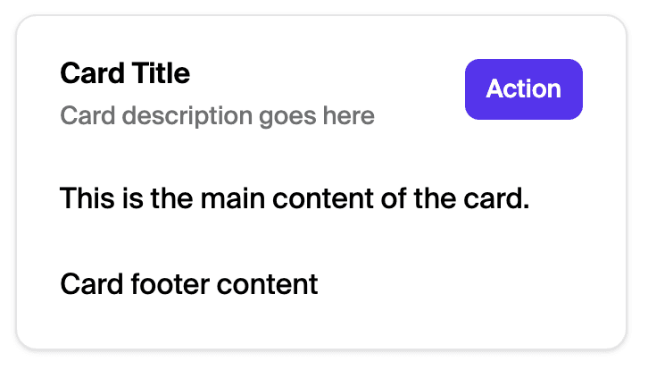
A composable component with header, content, and footer sections for displaying grouped information. You can view the Storybook for more interactive examples.
Was this section helpful?
Card
import {Card, CardHeader, CardFooter, CardTitle, CardDescription, CardContent} from '@shopify/shop-minis-react'

export default function MyComponent() {
  return (
    <Card>
      <CardHeader>
        <CardTitle>Card Title</CardTitle>
        <CardDescription>Card description goes here</CardDescription>
      </CardHeader>
      <CardContent>
        <p>This is the main content of the card.</p>
      </CardContent>
      <CardFooter>
        <p>Card footer content</p>
      </CardFooter>
    </Card>
  )
}
examples
Card
import {Card, CardHeader, CardFooter, CardTitle, CardDescription, CardContent} from '@shopify/shop-minis-react'

export default function MyComponent() {
  return (
    <Card>
      <CardHeader>
        <CardTitle>Card Title</CardTitle>
        <CardDescription>Card description goes here</CardDescription>
      </CardHeader>
      <CardContent>
        <p>This is the main content of the card.</p>
      </CardContent>
      <CardFooter>
        <p>Card footer content</p>
      </CardFooter>
    </Card>
  )
}
Preview

Anchor to examplesExamples
Card structure and components
Anchor to example-full-card-structureFull card structure
A complete card with header, content, and footer sections
Was this section helpful?
Full card structure
import {Card, CardHeader, CardFooter, CardTitle, CardDescription, CardContent} from '@shopify/shop-minis-react'
export default function MyComponent() {
return (
<Card>
<CardHeader>
<CardTitle>Card Title</CardTitle>
<CardDescription>Card description goes here</CardDescription>
</CardHeader>
<CardContent>
<p>This is the main content of the card.</p>
</CardContent>
<CardFooter>
<p>Card footer content</p>
</CardFooter>
</Card>
)
}
examples
Full card structure
description
A complete card with header, content, and footer sections
import {Card, CardHeader, CardFooter, CardTitle, CardDescription, CardContent} from '@shopify/shop-minis-react' export default function MyComponent() { return ( <Card> <CardHeader> <CardTitle>Card Title</CardTitle> <CardDescription>Card description goes here</CardDescription> </CardHeader> <CardContent> <p>This is the main content of the card.</p> </CardContent> <CardFooter> <p>Card footer content</p> </CardFooter> </Card> ) }