Button
ButtonGroup is used to display multiple buttons in a layout that is contextual based on the screen width or parent component. When there is more than one secondary action, they get collapsed.
When used within a Section component, the buttons will fill the width of the section.
Anchor to propertiesProperties
- Anchor to accessibilityLabelaccessibilityLabelstring
Label for the button group that describes the content of the group for screen reader users to understand what's included.
- string
A unique identifier for the element.
Anchor to slotsSlots
- Anchor to primary-actionprimary-actionHTMLElement
The primary action for the group. Accepts a single Button element.
- Anchor to secondary-actionssecondary-actionsHTMLElement
The secondary actions for the group. Accepts multiple Button elements.
Code
Examples
Code
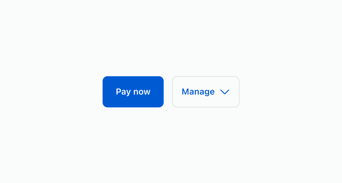
Default
<s-button-group>
  <s-button slot="primary-action" variant="primary">
    Pay now
  </s-button>
  <s-button slot="secondary-actions" variant="secondary">
    Edit order
  </s-button>
  <s-button slot="secondary-actions" variant="secondary">
    Cancel order
  </s-button>
</s-button-group>
Preview
Anchor to best-practicesBest practices
Use these best practices to deliver a clear and accessible experience in your extensions.
Prioritize and group related actions
Cluster actions by purpose and place the most important or common action first to set a clear default.
Use a single primary action
Reserve the primary style for one action only. Keep all other actions secondary to reinforce hierarchy.
Reduce clutter in secondary options
Limit the number of secondary actions and collapse extras into menus or overflow to keep the interface clean.
Write short, scannable labels
Use verbs and nouns in sentence cases. For example, “Edit address”. Keep styling consistent across actions.
Support accessibility and responsiveness
Provide an accessible label for the group and ensure the layout adapts well across screen sizes.