Customer
A modal to complete an order action flow. This component can only be used to populate the customer-account.order.action.render extension target, which renders as a result of the customer clicking the order action button rendered via the customer-account.order.action.menu-item.render extension target.
Anchor to propertiesProperties
- Anchor to headingheadingstringrequired
Sets the heading of the action container.
- string
A unique identifier for the element.
Anchor to slotsSlots
- Anchor to primary-actionprimary-actionHTMLElement
The primary action for the page. Accepts a single Button element with restricted properties (see below).
- Anchor to secondary-actionssecondary-actionsHTMLElement
The secondary actions for the page. Accepts multiple Button elements with restricted properties (see below).
Supported props for Buttons used inside CustomerAccountAction slots.children only support text.
- string
A label that describes the purpose or contents of the Button. It will be read to users using assistive technologies such as screen readers.
Use this when using only an icon or the button text is not enough context for users using assistive technologies.
- ((event: CallbackEventListener<typeof buttonTagName>) => void) | null
Callback when the button is activated. This will be called before the action indicated by
type.- '--auto' | '--show' | '--hide' | '--toggle' | '--copy'Default: '--auto'
Sets the action the
should take when this clickable is activated.See the documentation of particular components for the actions they support.
--auto: a default action for the target component.--show: shows the target component.--hide: hides the target component.--toggle: toggles the target component.--copy: copies the target ClipboardItem.
- string
ID of a component that should respond to activations (e.g. clicks) on this component.
See
commandfor how to control the behavior of the target.- booleanDefault: false
Disables the button, disallowing any interaction.
- string
The URL to link to.
- If set, it will navigate to the location specified by
hrefafter executing thecallback. - If a
is set, thecommandwill be executed instead of the navigation.
- If set, it will navigate to the location specified by
- booleanDefault: false
Replaces content with a loading indicator.
CallbackEventListener
(EventListener & {
      (event: CallbackEvent<TTagName, TEvent>): void;
    }) | null
CallbackEvent
TEvent & {
  currentTarget: HTMLElementTagNameMap[TTagName];
}
Code
Examples
Code
Default
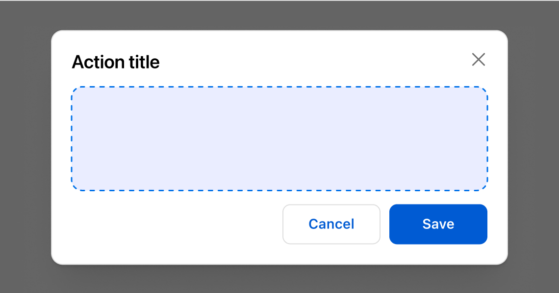
<s-customer-account-action heading="Action title">
  Modal content
  <s-button slot="primary-action">
    Save
  </s-button>
  <s-button slot="secondary-actions">
    Cancel
  </s-button>
</s-customer-account-action>
Preview
Anchor to best-practicesBest practices
Use these best practices to deliver a clear and accessible experience in your extensions.
Highlight the key decision
Use the component to present the essential details and actions needed to confirm or complete an order task.
Collect only what’s necessary
Request the minimum information required to finish the customer’s job so the flow stays quick and friction‑free.
Keep forms simple and predictable
Use clear labels, intuitive actions, and concise copy so customers know what’s required and what happens next.
Choose a full‑page extension for complex flows
If the task spans multiple steps or needs a lot of input, switch to a full‑page extension instead of a modal.
Refer to Polaris guidance
Refer to Polaris for additional best practices and content guidelines when designing modals.