Image
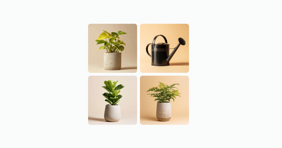
Display up to 4 images in a grid or stacked layout. The images are displayed as a grid when used within a Section component. For example, images of products in a wishlist or subscription. When there are more than 4 images, the component indicates how many more images are not displayed.
Anchor to propertiesProperties
- string
A unique identifier for the element.
- Anchor to totalItemstotalItemsnumber
Indicates the total number of items that could be displayed in the image group. It is used to determine the remaining number to show when all the available image slots have been filled.
Code
Examples
Code
Default
<s-image-group>
  <s-image
    src="https://cdn.shopify.com/YOUR_IMAGE_HERE"
    alt="Product image"
  ></s-image>
  <s-image
    src="https://cdn.shopify.com/YOUR_IMAGE_HERE"
    alt="Product image"
  ></s-image>
  <s-image
    src="https://cdn.shopify.com/YOUR_IMAGE_HERE"
    alt="Product image"
  ></s-image>
  <s-image
    src="https://cdn.shopify.com/YOUR_IMAGE_HERE"
    alt="Product image"
  ></s-image>
</s-image-group>
Preview
Anchor to best-practicesBest practices
Use these best practices to deliver a clear and accessible experience in your extensions.
Write concise alt text for each image
Describe what’s important about each image so all users can understand the content.
Optimize performance
Compress images and use modern formats; consider lazy loading to reduce initial load times.
Preserve visual breathing room
Maintain consistent spacing around the group so images don’t feel crowded or overwhelming.