Inline
Use this to organize layout elements along the horizontal axis of the page. It's great for horizontal alignment.
Anchor to inlinestackpropsInlineStackProps
- Anchor to accessibilityLabelaccessibilityLabelstring
A label that describes the purpose or contents of the element. When set, it will be announced to buyers using assistive technologies and will provide them with more context.
- Anchor to inlineAlignmentinlineAlignmentDefault: 'start'
Position children along the main axis
- Anchor to blockAlignmentblockAlignmentDefault: 'start'
Position children along the cross axis
- Anchor to accessibilityRoleaccessibilityRoleDefault: 'generic'
Sets the semantic meaning of the component’s content. When set, the role will be used by assistive technologies to help users navigate the page.
- < | boolean>
Adjust spacing between children
- Anchor to blockGapblockGapboolean |
Adjust spacing between elements in the block axis.
Alias for
- Anchor to inlineGapinlineGapboolean |
Adjust spacing between elements in the inline axis.
Alias for
- Anchor to rowGaprowGapboolean |
Adjust spacing between children in the block axis
- Anchor to columnGapcolumnGapboolean |
Adjust spacing between children in the inline axis
- string
A unique identifier for the element.
- Anchor to blockSizeblockSizenumber | `${number}%`
Adjust the block size.
number: size in pixels.`${number}%`: size in percentages of the available space.
- Anchor to minBlockSizeminBlockSizenumber | `${number}%`
Adjust the minimum block size.
number: size in pixels.`${number}%`: size in percentages of the available space.
- Anchor to maxBlockSizemaxBlockSizenumber | `${number}%`
Adjust the maximum block size.
number: size in pixels.`${number}%`: size in percentages of the available space.
- Anchor to inlineSizeinlineSizenumber | `${number}%`
Adjust the inline size.
number: size in pixels.`${number}%`: size in percentages of the available space.
- Anchor to minInlineSizeminInlineSizenumber | `${number}%`
Adjust the minimum inline size.
number: size in pixels.`${number}%`: size in percentages of the available space.
- Anchor to maxInlineSizemaxInlineSizenumber | `${number}%`
Adjust the maximum inline size.
number: size in pixels.`${number}%`: size in percentages of the available space.
- Anchor to paddingpadding< | boolean>
Adjust the padding.
To shorten the code, it is possible to specify all the padding for all edges of the box in one property.
basemeans block-start, inline-end, block-end and inline-start paddings arebase.base nonemeans block-start and block-end paddings arebase, inline-start and inline-end paddings arenone.base none largemeans block-start padding isbase, inline-end padding isnone, block-end padding islargeand inline-start padding isnone.base none large smallmeans block-start padding isbase, inline-end padding isnone, block-end padding islargeand inline-start padding issmall.trueapplies a default padding that is appropriate for the component.
Learn more about the 1-to-4-value syntax at https://developer.mozilla.org/en-US/docs/Web/CSS/Shorthand_properties#edges_of_a_box
- Anchor to paddingBlockpaddingBlock< | boolean>
Adjust the block-padding.
base nonemeans block-start padding isbase, block-end padding isnone.
- Anchor to paddingBlockStartpaddingBlockStartboolean |
Adjust the block-start padding.
- Anchor to paddingBlockEndpaddingBlockEndboolean |
Adjust the block-end padding.
- Anchor to paddingInlinepaddingInline< | boolean>
Adjust the inline padding.
base nonemeans inline-start padding isbase, inline-end padding isnone.
- Anchor to paddingInlineStartpaddingInlineStartboolean |
Adjust the inline-start padding.
- Anchor to paddingInlineEndpaddingInlineEndboolean |
Adjust the inline-end padding.
InlineStackProps
- accessibilityLabel
A label that describes the purpose or contents of the element. When set, it will be announced to buyers using assistive technologies and will provide them with more context.
string - inlineAlignment
Position children along the main axis
MainAxisAlignment - blockAlignment
Position children along the cross axis
CrossAxisAlignment - accessibilityRole
Sets the semantic meaning of the component’s content. When set, the role will be used by assistive technologies to help users navigate the page.
AccessibilityRole - gap
Adjust spacing between children
MaybeTwoBoxEdgesShorthandProperty<SpacingKeyword | boolean> - blockGap
Adjust spacing between elements in the block axis. Alias for `rowGap`
boolean | SpacingKeyword - inlineGap
Adjust spacing between elements in the inline axis. Alias for `columnGap`
boolean | SpacingKeyword - rowGap
Adjust spacing between children in the block axis
boolean | SpacingKeyword - columnGap
Adjust spacing between children in the inline axis
boolean | SpacingKeyword - id
A unique identifier for the element.
string - blockSize
Adjust the block size. - `number`: size in pixels. - `` `${number}%` ``: size in percentages of the available space.
number | `${number}%` - minBlockSize
Adjust the minimum block size. - `number`: size in pixels. - `` `${number}%` ``: size in percentages of the available space.
number | `${number}%` - maxBlockSize
Adjust the maximum block size. - `number`: size in pixels. - `` `${number}%` ``: size in percentages of the available space.
number | `${number}%` - inlineSize
Adjust the inline size. - `number`: size in pixels. - `` `${number}%` ``: size in percentages of the available space.
number | `${number}%` - minInlineSize
Adjust the minimum inline size. - `number`: size in pixels. - `` `${number}%` ``: size in percentages of the available space.
number | `${number}%` - maxInlineSize
Adjust the maximum inline size. - `number`: size in pixels. - `` `${number}%` ``: size in percentages of the available space.
number | `${number}%` - padding
Adjust the padding. To shorten the code, it is possible to specify all the padding for all edges of the box in one property. - `base` means block-start, inline-end, block-end and inline-start paddings are `base`. - `base none` means block-start and block-end paddings are `base`, inline-start and inline-end paddings are `none`. - `base none large` means block-start padding is `base`, inline-end padding is `none`, block-end padding is `large` and inline-start padding is `none`. - `base none large small` means block-start padding is `base`, inline-end padding is `none`, block-end padding is `large` and inline-start padding is `small`. - `true` applies a default padding that is appropriate for the component. Learn more about the 1-to-4-value syntax at https://developer.mozilla.org/en-US/docs/Web/CSS/Shorthand_properties#edges_of_a_box
MaybeAllBoxEdgesShorthandProperty<SpacingKeyword | boolean> - paddingBlock
Adjust the block-padding. - `base none` means block-start padding is `base`, block-end padding is `none`.
MaybeTwoBoxEdgesShorthandProperty<SpacingKeyword | boolean> - paddingBlockStart
Adjust the block-start padding.
boolean | SpacingKeyword - paddingBlockEnd
Adjust the block-end padding.
boolean | SpacingKeyword - paddingInline
Adjust the inline padding. - `base none` means inline-start padding is `base`, inline-end padding is `none`.
MaybeTwoBoxEdgesShorthandProperty<SpacingKeyword | boolean> - paddingInlineStart
Adjust the inline-start padding.
boolean | SpacingKeyword - paddingInlineEnd
Adjust the inline-end padding.
boolean | SpacingKeyword
export interface InlineStackProps
  extends AccessibilityRoleProps,
    GapProps,
    GlobalProps,
    SizingProps,
    PaddingProps {
  /**
   * A label that describes the purpose or contents of the element. When set,
   * it will be announced to buyers using assistive technologies and will
   * provide them with more context.
   */
  accessibilityLabel?: string;

  /**
   * Position children along the main axis
   *
   * @defaultValue 'start'
   */
  inlineAlignment?: MainAxisAlignment;

  /**
   * Position children along the cross axis
   *
   * @defaultValue 'start'
   */
  blockAlignment?: CrossAxisAlignment;
}
MainAxisAlignment
'start' | 'center' | 'end' | 'space-between' | 'space-around' | 'space-evenly'CrossAxisAlignment
'start' | 'center' | 'end' | 'baseline'AccessibilityRole
'main' | 'header' | 'footer' | 'section' | 'aside' | 'navigation' | 'ordered-list' | 'list-item' | 'list-item-separator' | 'unordered-list' | 'separator' | 'status' | 'alert' | 'generic'MaybeTwoBoxEdgesShorthandProperty
T | `${T} ${T}`SpacingKeyword
'none' | 'small' | 'base' | 'large'MaybeAllBoxEdgesShorthandProperty
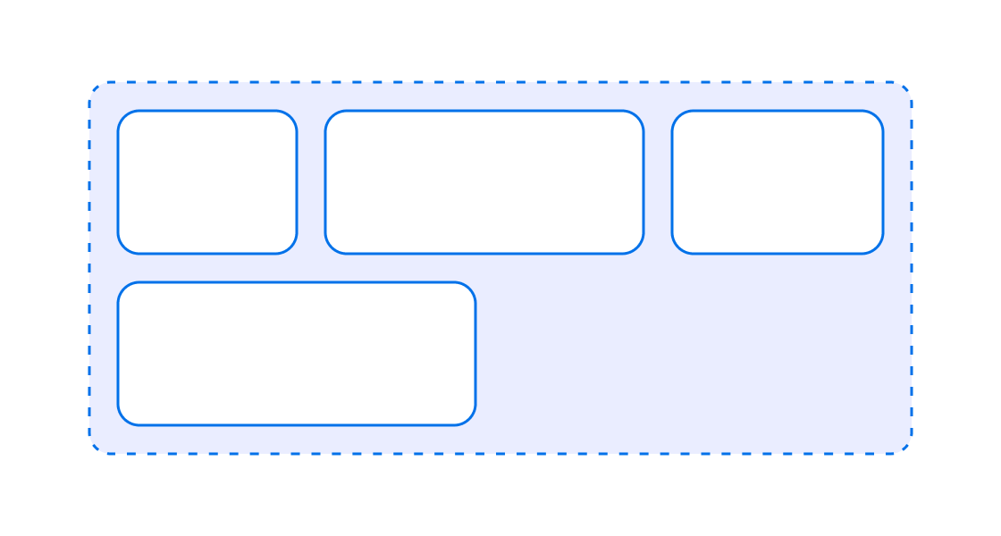
T | `${T} ${T}` | `${T} ${T} ${T}` | `${T} ${T} ${T} ${T}`Laying out elements in a row
examples
Laying out elements in a row
React
import React from 'react';
import {
  render,
  InlineStack,
} from '@shopify/ui-extensions-react/admin';

render('Playground', () => <App />);

function App() {
  return (
    <InlineStack gap>
      <>Child 1</>
      <>Child 2</>
      <>Child 3</>
      <>Child 4</>
    </InlineStack>
  );
}
JS
import {extension, InlineStack} from '@shopify/ui-extensions/admin';

export default extension('Playground', (root) => {
  const inlineStack = root.createComponent(
    InlineStack,
    {
      gap: true,
    },
    [
      root.createText('Child 1'),
      root.createText('Child 2'),
      root.createText('Child 3'),
      root.createText('Child 4'),
    ],
  );

  root.appendChild(inlineStack);
});
Preview