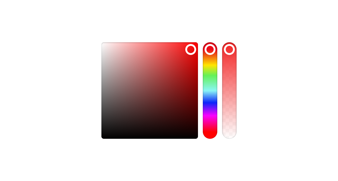
Color
Use this component if you need to select a color.
Anchor to colorpickerpropsColorPickerProps
- Anchor to allowAlphaallowAlphabooleanDefault: false
Allow user to select an alpha value.
- string
ID for the element.
- Anchor to onChangeonChange(value: string) => void
The
handler will emit the value in hex. If theprop istrue,will emit an 8-value hex (#RRGGBBAA). If theprop isfalse,will emit a 6-value hex (#RRGGBB).- Anchor to valuevaluestring
The currently selected color.
Supported formats include:
- RGB
ColorPickerProps
- allowAlpha
Allow user to select an alpha value.
boolean - id
ID for the element.
string - onChange
The `onChange` handler will emit the value in hex. If the `allowAlpha` prop is `true`, `onChange` will emit an 8-value hex (#RRGGBBAA). If the `allowAlpha` prop is `false`, `onChange` will emit a 6-value hex (#RRGGBB).
(value: string) => void - value
The currently selected color. Supported formats include: - RGB
string
export interface ColorPickerProps {
  /** ID for the element. */
  id?: string;

  /**
   * Allow user to select an alpha value.
   * @default false
   */
  allowAlpha?: boolean;

  /**
   * The `onChange` handler will emit the value in hex.
   * If the `allowAlpha` prop is `true`, `onChange` will emit an 8-value hex (#RRGGBBAA).
   * If the `allowAlpha` prop is `false`, `onChange` will emit a 6-value hex (#RRGGBB).
   */
  onChange?(value: string): void;

  /**
   * The currently selected color.
   *
   * Supported formats include:
   * - RGB @see https://developer.mozilla.org/en-US/docs/Web/CSS/color_value/rgb
   * - RGBA @see https://developer.mozilla.org/en-US/docs/Web/CSS/color_value/rgb
   * - Hex (3-value, 4-value, 6-value, 8-value) @see https://developer.mozilla.org/en-US/docs/Web/CSS/hex-color
   *
   * For RGB and RGBA, both the legacy syntax (comma-separated) and modern syntax (space-separate) are supported.
   * @see https://developer.mozilla.org/en-US/docs/Web/CSS/color_value/rgb
   *
   * If the value is invalid, the component will select rgb(0, 0, 0).
   *
   * The `onChange` handler will emit the value in hex.
   * If the `allowAlpha` prop is `true`, `onChange` will emit an 8-value hex (#RRGGBBAA).
   * If the `allowAlpha` prop is `false`, `onChange` will emit a 6-value hex (#RRGGBB).
   */
  value?: string;
}
Was this section helpful?
Simple ColorPicker example
import {
  render,
  ColorPicker,
} from '@shopify/ui-extensions-react/admin';

render('Playground', () => <App />);

function App() {
  return (
    <ColorPicker
      value="rgba(255 0 0 / 0.5)"
      onChange={(value) => {
        console.log({value});
      }}
    />
  );
}
examples
Simple ColorPicker example
React
import { render, ColorPicker, } from '@shopify/ui-extensions-react/admin'; render('Playground', () => <App />); function App() { return ( <ColorPicker value="rgba(255 0 0 / 0.5)" onChange={(value) => { console.log({value}); }} /> ); }JS
import {
  extension,
  ColorPicker,
} from '@shopify/ui-extensions/admin';

export default extension(
  'Playground',
  (root) => {
    const blockStack = root.createComponent(
      ColorPicker,
      {
        value: "rgba(255 0 0 / 0.5)",
        label: ""
      },
    );

    root.appendChild(blockStack);
  },
);
Preview