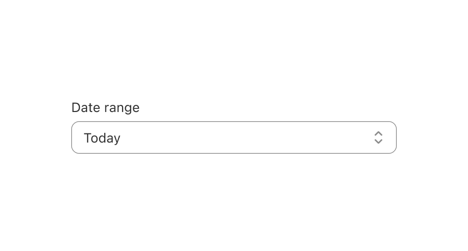
Select
Use this when you want to give users a predefined list of options to choose from.
Anchor to selectpropsSelectProps
- Anchor to labellabelstringrequired
Content to use as the field label.
- Anchor to optionsoptions( | )[]required
The options a user can select from.
When both
optionsand childrenOptionorare provided, the options will be merged together, with theoptionsproperty taking precedence.- Anchor to disableddisabledboolean
Whether the select can be changed.
- Anchor to errorerrorstring
Indicate an error to the user. The field will be given a specific stylistic treatment to communicate problems that have to be resolved immediately.
- string
A unique identifier for the field. When no
idis set, a globally unique value will be used instead.- Anchor to namenamestring
An identifier for the field that is unique within the nearest containing
Formcomponent.- Anchor to onBluronBlur() => void
Callback when focus is removed.
- Anchor to onChangeonChange(value: string) => void
A callback that is run whenever the selected option changes. This callback is called with the string
valueof the selectedoption. This component is controlled, so you must store this value in state and reflect it back in thevalueprop of the select.- Anchor to onFocusonFocus() => void
Callback when input is focused.
- Anchor to placeholderplaceholderstring
A short hint that describes the expected value of the field.
- Anchor to readOnlyreadOnlyboolean
Whether the field is read-only.
- Anchor to requiredrequiredboolean
Whether the field needs a value. This requirement adds semantic value to the field, but it will not cause an error to appear automatically. If you want to present an error when this field is empty, you can do so with the
errorprop.- Anchor to valuevaluestring
The active option for the select. This should match to one of the
valueproperties in theoptionsproperty or one of the<Option>. When not set, the value will default to an empty string, which will show theplaceholdertext as the "selected value".
SelectProps
- disabled
Whether the select can be changed.
boolean - error
Indicate an error to the user. The field will be given a specific stylistic treatment to communicate problems that have to be resolved immediately.
string - id
A unique identifier for the field. When no `id` is set, a globally unique value will be used instead.
string - label
Content to use as the field label.
string - name
An identifier for the field that is unique within the nearest containing `Form` component.
string - onBlur
Callback when focus is removed.
() => void - onChange
A callback that is run whenever the selected option changes. This callback is called with the string `value` of the selected `option`. This component is [controlled](https://reactjs.org/docs/forms.html#controlled-components), so you must store this value in state and reflect it back in the `value` prop of the select.
(value: string) => void - onFocus
Callback when input is focused.
() => void - options
The options a user can select from. When both `options` and children `Option` or `OptionGroup` are provided, the options will be merged together, with the `options` property taking precedence.
(OptionDescription | OptionGroupDescription)[] - placeholder
A short hint that describes the expected value of the field.
string - readOnly
Whether the field is read-only.
boolean - required
Whether the field needs a value. This requirement adds semantic value to the field, but it will not cause an error to appear automatically. If you want to present an error when this field is empty, you can do so with the `error` prop.
boolean - value
The active option for the select. This should match to one of the `value` properties in the `options` property or one of the `<Option>`. When not set, the value will default to an empty string, which will show the `placeholder` text as the "selected value".
string
export interface SelectProps {
  /**
   * Whether the select can be changed.
   */
  disabled?: boolean;

  /**
   * Indicate an error to the user. The field will be given a specific stylistic treatment
   * to communicate problems that have to be resolved immediately.
   */
  error?: string;

  /**
   * A unique identifier for the field. When no `id` is set,
   * a globally unique value will be used instead.
   */
  id?: string;

  /**
   * Content to use as the field label.
   */
  label: string;

  /**
   * An identifier for the field that is unique within the nearest
   * containing `Form` component.
   */
  name?: string;

  /**
   * Callback when focus is removed.
   */
  onBlur?(): void;

  /**
   * A callback that is run whenever the selected option changes. This callback
   * is called with the string `value` of the selected `option`. This component
   * is [controlled](https://reactjs.org/docs/forms.html#controlled-components),
   * so you must store this value in state and reflect it back in the `value`
   * prop of the select.
   */
  onChange?(value: string): void;

  /**
   * Callback when input is focused.
   */
  onFocus?(): void;

  /**
   * The options a user can select from.
   *
   * When both `options` and children `Option` or `OptionGroup` are provided,
   * the options will be merged together, with the `options` property
   * taking precedence.
   */
  options: (OptionDescription | OptionGroupDescription)[];

  /**
   * A short hint that describes the expected value of the field.
   */
  placeholder?: string;

  /**
   * Whether the field is read-only.
   */
  readOnly?: boolean;

  /**
   * Whether the field needs a value. This requirement adds semantic value
   * to the field, but it will not cause an error to appear automatically.
   * If you want to present an error when this field is empty, you can do
   * so with the `error` prop.
   */
  required?: boolean;

  /**
   * The active option for the select. This should match to one of the
   * `value` properties in the `options` property or one of the `<Option>`.
   * When not set, the value will default to an empty string,
   * which will show the `placeholder` text as the "selected value".
   */
  value?: string;
}
OptionDescription
- disabled
Whether this option can be selected or not.
boolean - label
The user-facing label for this option.
string - value
The value that will be passed to the select’s `onChange` callback when this option is selected.
string
export interface OptionDescription {
  /**
   * Whether this option can be selected or not.
   */
  disabled?: boolean;

  /**
   * The user-facing label for this option.
   */
  label: string;

  /**
   * The value that will be passed to the select’s `onChange` callback
   * when this option is selected.
   */
  value: string;
}
OptionGroupDescription
- disabled
Whether the options within this group can be selected or not.
boolean - label
The user-facing label for this group of options.
string - options
The options a user can select from.
OptionDescription[]
export interface OptionGroupDescription {
  /**
   * Whether the options within this group can be selected or not.
   */
  disabled?: boolean;

  /**
   * The user-facing label for this group of options.
   */
  label: string;

  /**
   * The options a user can select from.
   */
  options?: OptionDescription[];
}Simple Select example
examples
Simple Select example
React
import React from 'react';
import {
  render,
  Select,
} from '@shopify/ui-extensions-react/admin';

render('Playground', () => <App />);

function App() {
  const [value, setValue] = React.useState('2');

  return (
    <Select
      label="Country"
      value={value}
      onChange={setValue}
      options={[
        {
          value: '1',
          label: 'Australia',
        },
        {
          value: '2',
          label: 'Canada',
        },
        {
          value: '3',
          label: 'France',
        },
        {
          value: '4',
          label: 'Japan',
        },
        {
          value: '5',
          label: 'Nigeria',
        },
        {
          value: '6',
          label: 'United States',
        },
      ]}
    />
  );
}
JS
import {
  extension,
  Select,
} from '@shopify/ui-extensions/admin';

export default extension(
  'Playground',
  (root) => {
    let value = '2';
    const select = root.createComponent(Select, {
      value,
      label: 'Country',
      onChange(nextValue) {
        value = nextValue;
        select.updateProps({value});
      },
      options: [
        {
          value: '1',
          label: 'Australia',
        },
        {
          value: '2',
          label: 'Canada',
        },
        {
          value: '3',
          label: 'France',
        },
        {
          value: '4',
          label: 'Japan',
        },
        {
          value: '5',
          label: 'Nigeria',
        },
        {
          value: '6',
          label: 'United States',
        },
      ],
    });

    root.appendChild(select);
  },
);
Preview