Web components
Polaris provides a library of web components for your app to display data, get input from merchants, and trigger API calls. These components follow Shopify's design system, ensuring that your app looks and feels native to the Shopify admin.
To choose which release of the library your app loads, see Versioning for web components.
Anchor to ActionsActions
Action components let users trigger events, perform tasks, and navigate through the interface.
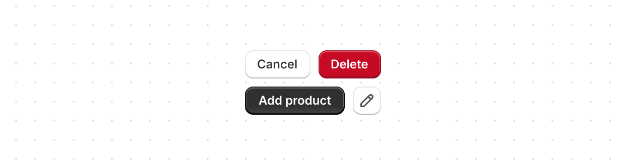
Button
Trigger actions or events, such as submitting forms, opening dialogs, or navigating to other pages.
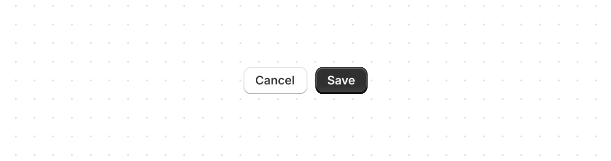
Button group
Display multiple buttons in a layout.
Clickable
Create custom interactive elements not achievable with Button or Link.
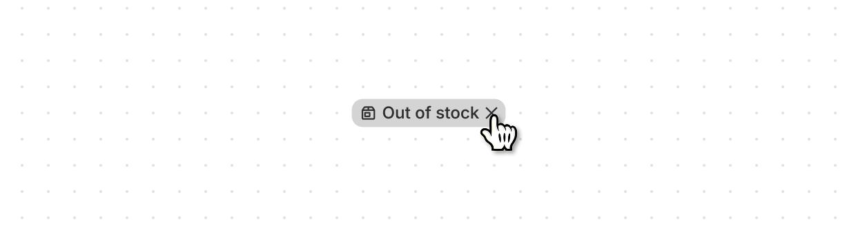
Clickable chip
Categorize or highlight content attributes with an interactive button.
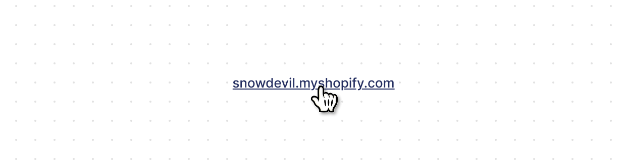
Link
Make text interactive for navigating to other pages or performing actions.
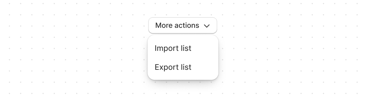
Menu
Display a list of actions that can be performed on a resource.
Anchor to Feedback and status indicatorsFeedback and status indicators
Feedback and status indicators display information about the status of resources and actions.
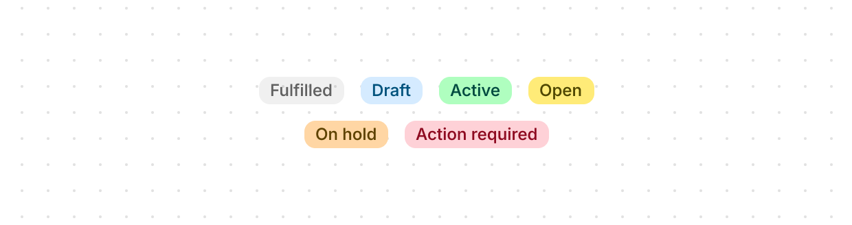
Badge
Inform users about the status of a resource or indicate that an action has been completed.
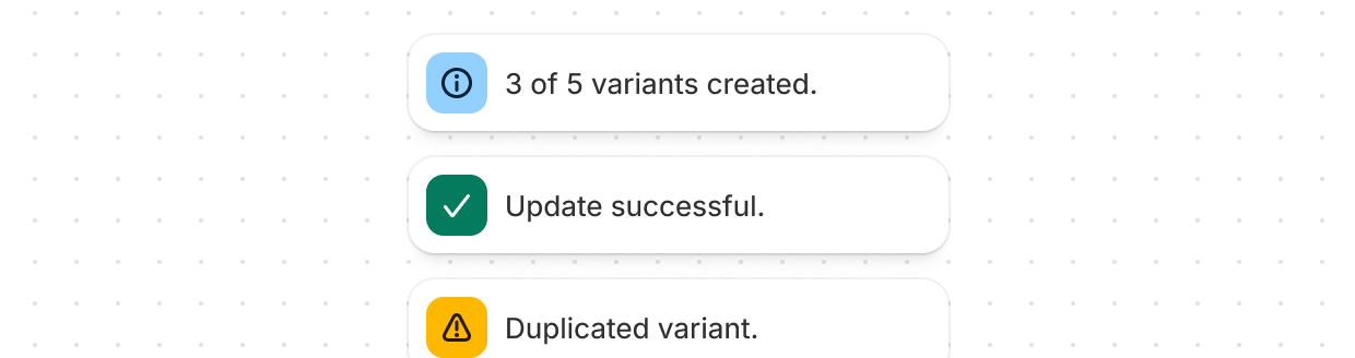
Banner
Highlight important information or required actions prominently within the interface.
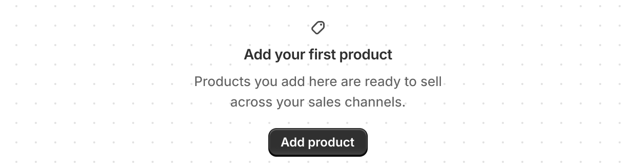
Empty state
Explain why a page, list, or table has nothing to show and offer the next action.
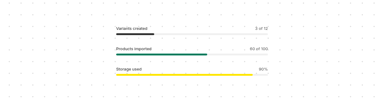
Progress
Show how far a measurable task or goal has advanced, such as an upload, an import, or a shipping threshold.
Spinner
Display an animated indicator showing users that content or actions are loading.
Anchor to FormsForms
Form components capture user input with built-in validation and formatting.
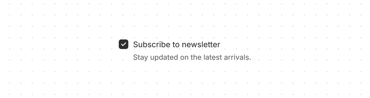
Checkbox
Give users a clear way to make selections, such as agreeing to terms or choosing multiple items.
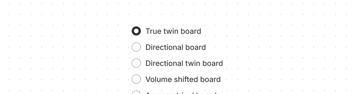
Choice list
Present multiple options for single or multiple selections.
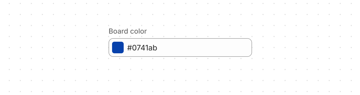
Color field
Let users select a color with a color picker or as a text input.
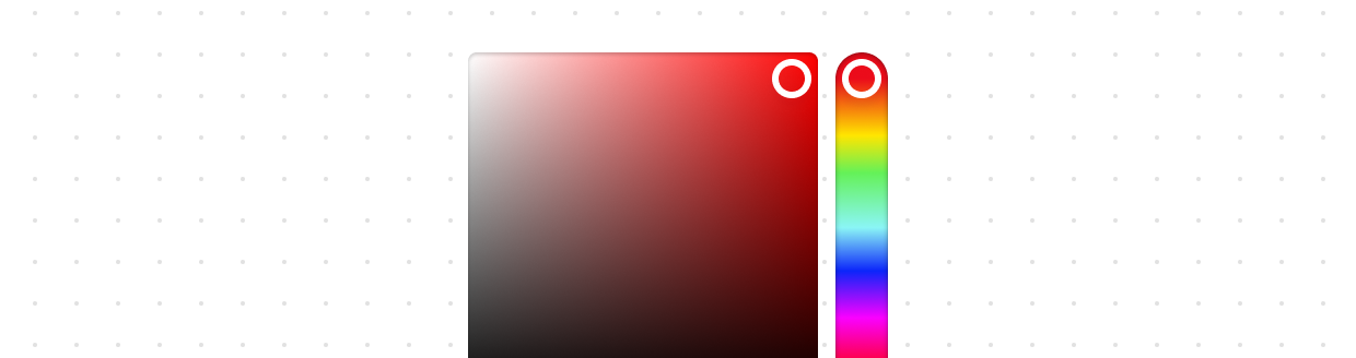
Color picker
Let users select a color from a color palette.
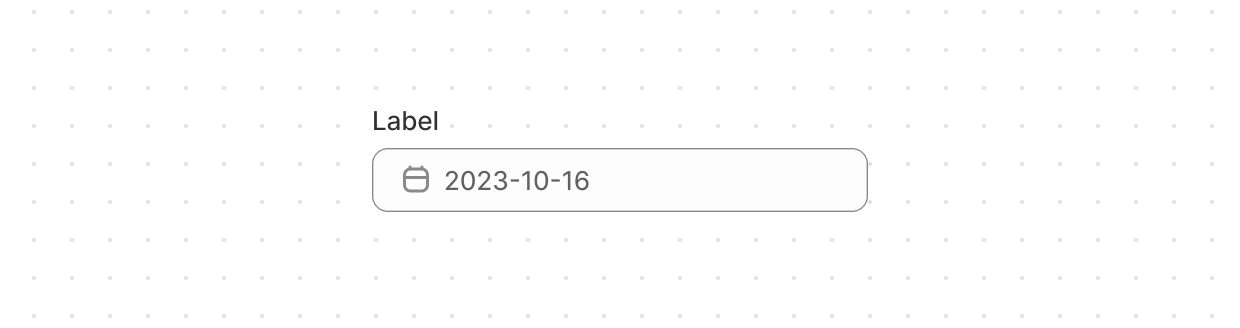
Date field
Let users select a specific date with a date picker.
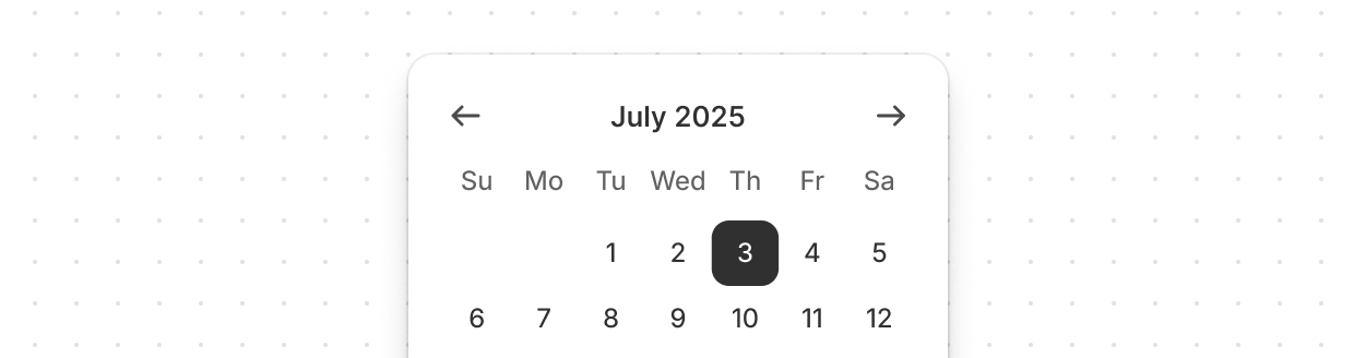
Date picker
Let users select a specific date or date range.
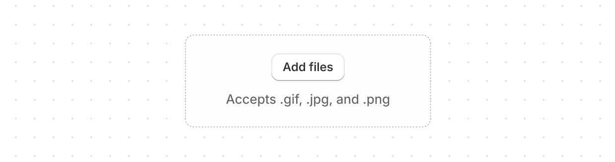
Drop zone
Let users upload files through drag-and-drop functionality or by activating a button.
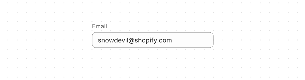
Email field
Let users enter email addresses with optimized keyboard settings.
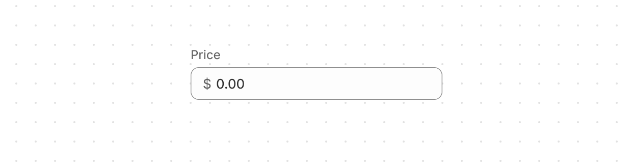
Money field
Collect monetary values from users with built-in currency formatting and validation.
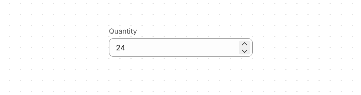
Number field
Collect numerical values from users with optimized keyboard settings and built-in validation.
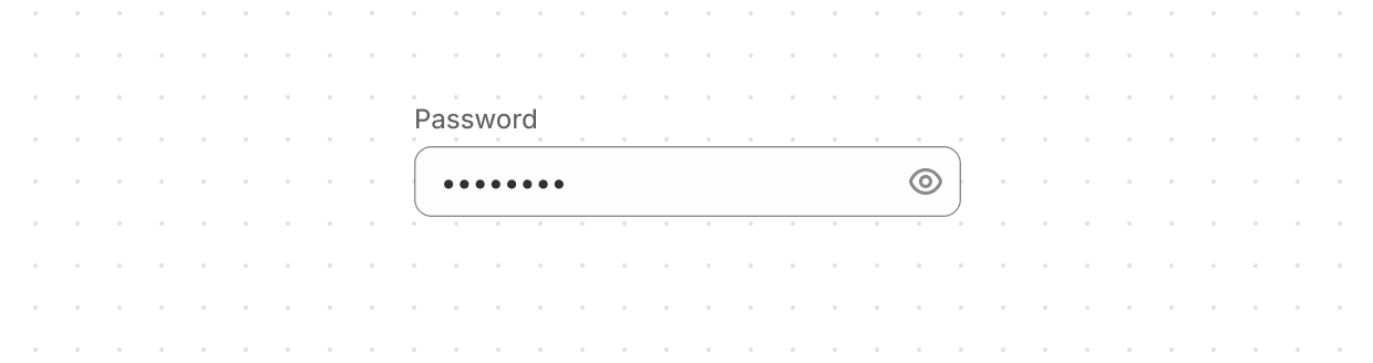
Password field
Securely collect sensitive information from users.
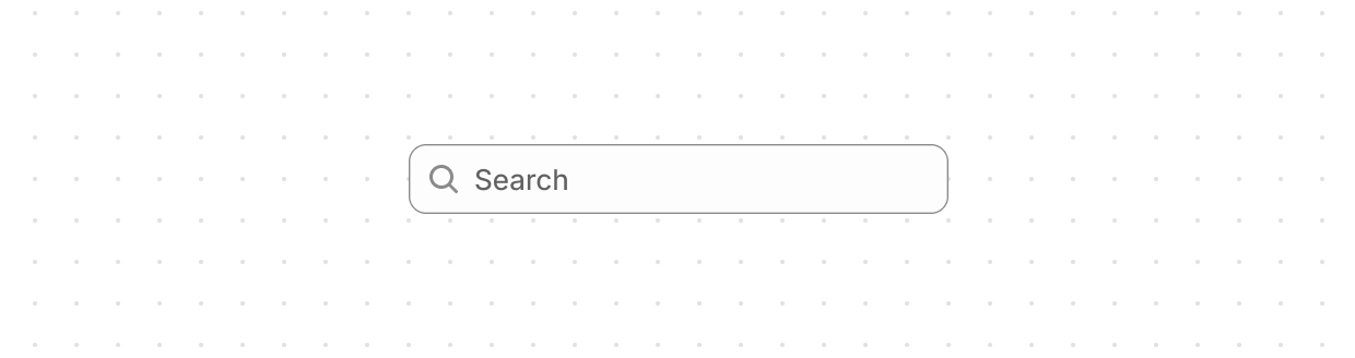
Search field
Let users enter search terms using a single-line input field.
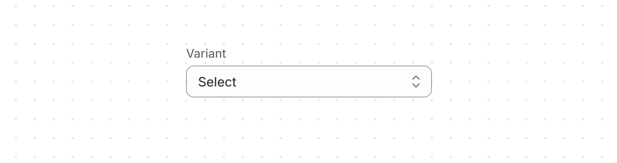
Select
Let users pick one option from a menu.
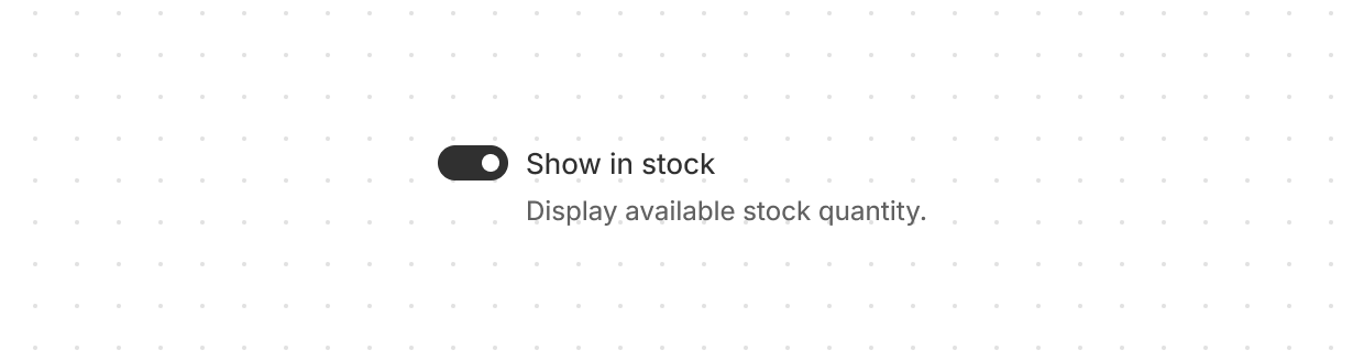
Switch
Give users a clear way to toggle options on or off.
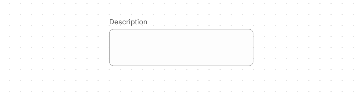
Text area
Collect longer text content from users with a multi-line input.
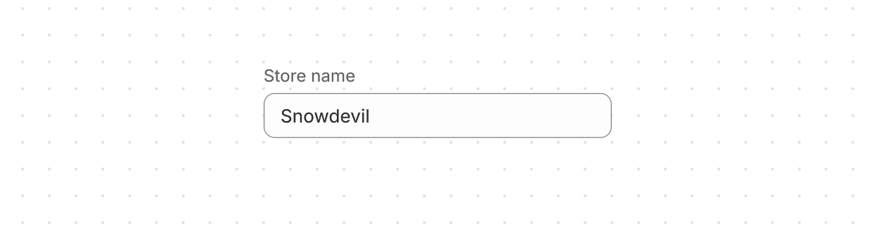
Text field
Let users enter or edit text within a single-line input.
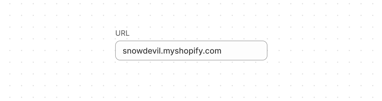
URL field
Collect URLs from users with built-in formatting and validation.
Anchor to Layout and structureLayout and structure
Layout components create consistent visual hierarchy and organize content into clear structures.
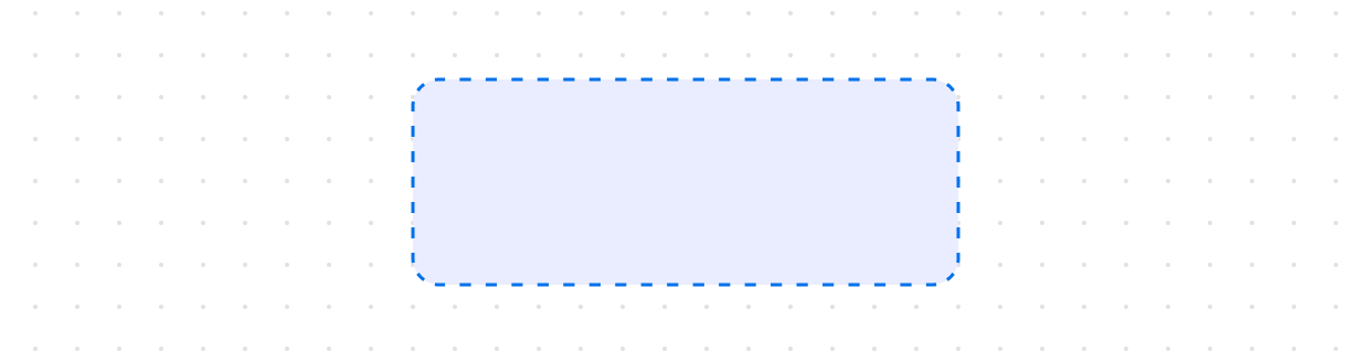
Box
Provide a flexible container for custom designs not achievable with existing components.
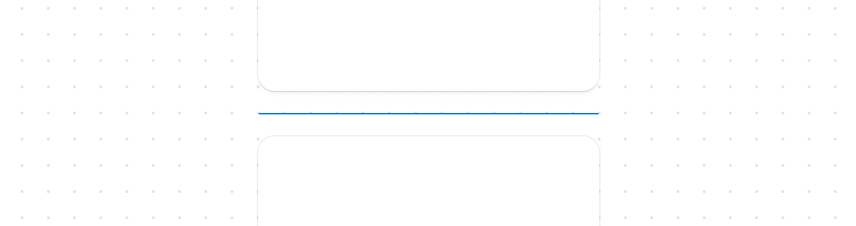
Divider
Create clear visual separation between elements.
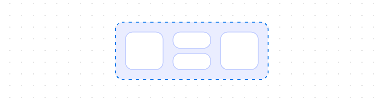
Grid
Organize content in a matrix of rows and columns for responsive layouts.
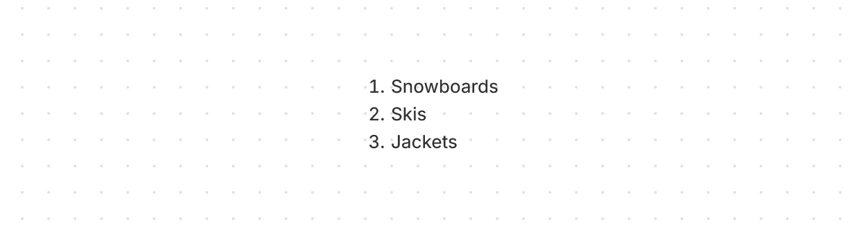
Ordered list
Display a numbered list of related items in a specific sequence.
Page
Use as the main container for placing content in your app with preset layouts and automatic spacing between elements.
Query container
Establish a query container for responsive design.
Section
Group related content into clearly-defined thematic areas.
Stack
Organize elements horizontally or vertically along the block or inline axis.
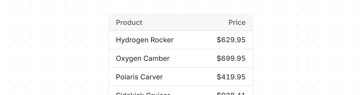
Table
Display data clearly in rows and columns for viewing, analyzing, and comparing information.
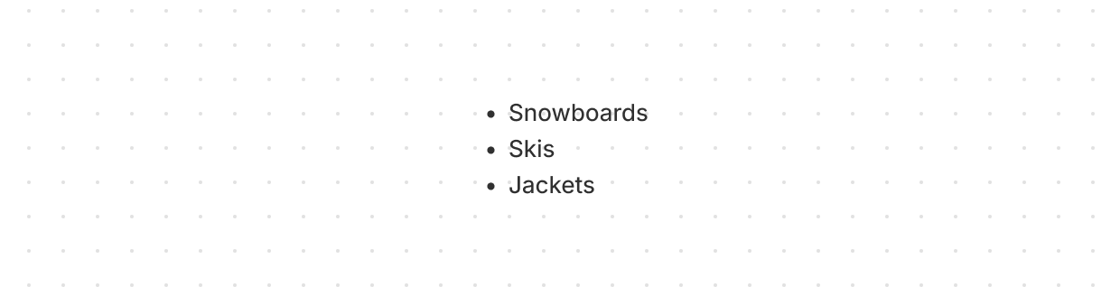
Unordered list
Display a bulleted list of related items.
Anchor to Media and visualsMedia and visuals
Media and visual components display images, icons, and visual elements that enhance the interface.
Avatar
Show a user's profile image or initials in a compact, visual element.
Icon
Render a graphic symbol to visually communicate core parts of the interface and available actions.
Image
Embed an image within the interface and control its presentation.
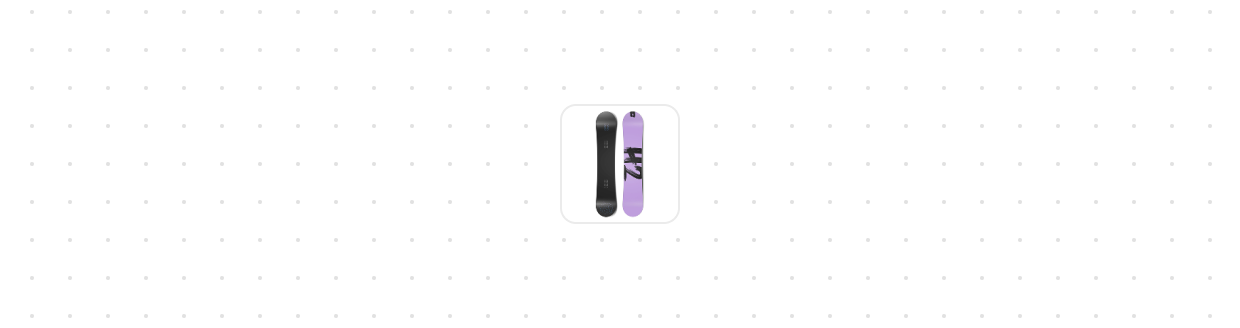
Thumbnail
Display a small preview image representing content, products, or media.
Anchor to OverlaysOverlays
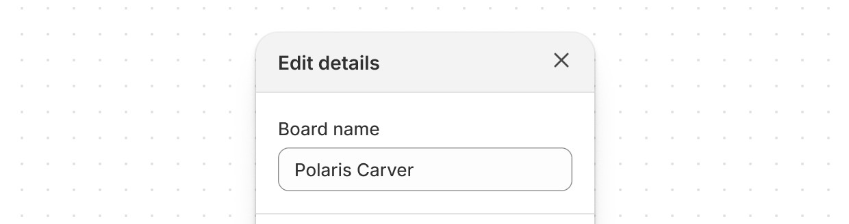
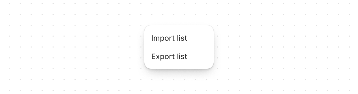
Overlay components display content above the page in focused, contextual layers.
Anchor to Typography and contentTypography and content
Typography components display and format text content with consistent styling.
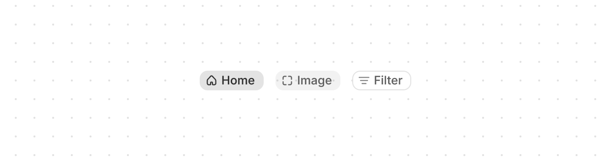
Chip
Represent user-supplied keywords that help label, organize, and categorize objects.
Heading
Render hierarchical titles to communicate the structure and organization of page content.
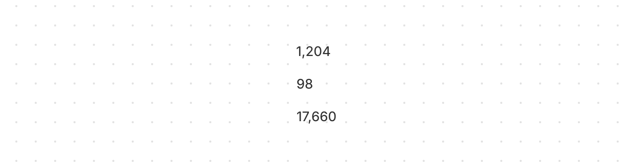
Number
Display inline numeric values with tabular numerals so figures line up in columns.
Paragraph
Display a block of text that can contain inline elements such as buttons, links, or emphasized text.
Text
Display inline text with specific visual styles or tones.
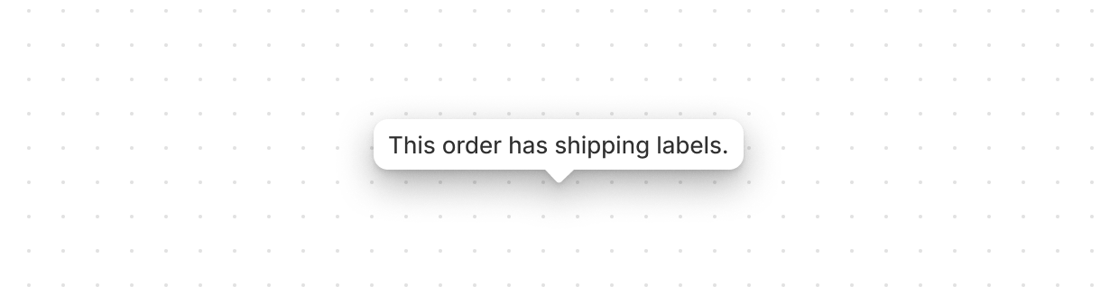
Tooltip
Display helpful information in a small overlay when users hover or focus on an element.