Order status
The order status page displays details for a single order, including line items, fulfillment progress, customer information, and payment status. Extensions on this page help customers get richer context for a specific order without leaving the page.
Anchor to Use casesUse cases
- Order tracking widgets: Display real-time shipment tracking with carrier updates and estimated delivery dates directly on the order status page.
- Loyalty and rewards context: Show loyalty points earned from the order or progress toward a reward tier.
- Custom line item details: Add product care instructions, warranty information, or personalization details beneath individual line items.
- Post-purchase upsells: Surface relevant product recommendations or subscription offers based on the items in the order.
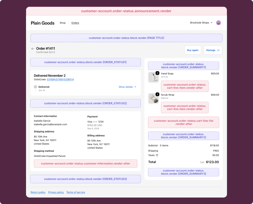
Anchor to Order status static targetsOrder status static targets
Use static targets to extend specific sections of the order status page with contextual information.
Static targets render after specific page elements, including line items, the line item list, and the customer information section. The examples demonstrate using the Order API and the Order Status Localization API or fetching data from your app's backend.
Anchor to Cart line item (render after) ,[object Object]Cart line item (render after) target
customer-account.order-status.cart-line-item.render-after
Renders after each individual line item on the order status page. Use this target to add product-specific information like care instructions, warranty details, or personalization summaries beneath each item.
Extensions at this target can access order data through the Order API and locale context through the Order Status Localization API. This target renders once per line item, not once per order. Avoid making API calls in your extension's root — they'll fire for every line item. Fetch data outside the render function or memoize results.
Supported components
- Abbreviation
- Announcement
- Avatar
- Badge
- Banner
- Box
- Button
- Button group
- Checkbox
- Chip
- Choice list
- Clickable
- Clickable chip
- Clipboard item
- Customer account action
- Date field
- Date picker
- Details
- Divider
- Drop zone
- Email field
- Form
- Grid
- Heading
- Icon
- Image
- Image group
- Link
- Map
- Menu
- Modal
- Money field
- Number field
- Ordered list
- Page
- Paragraph
- Password field
- Payment icon
- Phone field
- Popover
- Press button
- Product thumbnail
- Progress
- Qr code
- Query container
- Scroll box
- Section
- Select
- Sheet
- Skeleton paragraph
- Spinner
- Stack
- Switch
- Text
- Text area
- Text field
- Time
- Tooltip
- Unordered list
- Url field
Available APIs
- Addresses API
- Analytics API
- Attributes API
- Authenticated Account API
- Authentication State API
- Buyer Identity API
- Cart Lines API
- Checkout Settings API
- Cost API
- Customer Account API
- Customer Privacy API
- Discounts API
- Extension API
- Gift Cards API
- Intents API
- Localization API
- Metafields API
- Navigation API
- Note API
- Order API
- Order Status Localization API
- Require Login API
- Session Token API
- Settings API
- Shop API
- Storage API
- Storefront API
- Toast API
- Version API
Supported components
- Abbreviation
- Announcement
- Avatar
- Badge
- Banner
- Box
- Button
- Button group
- Checkbox
- Chip
- Choice list
- Clickable
- Clickable chip
- Clipboard item
- Customer account action
- Date field
- Date picker
- Details
- Divider
- Drop zone
- Email field
- Form
- Grid
- Heading
- Icon
- Image
- Image group
- Link
- Map
- Menu
- Modal
- Money field
- Number field
- Ordered list
- Page
- Paragraph
- Password field
- Payment icon
- Phone field
- Popover
- Press button
- Product thumbnail
- Progress
- Qr code
- Query container
- Scroll box
- Section
- Select
- Sheet
- Skeleton paragraph
- Spinner
- Stack
- Switch
- Text
- Text area
- Text field
- Time
- Tooltip
- Unordered list
- Url field
Available APIs
- Addresses API
- Analytics API
- Attributes API
- Authenticated Account API
- Authentication State API
- Buyer Identity API
- Cart Lines API
- Checkout Settings API
- Cost API
- Customer Account API
- Customer Privacy API
- Discounts API
- Extension API
- Gift Cards API
- Intents API
- Localization API
- Metafields API
- Navigation API
- Note API
- Order API
- Order Status Localization API
- Require Login API
- Session Token API
- Settings API
- Shop API
- Storage API
- Storefront API
- Toast API
- Version API
jsx
Examples
Display warranty information for a line item
Description
Show warranty details beneath each line item on the order status page. This example reads the line item's product title from `shopify.target.value` and fetches warranty data from your app's backend.
jsx
import '@shopify/ui-extensions/preact';
import {render} from 'preact';
import {useState, useEffect} from 'preact/hooks';

export default async () => {
  render(<Extension />, document.body);
};

function Extension() {
  const {merchandise: {title}} = shopify.target.value;
  const [warranty, setWarranty] = useState(null);

  useEffect(() => {
    async function fetchWarranty() {
      const token = await shopify.sessionToken.get();
      const res = await fetch(
        `https://your-app.com/api/warranty?product=${encodeURIComponent(title)}`,
        {headers: {Authorization: `Bearer ${token}`}},
      );
      const data = await res.json();
      setWarranty(data);
    }
    fetchWarranty();
  }, []);

  if (!warranty) return null;

  return (
    <s-stack direction="inline" gap="small-200">
      <s-badge>{warranty.status}</s-badge>
      <s-text color="subdued">
        Warranty expires {warranty.expiresAt}
      </s-text>
    </s-stack>
  );
}
Show product care instructions
Description
Display care instructions beneath a line item based on the product title. This example reads the line item from `shopify.target.value` and uses `shopify.i18n.translate` to render localized care text.
jsx
import '@shopify/ui-extensions/preact';
import {render} from 'preact';

export default async () => {
  render(<Extension />, document.body);
};

function Extension() {
  const {merchandise: {title}} = shopify.target.value;
  const translate = shopify.i18n.translate;

  return (
    <s-stack direction="block" gap="small-200">
      <s-text type="strong">{title}</s-text>
      <s-text color="subdued">
        {translate('care.instructions')}
      </s-text>
    </s-stack>
  );
}
Anchor to Cart line list (render after) ,[object Object]Cart line list (render after) target
customer-account.order-status.cart-line-list.render-after
Renders after the entire line item list on the order status page. Use this target to display order-level summaries, cross-sell recommendations, or aggregate information that applies to all items.
Extensions at this target can access order data through the Order API and locale context through the Order Status Localization API.
Supported components
- Abbreviation
- Announcement
- Avatar
- Badge
- Banner
- Box
- Button
- Button group
- Checkbox
- Chip
- Choice list
- Clickable
- Clickable chip
- Clipboard item
- Customer account action
- Date field
- Date picker
- Details
- Divider
- Drop zone
- Email field
- Form
- Grid
- Heading
- Icon
- Image
- Image group
- Link
- Map
- Menu
- Modal
- Money field
- Number field
- Ordered list
- Page
- Paragraph
- Password field
- Payment icon
- Phone field
- Popover
- Press button
- Product thumbnail
- Progress
- Qr code
- Query container
- Scroll box
- Section
- Select
- Sheet
- Skeleton paragraph
- Spinner
- Stack
- Switch
- Text
- Text area
- Text field
- Time
- Tooltip
- Unordered list
- Url field
Available APIs
- Addresses API
- Analytics API
- Attributes API
- Authenticated Account API
- Authentication State API
- Buyer Identity API
- Cart Lines API
- Checkout Settings API
- Cost API
- Customer Account API
- Customer Privacy API
- Discounts API
- Extension API
- Gift Cards API
- Intents API
- Localization API
- Metafields API
- Navigation API
- Note API
- Order API
- Order Status Localization API
- Require Login API
- Session Token API
- Settings API
- Shop API
- Storage API
- Storefront API
- Toast API
- Version API
Supported components
- Abbreviation
- Announcement
- Avatar
- Badge
- Banner
- Box
- Button
- Button group
- Checkbox
- Chip
- Choice list
- Clickable
- Clickable chip
- Clipboard item
- Customer account action
- Date field
- Date picker
- Details
- Divider
- Drop zone
- Email field
- Form
- Grid
- Heading
- Icon
- Image
- Image group
- Link
- Map
- Menu
- Modal
- Money field
- Number field
- Ordered list
- Page
- Paragraph
- Password field
- Payment icon
- Phone field
- Popover
- Press button
- Product thumbnail
- Progress
- Qr code
- Query container
- Scroll box
- Section
- Select
- Sheet
- Skeleton paragraph
- Spinner
- Stack
- Switch
- Text
- Text area
- Text field
- Time
- Tooltip
- Unordered list
- Url field
Available APIs
- Addresses API
- Analytics API
- Attributes API
- Authenticated Account API
- Authentication State API
- Buyer Identity API
- Cart Lines API
- Checkout Settings API
- Cost API
- Customer Account API
- Customer Privacy API
- Discounts API
- Extension API
- Gift Cards API
- Intents API
- Localization API
- Metafields API
- Navigation API
- Note API
- Order API
- Order Status Localization API
- Require Login API
- Session Token API
- Settings API
- Shop API
- Storage API
- Storefront API
- Toast API
- Version API
jsx
Examples
Suggest related products after the line item list
Description
Display product recommendations below the order's line items. This example fetches related products from your app's backend and renders them as a list with links.
jsx
import '@shopify/ui-extensions/preact';
import {render} from 'preact';
import {useState, useEffect} from 'preact/hooks';

export default async () => {
  render(<Extension />, document.body);
};

function Extension() {
  const [recommendations, setRecommendations] = useState(null);

  useEffect(() => {
    async function fetchRecommendations() {
      const token = await shopify.sessionToken.get();
      const res = await fetch('https://your-app.com/api/recommendations', {
        headers: {Authorization: `Bearer ${token}`},
      });
      const data = await res.json();
      setRecommendations(data.products);
    }
    fetchRecommendations();
  }, []);

  if (!recommendations || recommendations.length === 0) return null;

  return (
    <s-section heading="You might also like">
      <s-stack direction="block" gap="base">
        {recommendations.map((product) => (
          <s-stack key={product.id} direction="inline" gap="base">
            <s-text type="strong">{product.title}</s-text>
            <s-link href={product.url}>View product</s-link>
          </s-stack>
        ))}
      </s-stack>
    </s-section>
  );
}
Show loyalty points earned from the order
Description
Display the total loyalty points earned from the order below the line item list. This example fetches points data from your app's backend using the session token.
jsx
import '@shopify/ui-extensions/preact';
import {render} from 'preact';
import {useState, useEffect} from 'preact/hooks';

export default async () => {
  render(<Extension />, document.body);
};

function Extension() {
  const [points, setPoints] = useState(null);

  useEffect(() => {
    async function fetchPoints() {
      const token = await shopify.sessionToken.get();
      const res = await fetch('https://your-app.com/api/order-points', {
        headers: {Authorization: `Bearer ${token}`},
      });
      const data = await res.json();
      setPoints(data.pointsEarned);
    }
    fetchPoints();
  }, []);

  if (!points) return null;

  return (
    <s-stack direction="inline" gap="base">
      <s-badge tone="auto">{points} points earned</s-badge>
      <s-link href="shopify:customer-account/profile">
        View your rewards
      </s-link>
    </s-stack>
  );
}
Anchor to Customer information (render after) ,[object Object]Customer information (render after) target
customer-account.order-status.customer-information.render-after
Renders after the customer information section on the order status page. Use this target to display additional customer context like account tier, contact preferences, or organization details.
Extensions at this target can access order data through the Order API and locale context through the Order Status Localization API.
Supported components
- Abbreviation
- Announcement
- Avatar
- Badge
- Banner
- Box
- Button
- Button group
- Checkbox
- Chip
- Choice list
- Clickable
- Clickable chip
- Clipboard item
- Customer account action
- Date field
- Date picker
- Details
- Divider
- Drop zone
- Email field
- Form
- Grid
- Heading
- Icon
- Image
- Image group
- Link
- Map
- Menu
- Modal
- Money field
- Number field
- Ordered list
- Page
- Paragraph
- Password field
- Payment icon
- Phone field
- Popover
- Press button
- Product thumbnail
- Progress
- Qr code
- Query container
- Scroll box
- Section
- Select
- Sheet
- Skeleton paragraph
- Spinner
- Stack
- Switch
- Text
- Text area
- Text field
- Time
- Tooltip
- Unordered list
- Url field
Available APIs
- Addresses API
- Analytics API
- Attributes API
- Authenticated Account API
- Authentication State API
- Buyer Identity API
- Cart Lines API
- Checkout Settings API
- Cost API
- Customer Account API
- Customer Privacy API
- Discounts API
- Extension API
- Gift Cards API
- Intents API
- Localization API
- Metafields API
- Navigation API
- Note API
- Order API
- Order Status Localization API
- Require Login API
- Session Token API
- Settings API
- Shop API
- Storage API
- Storefront API
- Toast API
- Version API
Supported components
- Abbreviation
- Announcement
- Avatar
- Badge
- Banner
- Box
- Button
- Button group
- Checkbox
- Chip
- Choice list
- Clickable
- Clickable chip
- Clipboard item
- Customer account action
- Date field
- Date picker
- Details
- Divider
- Drop zone
- Email field
- Form
- Grid
- Heading
- Icon
- Image
- Image group
- Link
- Map
- Menu
- Modal
- Money field
- Number field
- Ordered list
- Page
- Paragraph
- Password field
- Payment icon
- Phone field
- Popover
- Press button
- Product thumbnail
- Progress
- Qr code
- Query container
- Scroll box
- Section
- Select
- Sheet
- Skeleton paragraph
- Spinner
- Stack
- Switch
- Text
- Text area
- Text field
- Time
- Tooltip
- Unordered list
- Url field
Available APIs
- Addresses API
- Analytics API
- Attributes API
- Authenticated Account API
- Authentication State API
- Buyer Identity API
- Cart Lines API
- Checkout Settings API
- Cost API
- Customer Account API
- Customer Privacy API
- Discounts API
- Extension API
- Gift Cards API
- Intents API
- Localization API
- Metafields API
- Navigation API
- Note API
- Order API
- Order Status Localization API
- Require Login API
- Session Token API
- Settings API
- Shop API
- Storage API
- Storefront API
- Toast API
- Version API
jsx
Examples
Display a customer loyalty tier
Description
Show the customer's loyalty tier after the customer information section. This example fetches the tier from your app's backend and renders it as a badge.
jsx
import '@shopify/ui-extensions/preact';
import {render} from 'preact';
import {useState, useEffect} from 'preact/hooks';

export default async () => {
  render(<Extension />, document.body);
};

function Extension() {
  const [tier, setTier] = useState(null);

  useEffect(() => {
    async function fetchTier() {
      const token = await shopify.sessionToken.get();
      const res = await fetch('https://your-app.com/api/loyalty-tier', {
        headers: {Authorization: `Bearer ${token}`},
      });
      const data = await res.json();
      setTier(data.tier);
    }
    fetchTier();
  }, []);

  if (!tier) return null;

  return (
    <s-stack direction="inline" gap="small-200">
      <s-text color="subdued">Loyalty tier:</s-text>
      <s-badge>{tier}</s-badge>
    </s-stack>
  );
}
Show order confirmation details
Description
Display the order confirmation number after the customer information section. This example reads `shopify.order` to show the confirmation number when available.
jsx
import '@shopify/ui-extensions/preact';
import {render} from 'preact';

export default async () => {
  render(<Extension />, document.body);
};

function Extension() {
  const order = shopify.order.value;

  if (!order?.confirmationNumber) return null;

  return (
    <s-stack direction="block" gap="small-200">
      <s-stack direction="inline" gap="small-200">
        <s-text color="subdued">Confirmation number:</s-text>
        <s-text type="strong">{order.confirmationNumber}</s-text>
      </s-stack>
    </s-stack>
  );
}
Anchor to Order status announcement and block targetsOrder status announcement and block targets
Use static and block targets to extend the order status page with announcements and custom block content.
Announcement targets render as dismissable banners at the top of the page, while block targets display as inline cards that merchants can position using the checkout and accounts editor. The examples demonstrate using the Order Status Localization API or fetching data from your app's backend.
Anchor to Order status announcement ,[object Object]Order status announcement target
customer-account.order-status.announcement.render
Renders a dismissable announcement at the top of the order status page. Use this target to surface time-sensitive information like delivery updates, delays, or order-specific promotions.
Extensions at this target can access order data through the Order API and locale context through the Order Status Localization API. The root element should be an announcement component.
Supported components
- Abbreviation
- Announcement
- Avatar
- Badge
- Banner
- Box
- Button
- Button group
- Checkbox
- Chip
- Choice list
- Clickable
- Clickable chip
- Clipboard item
- Customer account action
- Date field
- Date picker
- Details
- Divider
- Drop zone
- Email field
- Form
- Grid
- Heading
- Icon
- Image
- Image group
- Link
- Map
- Menu
- Modal
- Money field
- Number field
- Ordered list
- Page
- Paragraph
- Password field
- Payment icon
- Phone field
- Popover
- Press button
- Product thumbnail
- Progress
- Qr code
- Query container
- Scroll box
- Section
- Select
- Sheet
- Skeleton paragraph
- Spinner
- Stack
- Switch
- Text
- Text area
- Text field
- Time
- Tooltip
- Unordered list
- Url field
Available APIs
- Addresses API
- Analytics API
- Attributes API
- Authenticated Account API
- Authentication State API
- Buyer Identity API
- Cart Lines API
- Checkout Settings API
- Cost API
- Customer Account API
- Customer Privacy API
- Discounts API
- Extension API
- Gift Cards API
- Intents API
- Localization API
- Metafields API
- Navigation API
- Note API
- Order API
- Order Status Localization API
- Require Login API
- Session Token API
- Settings API
- Shop API
- Storage API
- Storefront API
- Toast API
- Version API
Supported components
- Abbreviation
- Announcement
- Avatar
- Badge
- Banner
- Box
- Button
- Button group
- Checkbox
- Chip
- Choice list
- Clickable
- Clickable chip
- Clipboard item
- Customer account action
- Date field
- Date picker
- Details
- Divider
- Drop zone
- Email field
- Form
- Grid
- Heading
- Icon
- Image
- Image group
- Link
- Map
- Menu
- Modal
- Money field
- Number field
- Ordered list
- Page
- Paragraph
- Password field
- Payment icon
- Phone field
- Popover
- Press button
- Product thumbnail
- Progress
- Qr code
- Query container
- Scroll box
- Section
- Select
- Sheet
- Skeleton paragraph
- Spinner
- Stack
- Switch
- Text
- Text area
- Text field
- Time
- Tooltip
- Unordered list
- Url field
Available APIs
- Addresses API
- Analytics API
- Attributes API
- Authenticated Account API
- Authentication State API
- Buyer Identity API
- Cart Lines API
- Checkout Settings API
- Cost API
- Customer Account API
- Customer Privacy API
- Discounts API
- Extension API
- Gift Cards API
- Intents API
- Localization API
- Metafields API
- Navigation API
- Note API
- Order API
- Order Status Localization API
- Require Login API
- Session Token API
- Settings API
- Shop API
- Storage API
- Storefront API
- Toast API
- Version API
jsx
Examples
Announce a delivery delay
Description
Display a dismissable announcement about a shipping delay for the current order. This example reads from `shopify.order` to include the order name in the message.
jsx
import '@shopify/ui-extensions/preact';
import {render} from 'preact';

export default async () => {
  render(<Extension />, document.body);
};

function Extension() {
  const order = shopify.order.value;

  return (
    <s-announcement>
      <s-text>
        {order
          ? `There's a shipping delay on ${order.name}. We'll update you when it ships.`
          : 'There\'s a shipping delay on your order. We\'ll update you when it ships.'}
      </s-text>
    </s-announcement>
  );
}
Show a localized order confirmation message
Description
Display a localized confirmation announcement on the order status page. This example uses `shopify.i18n.translate` to render the message in the customer's language.
jsx
import '@shopify/ui-extensions/preact';
import {render} from 'preact';

export default async () => {
  render(<Extension />, document.body);
};

function Extension() {
  const translate = shopify.i18n.translate;

  return (
    <s-announcement>
      <s-stack direction="inline" gap="base">
        <s-text>{translate('orderStatus.confirmation')}</s-text>
        <s-link href="shopify:customer-account/orders">
          {translate('orderStatus.viewAllOrders')}
        </s-link>
      </s-stack>
    </s-announcement>
  );
}
Show country-specific shipping policy
Description
Display a shipping policy announcement based on the buyer's country. This example reads `shopify.localization.country` from the [Order Status Localization API](/docs/api/customer-account-ui-extensions/2026-01/target-apis/order-apis/order-status-localization-api) and shows relevant shipping information for the buyer's region.
jsx
import '@shopify/ui-extensions/preact';
import {render} from 'preact';

export default async () => {
  render(<Extension />, document.body);
};

function Extension() {
  const country = shopify.localization.country.value;

  if (!country) return null;

  const isDomestic = country.isoCode === 'US';
  const translate = shopify.i18n.translate;

  return (
    <s-announcement>
      <s-stack direction="inline" gap="base">
        <s-text>
          {isDomestic
            ? translate('shipping.domestic')
            : translate('shipping.international', {country: country.isoCode})}
        </s-text>
        <s-link href="shopify:customer-account/orders">
          {translate('shipping.viewOrders')}
        </s-link>
      </s-stack>
    </s-announcement>
  );
}
Anchor to Order status block ,[object Object]Order status block target
customer-account.order-status.block.render
Renders inline content on the order status page. Use this target to display persistent information like tracking widgets, estimated delivery dates, or order-specific recommendations.
Extensions at this target appear as blocks that merchants can position using the checkout and accounts editor. To preview your extension in each supported location, use the placement reference for that location as a URL parameter.
Supported components
- Abbreviation
- Announcement
- Avatar
- Badge
- Banner
- Box
- Button
- Button group
- Checkbox
- Chip
- Choice list
- Clickable
- Clickable chip
- Clipboard item
- Customer account action
- Date field
- Date picker
- Details
- Divider
- Drop zone
- Email field
- Form
- Grid
- Heading
- Icon
- Image
- Image group
- Link
- Map
- Menu
- Modal
- Money field
- Number field
- Ordered list
- Page
- Paragraph
- Password field
- Payment icon
- Phone field
- Popover
- Press button
- Product thumbnail
- Progress
- Qr code
- Query container
- Scroll box
- Section
- Select
- Sheet
- Skeleton paragraph
- Spinner
- Stack
- Switch
- Text
- Text area
- Text field
- Time
- Tooltip
- Unordered list
- Url field
Available APIs
- Addresses API
- Analytics API
- Attributes API
- Authenticated Account API
- Authentication State API
- Buyer Identity API
- Cart Lines API
- Checkout Settings API
- Cost API
- Customer Account API
- Customer Privacy API
- Discounts API
- Extension API
- Gift Cards API
- Intents API
- Localization API
- Metafields API
- Navigation API
- Note API
- Order API
- Order Status Localization API
- Require Login API
- Session Token API
- Settings API
- Shop API
- Storage API
- Storefront API
- Toast API
- Version API
Supported components
- Abbreviation
- Announcement
- Avatar
- Badge
- Banner
- Box
- Button
- Button group
- Checkbox
- Chip
- Choice list
- Clickable
- Clickable chip
- Clipboard item
- Customer account action
- Date field
- Date picker
- Details
- Divider
- Drop zone
- Email field
- Form
- Grid
- Heading
- Icon
- Image
- Image group
- Link
- Map
- Menu
- Modal
- Money field
- Number field
- Ordered list
- Page
- Paragraph
- Password field
- Payment icon
- Phone field
- Popover
- Press button
- Product thumbnail
- Progress
- Qr code
- Query container
- Scroll box
- Section
- Select
- Sheet
- Skeleton paragraph
- Spinner
- Stack
- Switch
- Text
- Text area
- Text field
- Time
- Tooltip
- Unordered list
- Url field
Available APIs
- Addresses API
- Analytics API
- Attributes API
- Authenticated Account API
- Authentication State API
- Buyer Identity API
- Cart Lines API
- Checkout Settings API
- Cost API
- Customer Account API
- Customer Privacy API
- Discounts API
- Extension API
- Gift Cards API
- Intents API
- Localization API
- Metafields API
- Navigation API
- Note API
- Order API
- Order Status Localization API
- Require Login API
- Session Token API
- Settings API
- Shop API
- Storage API
- Storefront API
- Toast API
- Version API
jsx
Examples
Display a shipment tracking widget
Description
Show real-time tracking information for the order as an inline block. This example fetches tracking data from your app's backend and displays the current status with a link to the carrier's tracking page.
jsx
import '@shopify/ui-extensions/preact';
import {render} from 'preact';
import {useState, useEffect} from 'preact/hooks';

export default async () => {
  render(<Extension />, document.body);
};

function Extension() {
  const [tracking, setTracking] = useState(null);

  useEffect(() => {
    async function fetchTracking() {
      const token = await shopify.sessionToken.get();
      const res = await fetch('https://your-app.com/api/tracking', {
        headers: {Authorization: `Bearer ${token}`},
      });
      const data = await res.json();
      setTracking(data);
    }
    fetchTracking();
  }, []);

  if (!tracking) {
    return (
      <s-section heading="Shipment tracking">
        <s-spinner size="base" />
      </s-section>
    );
  }

  return (
    <s-section heading="Shipment tracking">
      <s-stack direction="block" gap="base">
        <s-stack direction="inline" gap="small-200">
          <s-text type="strong">{tracking.carrier}</s-text>
          <s-badge>{tracking.status}</s-badge>
        </s-stack>
        <s-text color="subdued">
          Estimated delivery: {tracking.estimatedDelivery}
        </s-text>
        <s-link href={tracking.trackingUrl}>
          Track on {tracking.carrier}
        </s-link>
      </s-stack>
    </s-section>
  );
}
Show estimated delivery date
Description
Display an estimated delivery date block on the order status page. This example fetches delivery estimates from your app's backend and shows the date range.
jsx
import '@shopify/ui-extensions/preact';
import {render} from 'preact';
import {useState, useEffect} from 'preact/hooks';

export default async () => {
  render(<Extension />, document.body);
};

function Extension() {
  const [estimate, setEstimate] = useState(null);

  useEffect(() => {
    async function fetchEstimate() {
      const token = await shopify.sessionToken.get();
      const res = await fetch('https://your-app.com/api/delivery-estimate', {
        headers: {Authorization: `Bearer ${token}`},
      });
      const data = await res.json();
      setEstimate(data);
    }
    fetchEstimate();
  }, []);

  if (!estimate) return null;

  return (
    <s-section heading="Estimated delivery">
      <s-stack direction="block" gap="small-200">
        <s-text type="strong">
          {estimate.earliestDate} – {estimate.latestDate}
        </s-text>
        <s-text color="subdued">
          {estimate.message}
        </s-text>
      </s-stack>
    </s-section>
  );
}
Anchor to Best practicesBest practices
- Guard against missing order data: Always check that
shopify.order.valueis defined before rendering order-specific content. The order data loads asynchronously and might beundefinedon the initial render. - Return null for empty states: If your extension has no data to display, such as missing warranty or tracking information, return
nullto avoid rendering an empty container on the page. - Keep announcements order-specific: Unlike order index announcements, order status announcements should relate to the specific order being viewed. Include the order name or relevant order details in the message.