Icon
The icon component renders graphic symbols to visually communicate actions, status, and navigation throughout the interface. Use icon to reinforce button actions, indicate status states, or provide wayfinding cues that help users understand available functionality.
Icon components support multiple sizes, semantic tones, and integration with components like button, badge, and chip. For recognized payment brand marks, use payment icon instead.
Supported targets
- customer-account.
footer. render-after - customer-account.
order-index. announcement. render - customer-account.
order-index. block. render - customer-account.
order-status. announcement. render - customer-account.
order-status. block. render - customer-account.
order-status. cart-line-item. render-after - customer-account.
order-status. cart-line-list. render-after - customer-account.
order-status. customer-information. render-after - customer-account.
order-status. fulfillment-details. render-after - customer-account.
order-status. payment-details. render-after - customer-account.
order-status. return-details. render-after - customer-account.
order-status. unfulfilled-items. render-after - customer-account.
order. action. menu-item. render - customer-account.
order. action. render - customer-account.
order. page. render - customer-account.
page. render - customer-account.
profile. addresses. render-after - customer-account.
profile. announcement. render - customer-account.
profile. block. render - customer-account.
profile. company-details. render-after - customer-account.
profile. company-location-addresses. render-after - customer-account.
profile. company-location-payment. render-after - customer-account.
profile. company-location-staff. render-after - customer-account.
profile. payment. render-after
Supported targets
- customer-account.
footer. render-after - customer-account.
order-index. announcement. render - customer-account.
order-index. block. render - customer-account.
order-status. announcement. render - customer-account.
order-status. block. render - customer-account.
order-status. cart-line-item. render-after - customer-account.
order-status. cart-line-list. render-after - customer-account.
order-status. customer-information. render-after - customer-account.
order-status. fulfillment-details. render-after - customer-account.
order-status. payment-details. render-after - customer-account.
order-status. return-details. render-after - customer-account.
order-status. unfulfilled-items. render-after - customer-account.
order. action. menu-item. render - customer-account.
order. action. render - customer-account.
order. page. render - customer-account.
page. render - customer-account.
profile. addresses. render-after - customer-account.
profile. announcement. render - customer-account.
profile. block. render - customer-account.
profile. company-details. render-after - customer-account.
profile. company-location-addresses. render-after - customer-account.
profile. company-location-payment. render-after - customer-account.
profile. company-location-staff. render-after - customer-account.
profile. payment. render-after
Anchor to Use casesUse cases
- Visual indicators: Add visual indicators to buttons for actions like save, delete, or edit.
- Status communication: Display status icons for success, warning, error, or informational states.
- Navigation cues: Provide visual cues in links or navigation elements.
- Feature identification: Help customers quickly identify features or sections with recognizable icons.
Anchor to PropertiesProperties
Configure the following properties on the icon component.
- Anchor to idididstringstring
A unique identifier for the element. Use this to reference the element in JavaScript, link labels to form controls, or target specific elements for styling or scripting.
- Anchor to sizesizesize'base' | 'small' | 'small-200' | 'small-100' | 'large' | 'large-100''base' | 'small' | 'small-200' | 'small-100' | 'large' | 'large-100'Default: 'base'Default: 'base'
The size of the icon.
'base': Default size that works well for most use cases.'small': Small icon for inline use within text or compact UI elements.'small-200': Extra small icon for the most compact contexts.'small-100': Small icon suitable for tight or dense layouts.'large': Large icon for emphasis or prominent display.'large-100': Extra large icon for maximum visual impact.
- Anchor to tonetonetone'info' | 'auto' | 'neutral' | 'success' | 'warning' | 'critical' | 'custom''info' | 'auto' | 'neutral' | 'success' | 'warning' | 'critical' | 'custom'Default: 'auto'Default: 'auto'
The semantic meaning and color treatment of the icon.
'info': Informational content or helpful tips.'auto': Automatically determined based on context.'neutral': General information without specific intent.'success': Positive outcomes or successful states.'warning': Important warnings about potential issues.'critical': Urgent problems or destructive actions.'custom': Inherits a custom color from its parent element's CSS.
- Anchor to typetypetype'' | ReducedIconTypes'' | ReducedIconTypes
The type of icon that will be displayed. You can specify an icon name from the available icon set, or use an empty string to show no icon.
ReducedIconTypes
The subset of icon types available in checkout and customer account surfaces. This is a narrowed set from the full Shopify icon library, containing only the icons supported in these contexts.
'reset' | 'map' | 'menu' | 'search' | 'circle' | 'filter' | 'image' | 'alert-circle' | 'alert-triangle-filled' | 'alert-triangle' | 'arrow-down' | 'arrow-left' | 'arrow-right' | 'arrow-up-right' | 'arrow-up' | 'bag' | 'bullet' | 'calendar' | 'camera' | 'caret-down' | 'cart' | 'cash-dollar' | 'categories' | 'check-circle' | 'check-circle-filled' | 'check' | 'chevron-down' | 'chevron-left' | 'chevron-right' | 'chevron-up' | 'clipboard' | 'clock' | 'credit-card' | 'delete' | 'delivered' | 'delivery' | 'disabled' | 'discount' | 'edit' | 'email' | 'empty' | 'external' | 'geolocation' | 'gift-card' | 'globe' | 'grid' | 'info-filled' | 'info' | 'list-bulleted' | 'location' | 'lock' | 'menu-horizontal' | 'menu-vertical' | 'minus' | 'mobile' | 'note' | 'order' | 'organization' | 'plus' | 'profile' | 'question-circle-filled' | 'question-circle' | 'reorder' | 'return' | 'savings' | 'settings' | 'star-filled' | 'star-half' | 'star' | 'store' | 'truck' | 'upload' | 'x-circle-filled' | 'x-circle' | 'x'Anchor to ExamplesExamples
Anchor to Display iconsDisplay icons
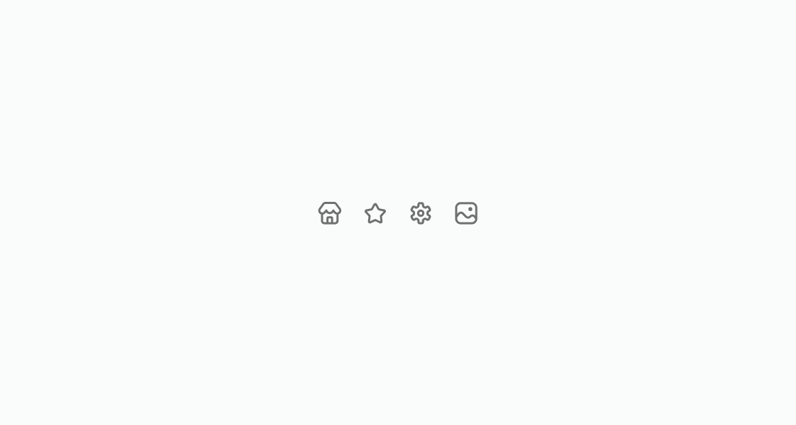
Add visual cues to help customers understand available actions. This example displays common icons for store, orders, favorites, and settings.
Display icons
html
Anchor to Pair an icon with a text labelPair an icon with a text label
Pair an icon with text to provide contextual information. This example places an info icon next to a delivery estimate label.
html
Anchor to Apply semantic tonesApply semantic tones
Communicate status through color-coded icons. This example displays icons with warning, success, info, and critical tones.
html
Anchor to De-emphasize an iconDe-emphasize an icon
De-emphasize supporting icons with a neutral tone. This example presents a help icon in a softer visual style.
html
Nest icons inside button components to reinforce actions. This example adds return and contact icons as children of action buttons.
html
Anchor to Use in badgesUse in badges
Add icons to badge components for quick status recognition. This example shows neutral and critical badges with matching icons.
html
Anchor to Best practicesBest practices
- Use meaningful icons to support actions and status, not decorate: Icons should clarify what an action does or indicate state. Use icons with well-established meanings such as a trash icon for delete actions, a checkmark for completed status, or a warning icon for errors. Avoid adding icons purely for visual interest.
- Use tones consistently to communicate semantic meaning: Apply
infofor neutral guidance,successfor confirmations,warningfor issues that need attention, andcriticalsparingly for problems that must be resolved immediately. - Pair with text labels: Don't rely on icons alone to communicate meaning. Always pair icons with visible text for clarity and accessibility.
- Maintain consistency across your interface: Always use the same icon for the same action or concept throughout your extension. If you use a pencil for edit in one place, use it everywhere. Inconsistent icon usage confuses customers.
- Size appropriately: Use
basefor standard inline icons,smallfor compact layouts, andlargewhen extra emphasis is needed. Avoid mixing sizes in the same row. Inconsistent sizing creates uneven vertical alignment and makes the UI feel unpolished.