Paragraph
The paragraph component displays blocks of text content and can contain inline elements like buttons, links, or emphasized text. Use paragraph to present standalone blocks of readable content, descriptions, or explanatory text.
Paragraphs can wrap inline components to create rich, formatted content blocks. For inline text styling, use text.
Paragraph doesn't support text truncation or maxLines. Manage overflow with a parent layout component.
Supported targets
- customer-account.
footer. render-after - customer-account.
order-index. announcement. render - customer-account.
order-index. block. render - customer-account.
order-status. announcement. render - customer-account.
order-status. block. render - customer-account.
order-status. cart-line-item. render-after - customer-account.
order-status. cart-line-list. render-after - customer-account.
order-status. customer-information. render-after - customer-account.
order-status. fulfillment-details. render-after - customer-account.
order-status. payment-details. render-after - customer-account.
order-status. return-details. render-after - customer-account.
order-status. unfulfilled-items. render-after - customer-account.
order. action. menu-item. render - customer-account.
order. action. render - customer-account.
order. page. render - customer-account.
page. render - customer-account.
profile. addresses. render-after - customer-account.
profile. announcement. render - customer-account.
profile. block. render - customer-account.
profile. company-details. render-after - customer-account.
profile. company-location-addresses. render-after - customer-account.
profile. company-location-payment. render-after - customer-account.
profile. company-location-staff. render-after - customer-account.
profile. payment. render-after
Supported targets
- customer-account.
footer. render-after - customer-account.
order-index. announcement. render - customer-account.
order-index. block. render - customer-account.
order-status. announcement. render - customer-account.
order-status. block. render - customer-account.
order-status. cart-line-item. render-after - customer-account.
order-status. cart-line-list. render-after - customer-account.
order-status. customer-information. render-after - customer-account.
order-status. fulfillment-details. render-after - customer-account.
order-status. payment-details. render-after - customer-account.
order-status. return-details. render-after - customer-account.
order-status. unfulfilled-items. render-after - customer-account.
order. action. menu-item. render - customer-account.
order. action. render - customer-account.
order. page. render - customer-account.
page. render - customer-account.
profile. addresses. render-after - customer-account.
profile. announcement. render - customer-account.
profile. block. render - customer-account.
profile. company-details. render-after - customer-account.
profile. company-location-addresses. render-after - customer-account.
profile. company-location-payment. render-after - customer-account.
profile. company-location-staff. render-after - customer-account.
profile. payment. render-after
Anchor to Use casesUse cases
- Shipping estimates: Display delivery timeframes or tracking information as readable body text.
- Legal disclosures: Present fine-print text about taxes, duties, or terms beneath the order total.
- Product descriptions: Render rich text blocks with inline links or emphasis for product details.
- Warning messages: Communicate address validation issues or stock alerts with semantic tone and color.
Anchor to PropertiesProperties
Configure the following properties on the paragraph component.
- Anchor to accessibilityVisibilityaccessibility
Visibilityaccessibility Visibility 'visible' | 'hidden' | 'exclusive''visible' | 'hidden' | 'exclusive'Default: 'visible'Default: 'visible' Controls how the element is exposed to sighted users and to assistive technologies such as screen readers.
visible: The element is visible to all users (both sighted users and screen readers).hidden: The element is visually visible but hidden from screen readers. Use this for decorative elements that don't provide meaningful information.exclusive: The element is visually hidden but announced by screen readers. Use this for screen-reader-only content like skip links or additional context.
- Anchor to colorcolorcolor'base' | 'subdued''base' | 'subdued'Default: 'base'Default: 'base'
The color emphasis level that controls visual intensity.
subdued: Deemphasized color for secondary text, supporting labels, and less critical interface elements.base: Primary color for body text, standard UI elements, and general content with good readability.strong: Higher-contrast color for text that needs more emphasis thanbase.
- Anchor to dirdirdir'ltr' | 'rtl' | 'auto' | '''ltr' | 'rtl' | 'auto' | ''Default: ''Default: ''
Indicates the directionality of the element’s text.
ltr: The languages written from left to right (such as English).rtl: The languages written from right to left (such as Arabic).auto: The user agent determines the direction based on the content."": The direction is inherited from parent elements (equivalent to not setting the attribute).
Learn more about the dir attribute.
- Anchor to idididstringstring
A unique identifier for the element. Use this to reference the element in JavaScript, link labels to form controls, or target specific elements for styling or scripting.
- Anchor to langlanglangstringstringDefault: ''Default: ''
The language of the text content. Use this when the text is in a different language than the rest of the page, allowing assistive technologies such as screen readers to invoke the correct pronunciation.
The value should be a valid language subtag from the IANA language subtag registry.
It is recommended to combine it with the
dirattribute to ensure the text is rendered correctly if the surrounding content’s direction is different.- Anchor to textAligntext
Aligntext Align 'start' | 'end' | 'center' | 'auto''start' | 'end' | 'center' | 'auto'Default: 'auto'Default: 'auto' Sets the alignment of the text.
- Anchor to tonetonetone'info' | 'auto' | 'neutral' | 'success' | 'warning' | 'critical' | 'custom''info' | 'auto' | 'neutral' | 'success' | 'warning' | 'critical' | 'custom'Default: 'auto'Default: 'auto'
The semantic meaning and color treatment of the component.
auto: Automatically determined based on context.neutral: General information without specific intent.info: Informational content or helpful tips.success: Positive outcomes or successful states.caution: Advisory notices that need attention.warning: Important warnings about potential issues.critical: Urgent problems or destructive actions.accent: Highlighted or promotional content.custom: Custom styling controlled by your theme.
- Anchor to typetypetypeParagraphTypeParagraphTypeDefault: 'paragraph'Default: 'paragraph'
The semantic type and styling treatment for the paragraph content.
Other presentation properties on
s-paragraphoverride the default styling.
ParagraphType
"paragraph" | "small"Anchor to ExamplesExamples
Anchor to Display a basic paragraphDisplay a basic paragraph
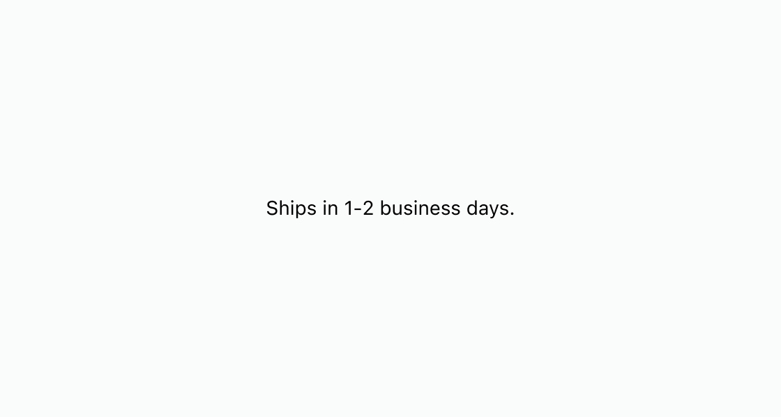
Render a block of body text with a shipping estimate message. This example displays an s-paragraph with default styling for a delivery timeframe.
Display a basic paragraph
html
Anchor to Use tone and color to style messagingUse tone and color to style messaging
Apply semantic color and muted styling to delivery messaging. This example combines tone="warning" with color="subdued" so the warning reads clearly without shouting.
html
Anchor to De-emphasize text using colorDe-emphasize text using color
De-emphasize legal or tax copy that must appear but shouldn't dominate the layout. This example sets color="subdued" on s-paragraph for text below the order total.
html
Anchor to Best practicesBest practices
- Apply tone for semantic meaning: Set
tone="warning"ortone="critical"to convey urgency rather than relying on color alone. - Create visual hierarchy with color: Use
color="subdued"for less important text like disclaimers and fine print. - Keep paragraphs focused: Limit each paragraph to a single idea so customers can scan content quickly.
- Layer tone and color deliberately: Pair
tonewithcoloronly when the combination still meets contrast and readability needs.