Box
The box component provides a container for layout and visual styling. Use it to apply padding, borders, and background colors, or to nest and group other components.
For user interaction, use box in combination with interactive components like button or clickable. For scrollable content, use scroll box.
Supported targets
- pos.
cart. line-item-details. action. render - pos.
customer-details. action. render - pos.
customer-details. block. render - pos.
draft-order-details. action. render - pos.
draft-order-details. block. render - pos.
home. modal. render - pos.
order-details. action. render - pos.
order-details. block. render - pos.
product-details. action. render - pos.
product-details. block. render - pos.
purchase. post. action. render - pos.
purchase. post. block. render - pos.
register-details. action. render - pos.
register-details. block. render
Supported targets
- pos.
cart. line-item-details. action. render - pos.
customer-details. action. render - pos.
customer-details. block. render - pos.
draft-order-details. action. render - pos.
draft-order-details. block. render - pos.
home. modal. render - pos.
order-details. action. render - pos.
order-details. block. render - pos.
product-details. action. render - pos.
product-details. block. render - pos.
purchase. post. action. render - pos.
purchase. post. block. render - pos.
register-details. action. render - pos.
register-details. block. render
Anchor to Use casesUse cases
- Spacing control: Create consistent spacing and padding around content groups.
- Structured layouts: Build layouts by nesting components within Box containers.
- Responsive sizing: Apply sizing that adapts to different screen sizes and orientations.
- Visual grouping: Group related interface elements with consistent boundaries.
Anchor to PropertiesProperties
Configure the following properties on the Box component.
- Anchor to blockSizeblock
Sizeblock Size SizeUnitsOrAutoSizeUnitsOrAutoDefault: 'auto'Default: 'auto' Adjust the block size.
- Anchor to idididstringstring
A unique identifier for the element.
- Anchor to inlineSizeinline
Sizeinline Size SizeUnitsOrAutoSizeUnitsOrAutoDefault: 'auto'Default: 'auto' Adjust the inline size.
- Anchor to maxBlockSizemax
Block Sizemax Block Size SizeUnitsOrNoneSizeUnitsOrNoneDefault: 'none'Default: 'none' Adjust the maximum block size.
- Anchor to maxInlineSizemax
Inline Sizemax Inline Size SizeUnitsOrNoneSizeUnitsOrNoneDefault: 'none'Default: 'none' Adjust the maximum inline size.
- Anchor to minBlockSizemin
Block Sizemin Block Size SizeUnitsSizeUnitsDefault: '0'Default: '0' Adjust the minimum block size.
- Anchor to minInlineSizemin
Inline Sizemin Inline Size SizeUnitsSizeUnitsDefault: '0'Default: '0' Adjust the minimum inline size.
- Anchor to paddingpaddingpaddingMaybeAllValuesShorthandProperty<PaddingKeyword>MaybeAllValuesShorthandProperty<PaddingKeyword>Default: 'none'Default: 'none'
Adjust the padding of all edges.
1-to-4-value syntax is supported. Note that, contrary to the CSS, it uses flow-relative values and the order is:
- 4 values:
block-start inline-end block-end inline-start - 3 values:
block-start inline block-end - 2 values:
block inline
For example:
largemeans block-start, inline-end, block-end and inline-start paddings arelarge.large nonemeans block-start and block-end paddings arelarge, inline-start and inline-end paddings arenone.large none largemeans block-start padding islarge, inline-end padding isnone, block-end padding islargeand inline-start padding isnone.large none large smallmeans block-start padding islarge, inline-end padding isnone, block-end padding islargeand inline-start padding issmall.
A padding value of
autowill use the default padding for the closest container that has had its usual padding removed.- 4 values:
- Anchor to paddingBlockpadding
Blockpadding Block '' | MaybeTwoValuesShorthandProperty<PaddingKeyword>'' | MaybeTwoValuesShorthandProperty<PaddingKeyword>Default: '' - meaning no overrideDefault: '' - meaning no override Adjust the block-padding.
large nonemeans block-start padding islarge, block-end padding isnone.
This overrides the block value of
padding.- Anchor to paddingBlockEndpadding
Block Endpadding Block End '' | PaddingKeyword'' | PaddingKeywordDefault: '' - meaning no overrideDefault: '' - meaning no override Adjust the block-end padding.
This overrides the block-end value of
.- Anchor to paddingBlockStartpadding
Block Startpadding Block Start '' | PaddingKeyword'' | PaddingKeywordDefault: '' - meaning no overrideDefault: '' - meaning no override Adjust the block-start padding.
This overrides the block-start value of
.- Anchor to paddingInlinepadding
Inlinepadding Inline '' | MaybeTwoValuesShorthandProperty<PaddingKeyword>'' | MaybeTwoValuesShorthandProperty<PaddingKeyword>Default: '' - meaning no overrideDefault: '' - meaning no override Adjust the inline padding.
large nonemeans inline-start padding islarge, inline-end padding isnone.
This overrides the inline value of
padding.- Anchor to paddingInlineEndpadding
Inline Endpadding Inline End '' | PaddingKeyword'' | PaddingKeywordDefault: '' - meaning no overrideDefault: '' - meaning no override Adjust the inline-end padding.
This overrides the inline-end value of
.- Anchor to paddingInlineStartpadding
Inline Startpadding Inline Start '' | PaddingKeyword'' | PaddingKeywordDefault: '' - meaning no overrideDefault: '' - meaning no override Adjust the inline-start padding.
This overrides the inline-start value of
.
SizeUnitsOrAuto
SizeUnits | 'auto'SizeUnits
`${number}px` | `${number}%` | `0`SizeUnitsOrNone
SizeUnits | 'none'MaybeAllValuesShorthandProperty
T | `${T} ${T}` | `${T} ${T} ${T}` | `${T} ${T} ${T} ${T}`PaddingKeyword
SizeKeyword | 'none'SizeKeyword
'small-500' | 'small-400' | 'small-300' | 'small-200' | 'small-100' | 'small' | 'base' | 'large' | 'large-100' | 'large-200' | 'large-300' | 'large-400' | 'large-500'MaybeTwoValuesShorthandProperty
T | `${T} ${T}`Anchor to ExamplesExamples
Anchor to Create a container with a boxCreate a container with a box
Create layouts using a box component. This example demonstrates a basic box container with padding and styling.Create a container with a box
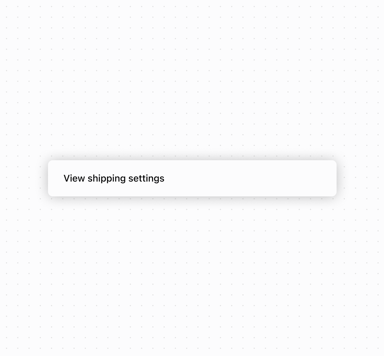
Create a container with a box
Anchor to Best practicesBest practices
- Use semantic sizing: Choose
autoto adapt to content, percentages for responsive layouts, pixels only for exact dimensions. - Use design system padding: Use predefined padding keywords (
small,base,large) for consistency. - Use directional padding for asymmetry: Use
paddingInlineandpaddingBlockwhen different spacing is needed on different sides. - Understand block vs inline:
blockrefers to content flow direction (usually vertical),inlineto text direction (usually horizontal).