---
title: Icon
description: >-
The `Icon` component displays standardized visual symbols from the POS catalog
to represent actions, statuses, or categories. Use icons to enhance navigation
or provide visual context alongside text.
For interactive icons, wrap them in
[`Button`](/docs/api/pos-ui-extensions/2025-10/polaris-web-components/actions/button)
or
[`Clickable`](/docs/api/pos-ui-extensions/2025-10/polaris-web-components/actions/clickable)
components.
api_version: 2025-10
api_name: pos-ui-extensions
source_url:
html: >-
https://shopify.dev/docs/api/pos-ui-extensions/latest/polaris-web-components/media-and-visuals/icon
md: >-
https://shopify.dev/docs/api/pos-ui-extensions/latest/polaris-web-components/media-and-visuals/icon.md
---
# Icon
The `Icon` component displays standardized visual symbols from the POS catalog to represent actions, statuses, or categories. Use icons to enhance navigation or provide visual context alongside text.
For interactive icons, wrap them in [`Button`](https://shopify.dev/docs/api/pos-ui-extensions/2025-10/polaris-web-components/actions/button) or [`Clickable`](https://shopify.dev/docs/api/pos-ui-extensions/2025-10/polaris-web-components/actions/clickable) components.
## Properties
Configure the following properties on the `Icon` component.
* color
ColorKeyword
Default: 'base'
Modify the color to be more or less intense. Use `'subdued'` for secondary icons, `'base'` for standard visibility, or `'strong'` for emphasized icons that need to stand out.
* id
string
A unique identifier for the element. Use this to reference the icon in JavaScript or CSS.
* size
SizeKeyword
Default: 'base'
Adjusts the size of the icon. Available sizes range from `'small-500'` (smallest) through `'base'` (default) to `'large-500'` (largest), allowing you to match icon size to your interface hierarchy.
* tone
ToneKeyword
Default: 'auto'
Sets the tone of the icon, based on the intention of the information being conveyed.
* type
SupportedIconNames
Default: ''
The type of icon to display.
### ColorKeyword
Defines the available color intensity options for icons. Controls the visual prominence and contrast of icon elements within the interface.
```ts
'subdued' | 'base' | 'strong'
```
### SizeKeyword
Defines the available size options for icons using a semantic scale. Provides granular control over icon dimensions from compact inline sizes to prominent display sizes.
```ts
'small-500' | 'small-400' | 'small-300' | 'small-200' | 'small-100' | 'small' | 'base' | 'large' | 'large-100' | 'large-200' | 'large-300' | 'large-400' | 'large-500'
```
### ToneKeyword
Defines the semantic tone options for icons. Controls the color and visual emphasis based on the information type and importance being communicated.
```ts
'auto' | 'neutral' | 'info' | 'success' | 'caution' | 'warning' | 'critical' | 'accent' | 'custom'
```
### SupportedIconNames
Lists all currently supported icon names available for use in the POS interface. Reference this list when selecting icons to ensure compatibility and availability.
```ts
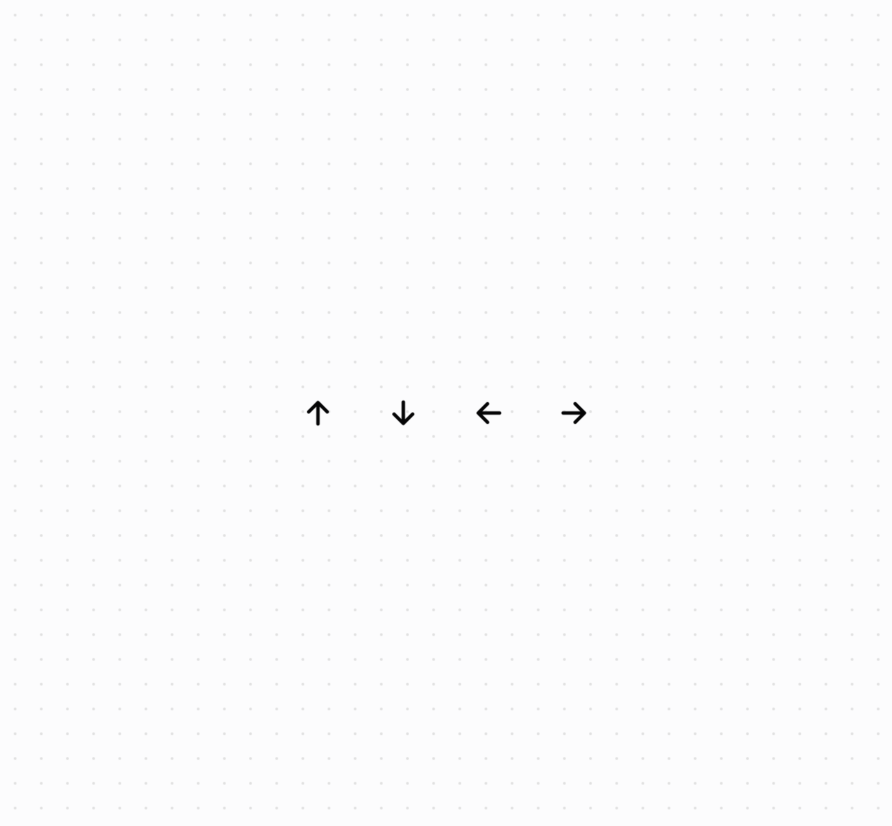
'external' | 'alert-circle' | 'apps' | 'arrow-down' | 'arrow-left' | 'arrow-right' | 'arrow-up' | 'backspace' | 'barcode' | 'battery-low' | 'bolt-filled' | 'bullet' | 'camera-flip' | 'caret-down' | 'caret-up' | 'cart' | 'cart-down' | 'cart-filled' | 'cart-send' | 'cart-up' | 'chart-line' | 'chart-vertical' | 'check' | 'check-circle-filled' | 'chevron-down' | 'chevron-left' | 'chevron-right' | 'chevron-up' | 'circle' | 'clipboard-checklist' | 'clock' | 'collection' | 'credit-card' | 'credit-card-reader' | 'delete' | 'delivery' | 'desktop' | 'disabled' | 'disabled-filled' | 'discount' | 'discount-add' | 'discount-automatic' | 'discount-code' | 'discount-remove' | 'drag-handle' | 'drawer' | 'duplicate' | 'edit' | 'email' | 'exchange' | 'flag' | 'gift-card' | 'graduation-hat' | 'grid' | 'hide-filled' | 'home' | 'home-filled' | 'image' | 'images' | 'info' | 'inventory' | 'inventory-edit' | 'inventory-list' | 'inventory-transfer' | 'keyboard-hide' | 'keypad' | 'link' | 'list-bulleted' | 'list-bulleted-filled' | 'live' | 'live-critical' | 'live-none' | 'location' | 'lock' | 'maximize' | 'menu' | 'menu-filled' | 'menu-horizontal' | 'minimize' | 'minus' | 'mobile' | 'money' | 'money-split' | 'note' | 'order' | 'order-draft' | 'order-filled' | 'package' | 'package-cancel' | 'package-reassign' | 'payment' | 'person' | 'person-add' | 'person-filled' | 'phablet' | 'phone-out' | 'play-circle' | 'plus' | 'point-of-sale' | 'point-of-sale-register' | 'print' | 'product' | 'product-filled' | 'profile' | 'question-circle-filled' | 'receipt' | 'refresh' | 'return' | 'scan-qr-code' | 'search' | 'send' | 'settings' | 'shipping-label-cancel' | 'sort' | 'star-circle' | 'star-filled' | 'store' | 'tablet' | 'transaction-fee-add' | 'unlock' | 'variant' | 'view' | 'wallet' | 'x' | 'x-circle'
```
### Examples
* #### Display icons from the POS catalog
##### Description
Display standardized visual symbols using an \`Icon\` component from the POS icon catalog. This example shows a basic icon with proper sizing and accessibility.
##### Default
```html
```
## Preview
## Best practices
* **Choose recognizable icons:** Use universally recognized symbols like `search`, `cart`, or `settings`. Avoid ambiguous icons.
* **Match size to context:** Use smaller sizes for inline text or secondary actions, `base` for standard elements, larger sizes for primary actions.
* **Apply tones for meaning:** Use `critical` for destructive actions, `warning` for cautions, `success` for confirmations, `auto` or `neutral` for general elements.
* **Pair with text for clarity:** Consider adding text labels, especially for complex or uncommon actions.
* **Use color for hierarchy:** Use `subdued` for secondary elements, `base` for standard visibility, `strong` for emphasis.