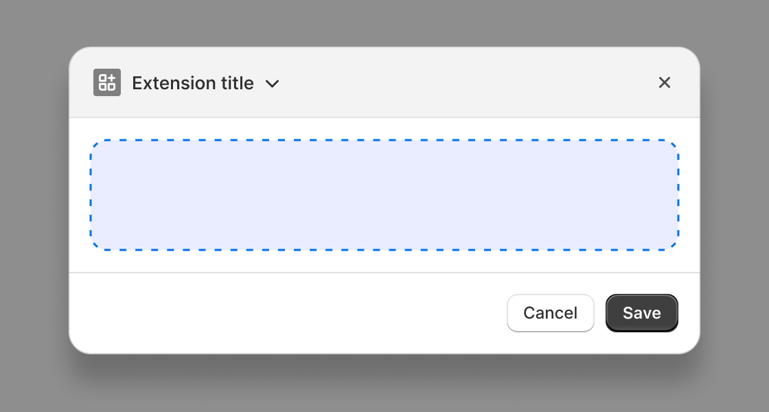
Admin
Use s-admin-action to configure a primary and secondary action and title. Use of this component is required in order to use Admin action extensions.
Anchor to propertiesProperties
- Anchor to headingheadingstring
The text to use as the Action modal’s title. If not provided, the name of the extension will be used.
- Anchor to loadingloadingbooleanDefault: false
Whether the action is in a loading state, such as initial page load or action opening. When true, the action could be in an inert state, which prevents user interaction.
AdminActionProps
- heading
The text to use as the Action modal’s title. If not provided, the name of the extension will be used.
string - loading
Whether the action is in a loading state, such as initial page load or action opening. When true, the action could be in an inert state, which prevents user interaction.
boolean
export interface AdminActionProps
extends Pick<AdminActionProps$1, 'heading' | 'loading'> {}Anchor to slotsSlots
- Anchor to primary-actionprimary-actionHTMLElement
The primary action to display in the admin action.
- Anchor to secondary-actionssecondary-actionsHTMLElement
The secondary actions to display in the admin action.
AdminActionSlots
- primary-action
The primary action to display in the admin action.
HTMLElement - secondary-actions
The secondary actions to display in the admin action.
HTMLElement
export interface AdminActionSlots {
  /**
   * The primary action to display in the admin action.
   */
  'primary-action': HTMLElement;
  /**
   * The secondary actions to display in the admin action.
   */
  'secondary-actions': HTMLElement;
}JSX
examples
JSX
<s-admin-action title="My App Action">
  Modal content
  <s-button
    slot="primary-action"
    onClick={() => console.log('pressed primary action')}
  >
    Primary
  </s-button>
  <s-button
    slot="secondary-actions"
    onClick={() => console.log('pressed secondary action')}
  >
    Secondary
  </s-button>
</s-admin-action>;
Preview