Admin
s-admin-block provides a deeper integration with the container your UI is rendered into. This component should only be used in Block Extensions, which render inline on a resource page.
Anchor to propertiesProperties
- Anchor to collapsedSummarycollapsedSummarystring
The summary to display when the app block is collapsed. Summary longer than 30 characters will be truncated.
- Anchor to headingheadingstring
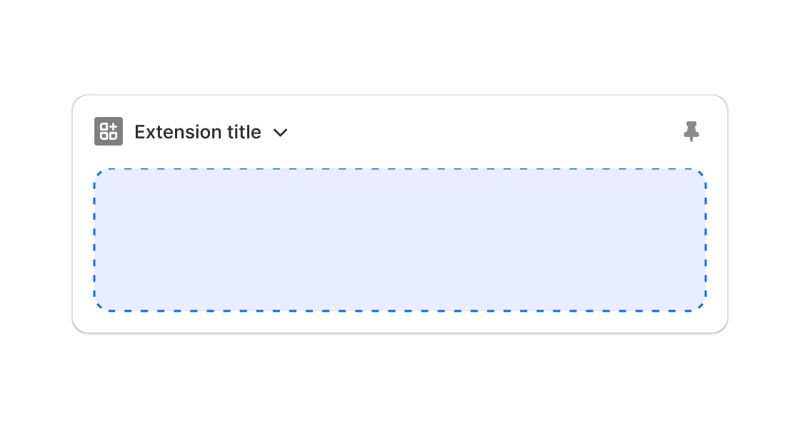
The text to use as the Block title in the block header. If not provided, the name of the extension will be used.
AdminBlockProps
- collapsedSummary
The summary to display when the app block is collapsed. Summary longer than 30 characters will be truncated.
string - heading
The text to use as the Block title in the block header. If not provided, the name of the extension will be used.
string
export interface AdminBlockProps
  extends Pick<AdminBlockProps$1, 'heading' | 'collapsedSummary'> {}
Was this section helpful?
JSX
<s-admin-block title="My App Block">5 items active</s-admin-block>;
examples
JSX
<s-admin-block title="My App Block">5 items active</s-admin-block>;
Preview
Anchor to considerationsConsiderations
- Initial height is limited to 300px.
- When content exceeds the height limit, a "Show more" button appears.
- In development, the following warning also displays: "Warning! This Block is too tall."
- After expanding to the max height, content that exceeds the limit is cut off, and the merchant must navigate to the extension's app via the provided link.
Was this section helpful?